Please note that since this report was written,
various other Special Reports have been published.
No. 445: SPECIAL COMMENTARY - Review of Economic, Systemic-Solvency, Inflation, U.S. Dollar and Gold Circumstances
Published June 12th, 2012. Open to public readership.
No. 485: SPECIAL COMMENTARY - Review of Economic, Systemic-Solvency, Inflation,
U.S. Dollar and Gold Circumstances
Published November 27th, 2012. Open to public readers
No. 527: SPECIAL COMMENTARY Update on U.S. Fiscal, Monetary, Economic Conditions and Outlook for U.S. Dollar, Gold and Silver
Published May 29th, 2013. Open to public readers
No. 614: HYPERINFLATION 2014—THE END GAME BEGINS
Published April 2nd, 2014 (Currently, open to SGS Newsletter Subscribers only)
HYPERINFLATION 2012
SPECIAL COMMENTARY NUMBER 414
January 25, 2012
__________
U.S. Hyperinflationary Great Depression Moves Ever Closer
U.S. Government and the Federal Reserve Effectively Have Destroyed
Global Confidence in the U.S. Dollar
Systemic-Solvency and Economic Crises Have Not Abated
Precursors to Ultimate Dollar Disaster Are in Place;
2014 Remains the Outside Timing for Same
__________
Hyperinflation 2012 is the fifth in a series of related writings going back to 2006. It updates and replaces the Hyperinflation Special Report (2011) of March 15, 2011, which preceded: the U.S. government’s demonstration of a lack of political will to address the country’s long-range insolvency; the downgrade of the “AAA” rating of U.S. Treasury securities; an ensuing U.S. dollar panic, dollar support operations and extremely unstable U.S. and global financial markets; a temporary shift in market focus to Euro-era issues; and growing recognition of the ongoing and deepening economic and systemic-solvency crises. Nonetheless, the outlook has changed little. With the passage of 10 months since the last report (updated circumstances have been covered regularly in weekly Commentaries), events just have continued to move this pending ultimate financial crisis into much closer time proximity.
In turn, the 2011 report updated and replaced the Hyperinflation Special Report (2010 Update) of December 2, 2009, which preceded: the Fed’s formal monetization of U.S. Treasury debt aimed at debasing the U.S. dollar; the sharpest post-World War II annual decline in broad money growth; the pronouncement of an official end to the 2007 recession despite no meaningful recovery; passage of the Administration’s health insurance legislation; and the mid-term election. Yet, the outlook had changed little. With the passage of 15 months since the prior report (updated circumstances were covered regularly in weekly Commentaries), again, events just had moved the hyperinflation crisis into closer time proximity.
In turn, the 2010 report updated and replaced the Hyperinflation Special Report version of April 8, 2008, which was published post-Bear Stearns, but pre-Lehman, pre-TARP, pre-recession recognition and pre-2008 presidential election. The April 2008 report updated and expanded upon the three-part Hyperinflation Series that began with the December 2006 SGS Newsletter, which predated public recognition of the 2007 economic and systemic-solvency crises.
This missive includes significant new material in addition to much of the same basic text that was in the 2011 edition, along with revisions and updates reflecting the still-unfolding economic and systemic-solvency crises.
__________
Contents
Chapter 1—Overview and Executive Summary
Events Moving at an Accelerating Pace Towards the Great Collapse
Graph 1: Federal Reserve Notes per Ounce of Gold
Background
Has the Euro Been Used as a Foil Against the Dollar?
Impact of Fed Monetization of U.S. Treasuries in QE2
Graph 2: Fed Monetization of Treasury Debt
Graph 3: Core Inflation from QE2
Crises Brewed by Federal Government and Federal Reserve Malfeasance
Saving the System at Any Cost
U.S. Economy Is Not Recovering
Hyperinflation Nears
Chapter 2—Defining the Components of a Hyperinflationary Great Depression
Deflation, Inflation and Hyperinflation
Recession, Depression and Great Depression
Chapter 3—Two Examples of Hyperinflation
Some Lessons from History
Weimar Republic
Graph 4: German Paper Marks per U.S. Dollar 1922 to 1923
Graph 5: Log Scale, German Paper Marks per U.S. Dollar 1922 to 1923
Zimbabwe
Chapter 4—Current Economic and Inflation Conditions in the United States
Economic Reality
Structural Consumer Liquidity Problems
Graph 6: Merchandise Trade Balance
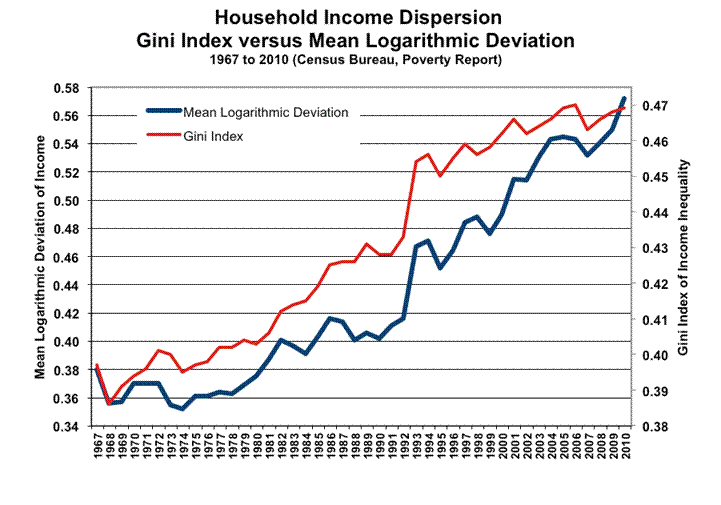
Graph 7: Household Income Dispersion
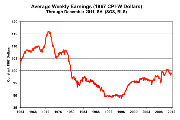
Graph 8: Average Weekly Earnings (1967 CPI-W Dollars)
Graph 9: Annual Median Household Income (1967 Dollars)
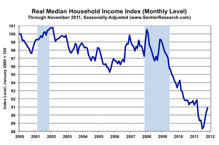
Graph 10: Median Household Income Index (Monthly)
CPI No Longer Reflects Costs of Maintaining Constant Standard of Living.
Graph 11: Annual Consumer Inflation, CPI versus SGS Alternate.
Early Impact of Dollar Debasement
Graph 12: Gold versus Swiss Franc
Graph 13: Gold versus Oil
Graph 14: Gold versus Silver
Income, Credit and Willingness to Spend
Consumer Credit Still Shrinking Net of Student Loan Surge
Graph 15: Consumer Credit Outstanding
Markets Are Flying Blind with Distorted Economic Reporting
Already in Depression, Economy Continues to Bottom Bounce
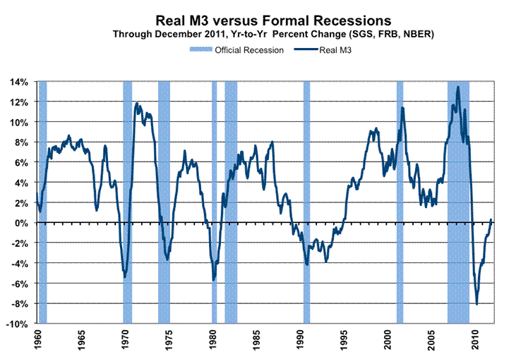
Graph 16: Real M3 versus Formal Recessions
Historical Perspective on the Economic Data
Graph 17: Year-to-Year Change Monthly Payroll Employment
Graph 18: Year-to-Year Change Quarterly Real GDP
Graph 19: Year-to-Year Change Annual Real GDP
Chapter 5—Key Economic Reporting Varies by Inflation Assumptions
Economic Reporting Free of Inflation And Inflation Corrected
Graph 20: Payroll Employment Level
Graph 21: Consumer Confidence
Graph 22: Housing Starts Beginning 2000
Graph 23: Housing Starts Post-World War II
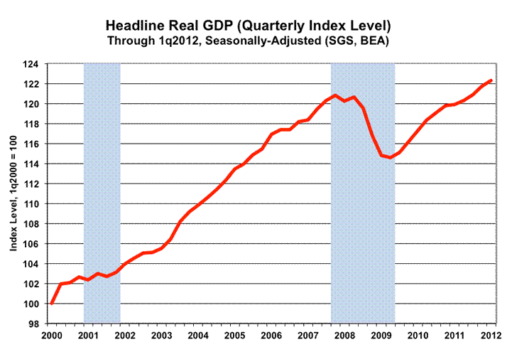
Graph 24: Real GDP Level, Official Version
Graph 25: Inflation-Corrected Real GDP Level
Graph 26: Headline Real Retail Sales
Graph 27: Inflation Corrected Headline Real Retail Sales
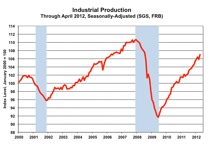
Graph 28: Headline Industrial Production Level
Graph 29: Inflation-Corrected Industrial Production
Chapter 6—Historical U.S. Inflation and U.S. Dollar Debasement
Graph 30: Consumer Inflation 1665 to 2011
Graph 31: Log-Scale Consumer Inflation 1665 to 2011
Table I: Loss of U.S. Dollar Purchasing Power
Chapter 7—Federal Reserve, Systemic Solvency and Inflation versus Deflation
Preventing Systemic Collapse at All Costs
“Helicopter Ben” on Preventing Deflation
Monetary Base and Money Supply Growth
Graph 32: Monetary Base, Leve
Graph 33: Monetary Base, Year-to-Year Change
Graph 34: M3, Monthly Year-to-Year Change
Graph 35: Year-to-Year U.S. Money Supply Growth with SGS M3 Continuation
Banks Not Increasing Lending into the Regular Flow of Commerce
Graph 36: Commercial and Industrial Loans
Graph 37: Commercial Paper Outstanding
Inflation and Money Growth
Chapter 8—U.S. Government Cannot Cover Existing Obligations
Annual GAAP-Based Federal Deficits at $5 Trillion
Federal Debt and Net Present Value of Unfunded Liabilities Exceed $80 Trillion
Graph 38: Total Federal Obligations as Percent of GDP
Annual Deficits of $5 Trillion Are Not Sustainable
Table II: U.S. Government GAAP Accounting, Deficits and Obligations
Chapter 9—Hyperinflationary Great Depression
Move Towards Hyperinflation Accelerated by Current Fed and Government Actions
Lack of Physical Cash
Possible Short-Term Electronic Relief for Individuals
Barter System
Financial Hedges and Investments
Graph 39: Year-End DJIA, Current versus Constant Dollar
Graph 40: Log-Based, Year-End DJIA, Current versus Constant Dollar
Possible Official Actions and Responses/External Risks
Closing Comments—Other Issues
Political Considerations
Common Sense
Recommended Further Reading
_________
Chapter 1—Overview and Executive Summary
A fair amount of the text in this chapter is repetitive from the prior hyperinflation report, but conditions have not changed much. The text reflects new developments and updated data where appropriate.
Little has changed in the basic outlook. The U.S. economic and systemic-solvency crises of the last five years continue to deteriorate. Yet they remain just the precursors to the coming Great Collapse: a hyperinflationary great depression. The unfolding circumstance will encompass a complete loss in the purchasing power of the U.S. dollar; a collapse in the normal stream of U.S. commercial and economic activity; a collapse in the U.S. financial system, as we know it; and a likely realignment of the U.S. political environment. Outside timing on the hyperinflation remains 2014, but events of the last year have accelerated the movement towards this ultimate dollar catastrophe. Following Mr. Bernanke’s extraordinary efforts to debase the U.S. currency in late-2010, the dollar had lost its traditional safe-haven status by early-2011. Whatever global confidence had remained behind the U.S dollar was lost in July and August. That was in response to the lack of political will—shown by those who control the White House and Congress—to address the long-range insolvency of the U.S. government, and as a result of the later credit-rating downgrade to U.S. Treasury debt.
Those latter circumstances triggered something of dollar selling panic, particularly as reflected in the corresponding buying of gold and Swiss francs, but various interventions, misdirection and manipulations helped to quell the currency disorders. Still, many financial markets were left rocking with the aftershocks of a major shift in the global view of the U.S. dollar.
The economy has underperformed and likely will continue to underperform consensus forecasts by a significant margin. In turn, weaker-than-expected economic growth will mean significantly worse-than-expected federal budget deficits, Treasury funding needs and banking-system solvency conditions.
With the U.S. election just nine months off, political pressures will mount to favor fiscal stimulus measures instead of restraint. The Fed should be forced to provide new “easing” in an effort to continue propping the banking system (the explanation will be an effort to boost the economy). Given the Treasury’s funding needs, the easing likely will in the form of renewed buying of U.S. Treasuries, with the Fed remaining lender of last resort there. Consistent with the precedent set in 2008, the Fed, and likely the Treasury, also will remain in place to do whatever is needed, at whatever cost, to prevent systemic collapse in the United States. All of these actions, though, have costs in terms of higher domestic inflation and intensified dollar debasement
The U.S. dollar remains highly vulnerable to massive, panicked selling, at any time, with little or no warning. The next round of Federal Reserve or U.S. government easing or stimulus could be the proximal trigger for such a currency panic and/or for strong efforts to strip the U.S. currency of its global reserve currency status.
As the advance squalls from this great financial tempest come ashore, the government could be expected to launch a variety of efforts at forestalling the hyperinflation’s landfall, but such efforts will buy little time and ultimately will fail in preventing the dollar’s collapse. The timing of the early days—the onset—of full-blown hyperinflation likely will be coincident with a broad global rejection of the U.S. dollar, which, again, could happen at any time.
With no viable or politically-practical way of balancing U.S. fiscal conditions and avoiding this financial economic Armageddon, the best action that individuals can take at this point remains to protect themselves, both as to meeting short-range survival needs as well as to preserving current wealth and assets over the longer term. Efforts there, respectively, would encompass building a store of key consumables, such as food and water, and moving assets into physical precious metals and outside of the U.S. dollar.
The following graph of Federal Reserve notes versus gold gives a suggestion of how the markets have been discounting the mounting U.S. fiscal and dollar problems since at least 2000.

By 2004, fiscal malfeasance of successive U.S. Administrations and Congresses had pushed the federal government into effective long-term insolvency (likely to have triggered hyperinflation by 2018). GAAP-based (generally accepted accounting principles) accounting then showed total federal obligations at $50 trillion—more than four-times the level of U.S. GDP—that were increasing each year by GAAP-based annual deficits in the uncontainable four- to five-trillion dollar range. Those extreme operating shortfalls continue unabated, with total federal obligations at $81 trillion—more than five-times U.S. GDP—at the end of the 2011 fiscal year. Taxes cannot be raised enough to bring the GAAP-based deficit into balance, and the political will in Washington is lacking to cut government spending severely, particularly in terms of the necessary slashing of unfunded liabilities in government social programs such as Social Security and Medicare.
Bankrupt governments—unable to raise adequate cash to cover obligations—invariably crank up the currency printing presses to do so, creating a hyperinflation. The federal government and Federal Reserve’s actions in response to, and in conjunction with, the economic and financial crises of 2007, however, accelerated the ultimate process—both in terms of fiscal deterioration and global perception of the issues—moving the outside horizon for hyperinflation from 2018 to 2014. Even so, over the last several years, the government and Fed’s actions and policies, and economic and financial-market developments have continued to exacerbate the circumstance, such that there is significant chance of the early stages of the hyperinflation breaking at any time. Key to the near-term timing remains a sharp decline in the exchange rate value of the U.S. dollar, with the rest of the world effectively moving to dump the U.S. currency and dollar-denominated paper assets.
As the U.S. dollar came under heavy selling pressure in September 2011, the global markets suddenly shifted their focus to the euro-area solvency crises, selling euros against dollars. That event has happened so frequently in recent years, and it appears so counterintuitive, that I suspect the euro has been used on more than occasion as a foil, distracting global currency trading from the perils of the U.S. dollar, since the United States remains the elephant in the bathtub of sovereign solvency problems.
Nonetheless, the euro area has significant sovereign-solvency concerns. To the extent those issues could threaten the U.S. banking system, presumably the Fed has taken actions or has a plan in place to prevent a U.S. systemic collapse that could be triggered by a euro-related problem. I do not know what will happen within the euro area, but its solvency issues likely will be worked through. The circumstance for the more-serious U.S. solvency and the U.S. dollar issues likely will not have as happy a resolution.
The current U.S. financial markets, financial system and economy remain highly unstable and increasingly vulnerable to unexpected shocks. At the same time, the Federal Reserve and the federal government are dedicated to preventing systemic collapse and broad price deflation. To prevent any imminent collapse—as has been seen in official activities of the last several years—they will create and spend whatever money is needed, including the deliberate debasement of the U.S. dollar with the intent of increasing domestic inflation. As shown in Graph 2, those efforts included effective full monetization of recent net Treasury debt issuance. During the period of QE2, and prior to the debt ceiling being hit, the Federal Reserve more than fully monetized net Treasury issuance in the same period.
The effects of QE2 included debasing the U.S. dollar. As the dollar weakened against other currencies, oil prices soared, and that spiked U.S. consumer inflation. Although the Fed likes to tout “core” inflation, net of food and energy costs, the oil inflation also has begun to spread into the broader economy.


As shown in Graph 3, annual “core” CPI-U inflation has risen for fourteen straight months, through December 2011, as a result of the Fed’s actions and remains an indication of a nascent, building inflation cycle. The resulting inflation here is just a foretaste of consumer inflation that likely would result from ongoing Fed “easing” actions.
The efforts to stave off systemic collapse also have resulted in uncontrolled fiscal excesses by the federal government. The deliberate monetary and fiscal abuses have resulted in de-stabilizing pressures against the U.S. currency, in generally rising gold and silver prices, and in the nascent pickup in reported U.S. consumer inflation. That inflation has been driven by unhealthy monetary policy, instead of by healthy economic demand.
The economic and systemic crises, triggered by the collapse of debt excesses that had been encouraged actively by the Greenspan Federal Reserve, have been centered on the U.S. financial system. Recognizing that the U.S. economy was sagging under the weight of structural income impairment created by government trade, regulatory and social policies—policies that limited real (inflation-adjusted) consumer income growth, where the average U.S. household could not stay ahead of inflation or make ends meet—then-Federal Reserve Chairman Alan Greenspan played along with the political and banking systems. He made policy decisions to steal economic activity from the future, fueling economic growth of the last decade largely through debt expansion (see Structural Consumer Liquidity Problems).
The Greenspan Fed pushed for ever-greater systemic leverage, including the happy acceptance of new financial products—instruments of mispackaged lending risks—designed for consumption by global entities that openly did not understand the nature of the risks being taken. Spreading the credit risks of banks among other industries, for example, was encouraged actively by the Fed as healthy and stabilizing for both the domestic and global financial systems. Also complicit in this broad malfeasance was the U.S. government, including both major political parties in successive Administrations and Congresses.
As with consumers, though, the federal government could not make ends meet. Driven by self-serving politics aimed at appeasing that portion of the electorate that could be kept docile through ever-expanding government programs and spending, political Washington became dependent on ever-expanding federal deficit spending, unfunded obligations and debt.
Purportedly, it was Arthur Burns, Fed Chairman under Richard Nixon, who first offered the advice that helped to guide Alan Greenspan and a number of Administrations. The gist of the imparted wisdom was that if the Fed or federal government ran into economic or financial-system difficulties, the federal budget deficit and the U.S. dollar simply could be ignored—or sacrificed. Ignoring them would not matter, it was argued, because doing so would not cost the incumbent powers any votes.
Back in 2005, I raised the issue of an inevitable U.S. hyperinflation with an advisor to both the Bush Administration and Fed Chairman Greenspan. I was told simply that “It’s too far into the future to worry about.”
Indeed, attempting to push the big problems further into the future continues to be the working strategy for both the Fed, under Chairman Ben Bernanke, and the current Administration and Congress.
In a February 25, 2011 speech, Federal Reserve Vice Chairman Janet Yellen examined the results of the recent use of “unconventional policy tools” by the Fed: “Each of these policy tools tends to generate spillovers to other financial markets, such as boosting stock prices and putting moderate downward pressure on the foreign exchange value of the dollar.”
While Wall Street may hail any artificial propping it can get from the Fed’s efforts to support the markets, more than “moderate” related declines in the U.S. dollar’s exchange rate destroy any illusions of stock gains and savage the U.S. consumers’ dollar purchasing power. A declining dollar can turn U.S. stock profits into losses for those living outside the dollar-denominated world, as funds are converted back to the strengthening currency domestic to the investor. Inflation driven by dollar weakness will do the same for those in a U.S. dollar-denominated environment, where, eventually, inflation can turn U.S. stock profits into real (inflation-adjusted) losses (see Financial Hedges and Investments).
Indeed, the U.S. dollar and the budget deficit do matter, and the future is at hand. As the federal budget deficit spirals well beyond sustainability and containment at an accelerating pace, and as the Fed moves with great deliberation to debase and to impair the purchasing power of the U.S. dollar, to generate rising consumer inflation, the day of ultimate financial reckoning appears to be breaking.
The Federal Reserve and the U.S. Treasury moved early in the current solvency crisis to prevent a collapse of the banking system, at any cost. It was the collapse of the banking system and loss of depositor assets in the early-1930s that intensified the Great Depression and its attendant deflation. A somewhat parallel risk was envisioned in 2008 as the system passed over the brink. The decision was made to avoid a deflationary great depression.
Effective financial impairments and at least partial nationalizations or orchestrated bailouts/takeovers resulted for institutions such as Bear Stearns, Citigroup, Washington Mutual, AIG, General Motors, Chrysler, Fannie Mae and Freddie Mac, along with a number of further troubled financial institutions. The Fed moved to provide whatever systemic liquidity would be needed, while the federal government moved to finance corporate bailouts, to guarantee any instruments or entities it had to, and to introduce large amounts of short-lived stimulus spending.
Curiously, though, the Fed and the Treasury let Lehman Brothers fail outright, which triggered a foreseeable run on the system and markedly intensified the systemic solvency crisis in September 2008. Whether someone was trying to play naive political games, with the public and Congress increasingly raising questions of moral hazard issues, or whether the U.S. financial wizards missed what would happen or simply moved to bring the crisis to a head, still remains to be seen.
In the still-early days of the crises, the Obama Administration pushed ahead with its social agenda, introducing major new government programs such as federal government control of healthcare and health insurance. Irrespective of stated goals of not increasing the federal deficit further, the resulting healthcare/insurance legislation will have a severely negative impact on the federal deficit—as will most other new legislation and “stimulus” efforts, either from massive net expenses, or from losses in tax revenues in an ever-weakening economy.
The U.S. Government’s 2011 GAAP-based financial statements (see Chapter 8—U.S. Government Cannot Cover Existing Obligations) showed an ongoing annual GAAP-based deficit of about $5 trillion, a circumstance that remains uncontrollable.
Efforts to save the system at any cost likely will continue as long as possible, with the government spending whatever money it and the Federal Reserve need to create, until such time as the global financial markets rebel. The ultimate cost here, though, will be in inflation and the increasing debasement of the purchasing power of the U.S. Dollar, and an eventual dollar collapse beyond any government or Federal Reserve control.
New in Chapter 5—Key Economic Reporting Varies by Inflation Assumptions, the effects of inflation assumptions are explored in terms of key reporting series. Corrected for understated inflation, the GDP, real retail sales and industrial production series show patterns similar to inflation-free measures, such as payroll employment, consumer confidence and housing starts. The adjusted data tend indicate that the economy is not in recovery.
Economic activity in the United States began to decline in 2006 or early-2007, and it plunged from late-2007 into 2009 at a pace not seen since the Great Depression. Subsequently, economic activity has been bottom-bouncing, with some boosts from short-lived stimulus effects. Without any fundamental turnaround in structural consumer-income problems that have been driving the downturn, and with contracting, inflation-adjusted systemic liquidity, the economy has started to slow anew.
Despite pronouncements of an end to the 2007 recession and the onset of an economic recovery, the U.S. economy still is mired in a deepening structural contraction, which eventually will be recognized as a double- or multiple-dip recession. Beyond the politically- and market-hyped GDP reporting, key underlying economic series show patterns of activity that are consistent with a peak-to-trough (so far) contraction in inflation-adjusted activity in excess of 10%, a formal depression (see Recession, Depression and Great Depression).
Existing formal projections for the federal budget deficit, banking system solvency, etc. all are based on assumptions of positive economic growth, going forward. That growth will not happen, and continued economic contraction will exacerbate fiscal conditions and banking-system liquidity problems terribly.
As previously noted, before the systemic-solvency crisis began to unfold in 2007, the U.S. government already had condemned the U.S. dollar to a hyperinflationary grave by taking on debt and obligations that never could be covered through raising taxes and/or by severely slashing government spending that had become politically untouchable. Also, the U.S. economy already had entered a severe structural downturn, which helped to trigger the systemic-solvency crisis.
Bankrupt sovereign states most commonly use the currency printing press as a solution to not having enough money to cover obligations. The alternative here would be for the U.S. eventually to renege on its existing debt and obligations, a solution for modern sovereign states rarely seen outside of governments overthrown in revolution, and a solution with no happier ending than simply printing the needed money. With the creation of massive amounts of new fiat dollars (not backed by gold or silver) comes the eventual full destruction of the value of the U.S. dollar and related dollar-denominated paper assets.
The U.S. government and the Federal Reserve have committed the system to its ultimate insolvency, through the easy politics of a bottomless pocketbook, the servicing of big-moneyed special interests, gross mismanagement, and a deliberate and ongoing effort to debase the U.S. currency. Yet, the particularly egregious fiscal and monetary responses to economic and solvency crises of the last five years have exacerbated the government’s solvency issues, bringing the great financial tempest close enough to making landfall that the hairs on the backs of investors necks should be standing on end.
Numerous foreign governments/central banks have offered unusually blunt criticism of U.S. fiscal and Federal Reserve policies as the crisis has expanded, but the perceived self-interests of the U.S. government and Fed always will come first in setting domestic policy. Where both private and official demand for U.S. Treasuries had been increasingly unenthusiastic, the Fed—the U.S. central bank—effectively has been fully funded Treasury needs for most of 2011, with its “quantitative easing,” becoming a euphemism for Fed monetization of U.S. Treasury debt.
Further easing by the Fed is likely in the months ahead, as the ongoing economic turmoil triggers significant further fiscal deterioration. Those actions should pummel heavily the U.S. dollar’s exchange rate against other major currencies. Looming with uncertain timing is a panicked dollar dumping and dumping of dollar-denominated paper assets, which remains the most likely event as proximal trigger for the onset of hyperinflation in the near-term.
The early stages of the hyperinflation would be marked simply by an accelerating upturn in consumer prices, a pattern that already was initially in response to QE2. Also, money supply velocity (see Inflation and Money Growth) will spike, as the U.S. dollar, again, comes under heavy and even disorderly selling pressure, with both domestic and foreign holders getting rid of their dollar holdings as quickly as possible. One factor that can contribute to rising velocity is the current circumstance where U.S. investors cannot get a safe return that beats inflation, as reported by the government. Investors can do better by buying a store of products that are rising price, rather than by holding cash or a Treasury bill.
Given the current lack of political will by those controlling the U.S. Government to address the fiscal solvency issues, the U.S. has no way of avoiding a financial Armageddon. Various government intervention tactics might slow the process for brief periods, and the system always is vulnerable to external shocks, such as wars and natural disasters. Government actions could include supportive dollar intervention, restrictions on international capital flows, wage and price controls, etc. Effects of any such moves in delaying the onset of full hyperinflation, though, would be limited and short-lived. There is no obvious course of action or external force at this point of the process that meaningfully would put off the nearing day of reckoning.
What lies ahead will be extremely difficult, painful and unhappy times for many in the United States. The functioning and adaptation of the U.S. economy and financial markets to a hyperinflation likely will be particularly disruptive. Trouble could range from turmoil in the food distribution chain and electronic cash and credit systems unable to handle rapidly changing circumstances, to political instability. The situation quickly would devolve from a deepening depression, to an intensifying hyperinflationary great depression.
While resulting U.S. economic difficulties would have broad global impact, the initial hyperinflation should be largely a U.S. problem, albeit with major implications for the global currency system.
For those living in the United States, long-range strategies should look to assure safety and survival, which from a financial standpoint means preserving wealth and assets. Also directly impacted, of course, are those holding or dependent upon U.S. dollars or dollar-denominated assets, and those living in “dollarized” countries.
Physical gold (sovereign coins priced near bullion prices) remains the primary hedge in terms of preserving the purchasing power of current dollars. In like manner, silver is in this category. Also, holding stronger major currencies such as the Swiss franc, Canadian dollar and the Australian dollar, likely are good hedges (see Financial Hedges and Investments).
In terms of survival on a day-to-day basis, U.S.-based individuals should be building a store of goods in preparation for a manmade disaster, much as they would for a natural disaster such as an earthquake. Economic activity probably would devolve to a barter system, but such could take months to become fully functional (see Barter System).
Chapter 2—Defining the Components of a Hyperinflationary Great Depression
Other than for the expansion on the definition of the CPI-U-RS and additions of C-CPI-U and “core” inflation, and for revised contraction detail on the “Great Recession,” the text here is little changed from the prior hyperinflation report.
Inflation broadly is defined in terms of a rise in general prices usually due to an increase in the amount of money in circulation. The inflation/deflation issues defined and discussed here are as applied to consumer goods and services, not to the pricing of financial assets, unless specified otherwise.
In terms of hyperinflation, there have been a variety of definitions used over time. The circumstance envisioned ahead is not one of double- or triple- digit annual inflation, but more along the lines of seven- to ten-digit inflation seen in other circumstances during the last century. Under such circumstances, the currency in question becomes worthless, as seen in Germany (Weimar Republic) in the early 1920s, in Hungary after World War II, in the dismembered Yugoslavia of the early 1990s and most recently in Zimbabwe, where the aggregate pace of hyperinflation likely was the most extreme ever seen.
The historical culprit generally has been the use of fiat currencies—currencies with no hard-asset backing such as gold—and the resulting massive printing of currency that the issuing authority needed to support its spending, when it did not have the ability, otherwise, to raise enough money for its perceived needs, through taxes or other means.
Ralph T. Foster (hereinafter generally cited as Foster) in Fiat Paper Money, The History and Evolution of Our Currency (see Recommended Further Reading) details the history of fiat paper currencies from 11th Century Szechwan, China, to date, and the consistent collapse of those currencies, time-after-time, due to what appears to be the inevitable, irresistible urge of issuing authorities to print too much of a good thing.
Here are the definitions:
Deflation: A decrease in the prices of consumer goods and services, usually tied to a contraction of money in circulation. Formal deflation is measured in terms of year-to-year change.
Inflation: An increase in the prices of consumer goods and services, usually tied to an increase of money in circulation.
Hyperinflation: Extreme inflation, minimally in excess of four-digit annual percent change, where the involved currency becomes worthless. A fairly crude definition of hyperinflation is a circumstance, where, due to extremely rapid price increases, the largest pre-hyperinflation bank note ($100 bill in the United States) becomes worth more as functional toilet paper/tissue or wallpaper than as currency.
As discussed in Chapter 6—Historical U.S. Inflation and U.S. Dollar Debasement, the domestic economy has been through periods of both major inflation and deflation, usually tied to wars and their aftermaths. Such, however, preceded the U.S. going off the domestic gold standard in 1933 and abandoning international gold convertibility in 1971. The era of the modern fiat dollar generally has been one of persistent and slowly debilitating inflation.
As to the reporting of inflation, the following notes detail the various measures of consumer systemic prices referenced in this report:
The Consumer Price Index (CPI): The CPI is the primary consumer inflation measure published by U.S. Government, through the Bureau of Labor Statistics (BLS), Department of Labor:
CPI-U (Consumer Price Index for All Urban Consumers): The CPI-U is the monthly headline inflation number (seasonally adjusted) and is the broadest in its coverage, representing the buying patterns of all urban consumers. Its standard measure is not seasonally adjusted, and it never is revised on that basis except for outright errors.
C-CPI-U (Chained CPI-U): The C-CPI-U is a fully substitution-based (as opposed to the former fixed basket of goods) inflation measure, like the deflator used for personal consumption expenditure in the GDP. The C-CPI was designed by the government as a replacement for the CPI in calculating cost-of-living adjustments (COLA) for government programs such as Social Security. With the C-CPI showing the lowest inflation of the CPI measures, the concept has been viewed positively by Congress as a way to reduce the federal deficit (the basic concept was used before when redefining the CPI). Unlike the CPI reporting, which is set forever on a not-seasonally-adjusted basis, once reported, the C-CPI-U faces revisions for two years. That could become a major issue in the C-CPI replacing the CPI in COLA adjustments.
CPI-W (CPI for Urban Wage Earners and Clerical Workers): The CPI-W covers the more-narrow universe of urban wage earners and clerical workers and is used in determining cost-of-living adjustments in government programs such as Social Security. Otherwise its background is the same as the CPI-U.
CPI-U-RS (Current Methods CPI): The CPI-U-RS is the current CPI-U with its history restated as if all the new methodologies introduced since the 1980s had been in place from day one. The involved changes have moved the CPI away from being a measure of inflation for a fixed basket of goods and services, away from being a measure of the cost of living of maintaining a constant standard of living, away from fully accounting for inflation in out-of-pocket expenses.
In government reporting, the measure has been used primarily by the Census Bureau in deflating income measures in its annual poverty survey. The use of the resulting lower historical inflation rates shown in the CPI-U-RS, versus the CPI-U, has the effect of making current inflation-adjusted data, such as income, look relatively stronger on an historical basis.
SGS Alternate CPI-U Measure: The SGS Alternate CPI Measure (based on 1980 reporting methodologies) is an attempt to reverse methodological changes to CPI inflation since 1980 that have changed the CPI concept from being a measure of the cost of living needed to maintain a constant standard of living, to a measure of a cost of living that reflects a declining standard of living. It is based primarily on a reverse engineering of the CPI-U-RS. (See Response to BLS Article on CPI Misperceptions for further details).
GNP/GDP Implicit Price Deflator (IPD): The IPD is the rate of inflation for the aggregate economy (including consumer, business, housing, government and trade sectors) that is used in deflating nominal or current-dollar Gross National Product (GNP), Gross Domestic Product (GDP) and components of same, to “real,” constant-dollar or inflation-adjusted levels.
Core Inflation: Inflation net of food and energy cost. This is a concept popularized by the Federal Reserve in an effort to report and focus on the lowest possible inflation rate that the government could produce. Over periods of a year or more, the use of “core” inflation is nonsensical in terms of measuring consumer inflation that has any relationship to common experience.
Recession, Depression and Great Depression
A couple of decades back, I tried to tie down the definitional differences between a recession, depression and a great depression with the Bureau of Economic Analysis (BEA), the National Bureau of Economic Research (NBER) and a number of private economists. I found that there was no consensus on the matter, where popular usage of the term “depression” had taken on the meaning of a severe recession, so I set some definitions that the various parties (neither formally nor officially) thought were within reason.
If you look at the plot of the level of economic activity during a downturn, you will see something that looks like a bowl, with activity recessing on the downside and recovering on the upside. The term used to describe this bowl-shaped circumstance before World War II was “depression,” while the downside portion of the cycle was called “recession,” and the upside was called “recovery.” Before World War II, all downturns simply were referred to as depressions. In the wake of the Great Depression of the 1930s, however, a euphemism was sought for describing future economic contractions, so as to avoid evoking memories of that earlier, financially painful time.
Accordingly, a post-World War II downturn was called “recession.” Officially, now, the deepest post-World War II recession was from December 2007 through June 2009, with a peak-to-trough contraction in the inflation-adjusted quarterly GDP activity level of 5.1% (revised from the 4.1% in place as of the prior hyperinflation report). That was worse than the 3.7% contraction from August 1957 through April 1958, which involved a steel strike, and a 3.2% contraction in the November 1973 to March 1975, which more commonly is viewed as the worst post-World War II recession prior to 2007. The 2007 recession also has been declared the longest since the first down-leg of the Great Depression. I’ll contend, though, that the 2007 downturn is ongoing and that it still is much deeper than has been indicated officially (see Chapter 4—Current Economic and Inflation Conditions in the United States). Here are the definitions:
Recession: Two or more consecutive quarters of contracting real (inflation-adjusted) GDP, where the downturn is not triggered by an exogenous factor such as a truckers’ strike. The NBER, which is the official arbiter of when the United States economy is in recession, attempts to refine its timing calls, on a monthly basis, through the use of economic series such as payroll employment and industrial production, and it no longer relies on the two quarters of contracting GDP rule.
Depression: A recession, where the peak-to-trough contraction in real growth exceeds 10%.
Great Depression: A depression, where the peak-to-trough contraction in real growth exceeds 25%.
On the basis of the preceding, there has been the one Great Depression, in the 1930s. Most of the economic contractions before that would be classified as depressions. All business downturns since World War II—as officially reported —have been recessions. Using a somewhat narrower “great depression” definition of a contraction in excess of 20% (instead of 25%), the depression of 1837 to 1843 would be considered “great,” as would be the war-time production shut-down in 1945.
As explored in Chapter 4—Current Economic and Inflation Conditions in the United States, the current downturn would qualify as a “depression” per the above definitions, and it should evolve into a “great depression,” as normal commercial activity grinds to a halt in a hyperinflation. Nonetheless, the term “Great Recession” has entered the popular lexicon for the current downturn. Given the financial pain that will be attributed to the Great Recession—if that terminology holds—those naming future such events likely will be looking to come up with a different descriptor for a “recession” in the post-collapse period.
Chapter 3—Two Examples of Hyperinflation
Aside from the new first section, the text is little changed from the prior hyperinflation report.
Ralph T. Foster (Foster) in Fiat Paper Money, The History and Evolution of Our Currency (see Recommended Further Reading) details the history of fiat paper currencies from 11th Century Szechwan, China, to date. He recounts the consistent collapse of those currencies, time-after-time, due to what appears to be the inevitable, irresistible urge of issuing authorities to print too much of a good thing. The United States is no exception, already having obligated itself to liabilities well beyond its ability ever to pay off—and the obligations continue to mount—while the currency printing presses already are running overtime.
Among numerous instances of hyperinflation in the last one hundred years, two are highlighted here. First, the Weimar Republic hyperinflation of the early 1920s is close enough to what I envision for the United States so as to provide some cautions as to the scope of the runaway inflation. Second, the Zimbabwe hyperinflation in the first decade of the 21st Century provides an example of an economy continuing to function through such a currency crisis, thanks to functioning black markets. The United States does not have a back-up system for its currency, black market or otherwise.
Weimar Republic
Foster closes his book’s preface with a particularly poignant quote from a 1993 interview of Friedrich Kessler (1901-1998), a law professor whose university affiliations included, among others, Yale and the University of California Berkeley. From firsthand experience, Kessler described the Weimar Republic hyperinflation:
“It was horrible. Horrible! Like lightning it struck. No one was prepared. You cannot imagine the rapidity with which the whole thing happened. The shelves in the grocery stores were empty. You could buy nothing with your paper money.”
The hyperinflation in Germany’s Weimar Republic is along the lines of what likely will unfold in the United States. The following two graphs plot the same numbers, but on different scales. The data are the monthly averages of the number of paper German marks that equaled one dollar (gold-backed) in 1922 and 1923, with that number acting as something of a surrogate for the pace of inflation.
Graph 4 is a simple arithmetic plot, but the earlier detail is masked by the extreme numbers of the final several months, suggestive of the extraordinarily rapid and large rise in the pace of inflation. The second plot, Graph 5, is on a logarithmic scale, where each successive power of ten represents the next tick mark on the vertical scale.
While the hyperinflation did hit rapidly, annual inflation in January 1922 already was more than 200%, up from as low as 6% in April 1921. The existing currency was abandoned at the end of 1923.


Milton Friedman and Anna Jacobson Schwartz noted in their classic A Monetary History of the United States that the early stages of the Weimar Republic hyperinflation was accompanied by a huge influx of foreign capital, much as had happened during the U.S. Civil War. The speculative influx of capital into the U.S. at the time of the Civil War inflation helped to stabilize the system, as the foreign capital influx into the U.S. in recent years had helped to provide relative stability and strength to the equity and credit markets. Following the Civil War, however, the underlying U.S. economy had significant untapped potential and was able to generate strong, real economic activity that covered the war’s spending excesses.
Post-World War I Germany was a different matter, where the country was financially and economically depleted as a penalty for losing the war. Here, after initial benefit, the influx of foreign capital helped to destabilize the system. “As the mark depreciated, foreigners at first were persuaded that it would subsequently appreciate and so bought a large volume of mark assets…” Such boosted the foreign exchange value of the German mark and the value of German assets. “As the German inflation went on, expectations were reversed, the inflow of capital was replaced by an outflow, and the mark depreciated more rapidly… (Friedman p. 76).”
Indeed, in the wake of its defeat in the Great War, Germany was forced to make debilitating reparations to the victors—particularly France—as well as to face loss of territory. From Foster (Chapter 11):
“By late 1922, the German government could no longer afford to make reparations payments. Indignant, the French invaded the Ruhr Valley to take over the production of iron and coal (commodities used for reparations). In response, the German government encouraged its workers to go on strike. An additional issue of paper money was authorized to sustain the economy during the crisis. Sensing trouble, foreign investors abruptly withdrew their investments.
“During the first few months of 1923, prices climbed astronomically higher, with no end in sight… The nation was effectively shut down by currency collapse. Mailing a letter in late 1923 cost 21,500,000,000 marks.”
The worthless paper German mark became useful as wallpaper and toilet paper, as well as for stoking fires.
The Weimar circumstance, and its heavy reliance on foreign investment, was closer to the current U.S. situation than it was to the U.S. Civil War experience. In certain aspects, the current U.S. situation is even worse than the Weimar situation. It certainly is worse than the Civil war circumstance.
Unlike the still largely untapped economic potential of the United States 147 years ago, today’s U.S. economy is languishing in the structural problems of the loss of its manufacturing base and a shift of domestic wealth offshore; it is mired in an economic contraction that is immune to traditional economic stimuli. As the U.S. government has attempted in recent decades to assuage electorate discontent with ever more expensive social programs; as the Federal Reserve moved to encourage debt expansion as a remedy for lack of real, inflation-adjusted, income growth; the eventual bankruptcy of the U.S. dollar was locked in. The problem here was taken on and created willingly by U.S. government officials—embraced by both major political parties—not imposed by a victorious and vengeful enemy of war.
In the early 1920s, foreign investors in Germany were not propping up the world’s reserve currency in an effort to prevent a global financial collapse, and they did not know in advance that they were doomed to take a large hit on their German investments. In today’s environment, both central banks and major private investors know that the U.S. dollar is a losing proposition. They either expect and/or hope that they can get out of the dollar in time to avoid more-severe losses than already taken, or, in the case of the central banks, that they can forestall the ultimate global economic crisis. Such expectations and hopes have dimmed markedly in the last several years, as the untenable U.S. fiscal condition has gained much broader public and global recognition.
Hyperinflation in Zimbabwe, the former Rhodesia, was a quadrillion times worse than it was in Weimar Germany. Zimbabwe went through a number of years of high inflation, with an accelerating hyperinflation from 2006 to 2009, when the currency was abandoned. Through three devaluations, excess zeros repeatedly were lopped off notes as high as 100 trillion Zimbabwe dollars.

The cumulative devaluation of the Zimbabwe dollar was such that a stack of 100,000,000,000,000,000,000,000,000 (26 zeros) two dollar bills (if they were printed) in the peak hyperinflation would have be needed to equal in value what a single original Zimbabwe two-dollar bill of 1978 had been worth. Such a pile of bills literally would be light years high, stretching from the Earth to the Andromeda Galaxy.
In early-2009, the governor of the Zimbabwe Reserve Bank indicated he felt his actions in printing money were vindicated by the recent actions of the U.S. Federal Reserve. If the U.S. went through a hyperinflation like that of Zimbabwe’s, total U.S. federal debt and obligations (more than $80 trillion with unfunded liabilities) could be paid off for much less than a current U.S. penny.
This sign in a restroom facility at a South African border station with Zimbabwe speaks for itself.

What helped to enable the evolution of the Zimbabwe monetary excesses over the years, while still having something of a functioning economy, was the back-up of a well-functioning black market in U.S. dollars. The United States has no such backup system, however, with implications for a more rapid and disruptive hyperinflation than seen in Zimbabwe, when it hits. This will be discussed later.
Chapter 4—Current Economic and Inflation Conditions in the United States
Before examining how the current circumstance can evolve into a hyperinflationary great depression, it is worth assessing the nature of the present economic and inflation conditions in the United States, along with likely near-term developments in those areas. Underlying economic activity is reviewed in this chapter based on traditional but inconsistent reporting, and it is explored in the next chapter based on adjustments to related underlying inflation reporting.
As to the broad outlooks, they have not changed since the prior hyperinflation report. The economic recession/depression is structural and ongoing in nature, with growth well below official estimates, and with no recovery likely in the foreseeable future. Inflation deliberately is understated by the U.S. government, and has shown an initial increase in inflation from the Federal Reserve’s dollar debasement policies and the ensuing increase in oil prices.
It’s All in the Inflation Assumptions. Simply put, key series such as payroll employment, housing starts and consumer confidence indicate that an economic collapse began in 2006 or 2007 and continued into 2009, with roughly a three-year period of bottom-bouncing activity following the collapse, instead of showing economic recovery during the same post-collapse period of time.
In contrast, the GDP now is reported showing full recovery, with third-quarter 2011 activity having regained the GDP level seen before the recession began. Real (inflation-adjusted) retail sales and industrial production both show some fair rebound, but no major series has shown full recovery other than the GDP. The difference between the two sets of series is that those showing no recovery are not otherwise affected by inflation. Those showing recovery or some rebound, however, are dependent on underlying inflation assumptions. Corrected for more realistic inflation numbers, the latter series show the same collapse and bottom-bouncing patterns as seen in former, more-reliable series. This is shown in detail in the next Chapter 5—Key Economic Reporting Varies by Inflation Assumptions.
Wall Street and Political Hype on the Economy and Inflation Are Overly Optimistic. As heavily touted on Wall Street, the official version of the current U.S. economic circumstance is that business activity is enjoying normal growth, having recovered to levels last seen before the severe recession of 2007-2009. Reported consumer inflation is higher, but contained, with rising “core” inflation getting less headline coverage than it did the year before.
If this happy picture were real, the Federal Reserve would not be panicking, printing new money and attempting to liquefy the system at an unprecedented pace in QE2, and ongoing speculation of a new round of easing would not be floated every couple of days by Wall Street, looking for a quick fix. If the economy really were recovering and on a positive track, the Administration and Congress would not be positioning themselves to handle an economically- and financially-impaired electorate in advance of what is likely to be a tumultuous 2012 election.
Indeed, anecdotally, Main Street U.S.A. is not seeing this near-perfect economic environment, either. Common perception remains that the economy and labor conditions are much worse than the happy news in GDP and jobs reporting, and that inflation is running well above the price increases indicated by the government’s consumer inflation estimates.
The SGS assessment of the current circumstance generally is in line with the common experience. The economy still is in broad contraction, with consumer inflation—viewed from the standpoint of the cost of maintaining a constant standard of living (as the CPI initially was intended) and of reflecting out of pocket expenses—running well above official inflation. Irrespective of the measure, consumer inflation has moved higher in response to Federal Reserve efforts to create inflation.
Suffering from a deteriorating structural shift in consumer liquidity, the U.S. economy went into a severe contraction, starting slowly in late-2006, but plunging by the end of 2007 through early-2009. Since then the broad economy has been bottom-bouncing at a low-level plateau of activity, with spikes seen in the activity of several important series such as retail sales and industrial production from short-lived stimulus effects, bad underlying inflation assumptions and from distortions in a post-World War II economic reporting system that never was designed to handle a downturn of the present nature and severity.
Broad economic activity has remained stagnant since the collapse, bottom-bouncing and likely to slow anew, and such should painfully evident in the months ahead. Since the National Bureau of Economic Research (NBER)—official arbiter of U.S. recessions—has formally timed the recession, peak-to-trough, from December 2007 to June 2009, the renewed downturn eventually should gain official recognition as the second down-leg of a multiple-dip recession, with its onset likely timed from third-quarter 2010.
Considered in the pages ahead is the nature of the structural consumer-income problems driving the downturn; economic reporting quality issues that have arisen from an unprecedented downturn in the era of modern economic reporting.
Structural Consumer Liquidity Problems
Until structurally-impaired real (or inflation-adjusted) household income and liquidity fundamentally turn around, there can be no sustainable recovery in U.S. economic activity. The consumer accounted for 73% of reported third-quarter 2011 U.S. GDP.
The U.S. economy is in a deepening structural change that has resulted from U.S. trade, social and regulatory policies driving a goodly portion of the U.S. manufacturing and technology base offshore. As a result, a large number of related, high paying jobs have disappeared for U.S. workers. Accordingly, U.S. consumers have found increasingly that their household incomes fail to keep up with inflation. Without real growth in income, there cannot be sustained economic growth. Growth driven solely by debt expansion, as encouraged by the Greenspan Fed of recent years, ultimately is not sustainable; it is temporary, as has become painfully obvious to many in the still-evolving systemic-solvency crisis.
Shown in the following Graph 6, the U.S. trade deficit—in general deterioration since the early-1970s— initially narrowed in the current downturn, with weaker U.S. consumption and with a short-lived collapse in oil prices. Yet, the trade shortfall resumed its net deterioration in the last couple of years. The brief period of deficit narrowing reflected no fundamental shift in circumstances, no healthy move in U.S. economic activity towards a basic improvement in the trade balance, or in a shift towards reinvigorating the U.S. manufacturing base.

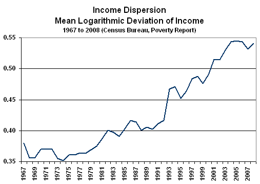
The gradual deterioration in inflation-adjusted wages and household income has resulted in a record level of the variance or dispersion in household income, as shown in the next Graph 7, and that has negative longer term economic implications. Variance in income is low when the distribution of income levels is heavily concentrated in the middle, and it is high when more of the income distribution is pushed into the extremes of high- and low-income levels, with a weaker middle-income range.
A person earning $100,000,000 per year is not going to buy that many more automobiles than someone earning $100,000 per year. The stronger the middle class is, generally the stronger will be consumption and the economy.
Historically, extremes in income variance have been followed by financial panics and economic depressions, which then tend to redistribute income towards the middle. Income variance today is higher than it was coming into 1929 and 1987, and it is nearly double that of any other “advanced” economy. At a peak in 2006, the measure dipped as systemic crises broke in 2007. Yet, U.S. income dispersion moved higher again in 2008, 2009 and 2010 (the most recent reporting) setting a new historic high.
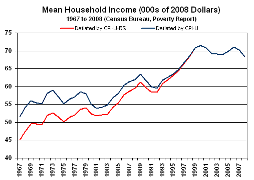
Graph 9: Annual Median Household Income (1967 Dollars)

Graph 10: Median Household Income Index (Monthly)
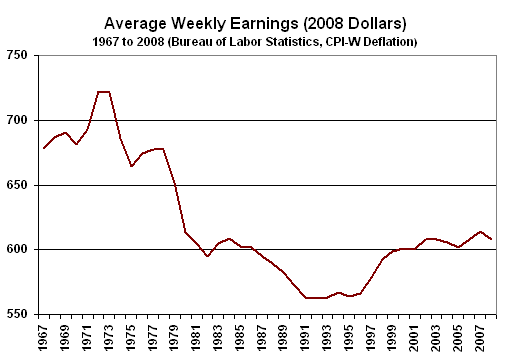
Graphs 8, 9 and 10 show officially-reported weakness in inflation-adjusted income. Graph 8 shows real average weekly earnings (production and supervisory workers), as reported and deflated by the Bureau of Labor Statistics (BLS) using the regular CPI-W. Real wages never recovered their pre-1973 recession peak. As wages dropped through the decades, the number of people in an average household that had to work—in order to make ends meet—increased. If the shown wages were deflated using the SGS-Alternate CPI Measure (discussed later in this section), the wage line would continue sloping downward, subsequent to 1996.
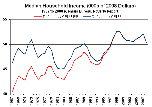
Graph 9 reflects median (the middle measure instead of average) U.S. household income over the years. The bottom dark-blue line shows income deflated by the regular CPI-U, a measure somewhat broader than the CPI-W used in the wage plot. Those inflation-adjusted numbers show that median household income never recovered its pre-2001 recession peak and stood below its level of 1969, as of 2010. Even deflated by the CPI-U-RS (current methods) used in Census Bureau reporting—discussed below—the pre-2001 recession peak also has not been recovered. The BLS uses the CPI-U or CPI-W for deflating its official income series; the Census Bureau has been playing games with the CPI-U-RS. I know no other use of the “RS” series in major economic reporting.
Graph 10 reflects a new series on median household income that shows a seasonally-adjusted monthly index deflated by the CPI-U. The income index plunged through 2008 into 2011. I expect further downturns will be seen here. There is nothing here to support the concept, let alone the possibility of an economic recovery.
The broad point on inflation-adjusted U.S. consumer income is that it is inadequate to sustain growing, inflation-adjusted economic activity. In the absence of income growth, debt expansion can act as a short-term prop for the economy, but that is not available at present. The system is in the throes of a solvency crisis, with banks having reduced lending to consumers. The consumer is in an unprecedented liquidity crisis, constrained by shrinking income and by limited credit.
In the last several decades, the BLS introduced a variety of new methodologies into the calculation of the CPI, with the effect of reducing the level of reported CPI inflation. The general approach was to move the CPI away from its traditional measuring of the cost of living of maintaining a constant standard of living. The introduction of hedonic adjustments also has eliminated the concept of the CPI reflecting actual out-of-pocket expenditures.
The lower the rate of inflation that is used in deflating a number, the stronger will be the resulting inflation-adjusted level or growth. The CPI-U-RS is the CPI with its history restated as if all the new methodologies had been in place from day one. The impact of the methodological changes in calculating inflation is evident in the two lines in Graph 9: Annual Median Household Income (1967 Dollars), with the upper, red CPI-U-RS line showing stronger relative growth.
By reverse-engineering the CPI-U-RS, current inflation reporting can be estimated as though it were free of the inflation-dampening methodologies. Such has been done with the SGS-Alternate Consumer Inflation Measure (based on 1980 methodologies). The SGS measure adjusts on an additive basis for the cumulative impact on the annual inflation rate of various methodological changes made by the BLS (the series is not recalculated). Over the decades, the BLS has altered the meaning of the CPI from being a measure of the cost of living needed to maintain a constant standard of living, to something that no longer reflects the constant-standard-of-living concept. Roughly five percentage points of the additive SGS adjustment reflect the BLS’s formal estimate of the annual impact of methodological changes; roughly two percentage points reflect changes by the BLS, where SGS has estimated the impact not otherwise published by the BLS.
As plotted in following graph, the gap between the SGS measure (blue line) and the CPI-U (thinner red line) effectively is the shortfall in official inflation reporting that otherwise would have offset declining standards of living. This is one reason why individuals who have their income tied to the CPI find it increasingly difficult to make ends meet (see Response to BLS Article on CPI Misperceptions for further details).

Regardless of the inflation measure, inflationary pressures surfaced from the Fed’s efforts at dollar debasement. A weakening U.S. dollar placed upside pressure on dollar-denominated oil prices and other dollar-denominated commodity prices, including food, which in turn began pushing annual inflation higher. This is not inflation generated by strong economic demand, but rather inflation driven by the Federal Reserve’s monetary efforts to weaken the dollar. While global supply problems or political concerns also have affected food and energy commodity prices, movements against the dollar seem to have been the primary moving force behind getting oil prices to their current elevated levels.


Shown in Graphs 12, 13 and 14 are powerful fundamentals that either drive U.S. inflation or reflect market expectations of the longer-term domestic inflation outlook. The currency, oil and gold markets have seen extreme volatility in the last couple of years, and they likely will continue to be volatile in the year ahead. Reflecting the inflationary pressures from a weaker dollar and higher oil prices, ongoing solvency issues for the United States, and continued dollar debasement efforts by the Federal Reserve—including the apparent recent loss of the U.S. dollar’s traditional safe-haven status, and a severe loss of global confidence in the dollar—the Swiss franc, gold and silver have hit historic or multi-decade (silver) highs in the last year, before the heavy selling and market manipulations in late-2011.
The income shortfalls experienced by many individuals and households—in terms of being able to maintain or to improve standards of living—often were met by consumer debt expansion. Such was encouraged by a Federal Reserve that recognized the U.S. economy would face stagnation or a slowdown without a surge in consumer credit.
Keep in mind that the Federal Reserve is not a government entity, but rather a private corporation owned by private banking interests. Irrespective of federal government mandates that the Fed pursue polices to maintain stable economic growth and to contain inflation, the Fed’s primary mission has been to protect the banking system, to keep that system solvent and profitable.
Explosive growth in the use of credit cards and the expansion of home equity loans as sources of consumer liquidity, fueled consumer liquidity, fueled consumer spending, gave consumers a false sense of financial security and helped banking-system profitability.
As housing activity began to fall off in 2006, and as the recession and the financial and bank solvency crises became apparent to authorities in 2007 and 2008, lending to consumers dried up by mid-2008. Impaired bank balance sheets limited banks’ lending abilities. Income problems, which had been masked by excessive consumer debt growth, suddenly were exacerbated by collapsing credit.
The following Graph 15 shows total consumer credit outstanding (excluding mortgages) since 2000. The recent downturn in consumer credit was the most severe of the post-World War II era, and followed the general pattern of the economic collapse in the ongoing downturn, with an ensuing period of bottom-bouncing.
The recent gains in consumer credit are deceiving. Since the near-term trough of the series in September 2010, the $54.1 billion increase in consumer credit outstanding as of November 2011 was more than accounted for by a $136.1 billion increase federal government student loans, not to lending that might fuel consumer spending. Otherwise, consumer credit and bank lending to consumers still are contracting on a month-to-month and annual basis.

Beyond having the income and/or credit, however, consumers also need the willingness to spend. There is something of a surrogate measure for this willingness in the Conference Board’s consumer confidence index (shown later in Graph 21: Consumer Confidence). December 2011’s reading was more than 50% below the levels seen in the halcyon days pre-2001 recession, when debt excesses were not viewed by most as a particular problem. At present, consumers have neither the physical ability nor the willingness to prop up the U.S. economy in the manner to which the Federal Reserve and the big-deficit spenders in Washington, D.C. have become accustomed.
Neither the federal government nor the Federal Reserve can address easily the fundamental structural problems tied to consumer liquidity. Stimulus efforts have been limited to one-time or otherwise short-lived efforts to provide temporary boosts to consumer disposable income. Until income growth gains sustainably relative to inflation, and/or credit is flowing freely enough to boost willing consumption, there is no chance for sustained economic growth or economic recovery in the United States.
Seasonal-Factor Warping. A note of caution is offered here as to the quality of current and recent economic reporting. The significance of month-to-month data has been heavily impaired by the extraordinary severity of the current economic downturn, both in terms of duration and depth. Most modern economic reporting was put in place after World War II, designed to handle generally positive growth in the broad economy, with occasional downturns in the business cycle.
Reporting of month-to-month and quarter-to-quarter data usually were based on seasonal adjustments, where repetitive patterns tied to holiday, school year, etc. activity were removed statistically from the numbers, theoretically leaving patterns due to just shifting economic activity. Seasonal adjustments were based on patterns of activity over a number of years, with the most-recent year receiving the heaviest weighting. In recent years, key series such as nonfarm payrolls and retail sales have been reported using “concurrent” seasonal-factor adjustments, where the adjustments are recalculated each month, using the latest month’s data.
When the seasonal factors are meaningful, they tend to remain stable over time, with little variation in the distribution of monthly patterns from the year-to-year or even month-to-month re-estimations. Extreme volatility of economic activity in the last several years has outweighed and distorted regular seasonal factor patterns. As result, annual and monthly recalculations of the seasonals have been showing highly unstable patterns, which, in turn, have thrown off the significance of reported monthly and quarterly changes, well beyond previously recognized reporting error confidence intervals.
Of particular concern with the “concurrent” adjustments made to payrolls and retail sales, for example, is that the monthly revisions from the unstable seasonal-factor recalculations have been significant. While those revisions affect data going back for years, the government only shows revisions to the last two months (with retail sales they also show the last two months from one year ago), freezing all the other data in place.
The problem in terms of analyzing these data is that reported monthly gains or losses often reflect no more than the unstable seasonal factors shifting activity patterns around during the year, not changes in economic activity. Those analyzing the numbers, though, cannot see what is happening. The historical data are inconsistent with the latest reporting, since the fully revised history simply is not published.
Loss of Survey Base Inflates Reported Activity / Distorts Rules of Thumb. In a deep and protracted downturn, companies go out business. If a company fails to report its payrolls, sales or orders, however, the government generally assumes that the company still is active and estimates what that company should be reporting.
Also, economic activity has sunk to such low levels, that regular measures of change followed closely by the financial markets—such as new claims for unemployment insurance—are not signaling economic recovery, as they turn less negative. Some analysts look at historical patterns and conclude that when new claims drop below a certain level that the economy is improving. In the current circumstance, layoffs have been so severe that the universe of potential further layoffs has been meaningfully reduced. Under such circumstances, rules of thumb may not work well.
Corporate Revenues and Profits. Unusually severe economic times also can affect reported corporate performance. The current downturn has not hit all sectors or all companies with equal vigor, and, as often is the case, downturn and recovery will vary sharply across the commercial spectrum. Nonetheless, company financials are always worth a close look.
Publicly held corporations usually enjoy the flexibility and creativity needed to show strong financial results even when the economy is down; or least they can help guide market expectations in terms of earnings, etc. Creative accounting—often involving throwing future losses into one-time charges for downsizing or such—usually is well accepted by investors, even when that cutting of productive assets has gone beyond the fat, through the muscle and into the bone. Asset valuations also may enjoy gimmicked accounting practices in difficult times.
Further, companies holding assets outside the U.S. dollar can boost their dollar-based picture, when the U.S. currency is under pressure. Also, against extremely weak prior-year profits or revenues, impressive year-to-year growth rates can help paint a happy picture for investors.
Already in Depression, Economy Continues to Bottom Bounce
Near-Term Economic Activity. As discussed in the regular SGS Commentaries, the U.S. economy remains in a structural recession/depression that is or is going to get a great deal worse. Due to the NBER calling a formal end to the 2007 recession, however, the ongoing difficulties here will be recognized as a double- or multiple-dip downturn. As will be discussed shortly, the contraction in business activity so far in the extreme downturn since 2006/2007 likely would qualify as a “depression” per SGS definitions (see Recession, Depression and Great Depression).
Shown in Graph 16, inflation-adjusted, year-to-year change in broad money supply (M3) generates a reliable signal in advance of recessions, or, in the case where a recession already is underway (as in the 1973 and 2007 recessions), a pending intensification of the downturn. The lead-time usually is six-to-nine months. Some recessions start without a money contraction, and upturns in money do not always lead economic upturns, but whenever real, broad systemic liquidity is in contraction, the economy always will follow. The downturn signal is generated when the inflation-adjusted annual money growth (which adjusted for the velocity of money is the theoretical equivalent of real GDP) first turns negative (see Inflation and Money Growth).
In the current circumstance, a downside signal was generated in December 2009. After protracted bottom-bouncing, the economy appears to have turned down anew around September/October 2010, as will be discussed in the next chapter. The year-to-year upturn in the series as of December 2011 is of no particular meaning; again, the reliable signal only is on the downside.
Traditional Year-to-Year View. The current downturn, as reported, already is the longest and the deepest business contraction since the first down-leg of the Great Depression in the early 1930s. Such is reflected in payroll employment and GDP growth plotted in the following graphs. The quarterly GDP numbers are available only back to 1947. If one counts the war-production shutdown at the end of World War II as a normal business cycle, then the current downturn is the deepest since then, but still the longest since the early 1930s. The respective depths of the Great Depression and post-war production contractions are based on annual data available back to 1929.
While the official peak-to-trough contraction in the downturn since fourth-quarter 2007 GDP now is 5.1% (second-quarter 2009 trough), most of the better economic series are showing or have shown contractions that are more consistent with a peak-to-trough GDP contraction in excess of 10% (depression range), as indicated by payroll employment, retail sales and industrial production, while others such as housing starts showing contractions of greater than 25% (great-depression range). These issues will be covered in the next chapter, along with evidence of even greater annual down turn in major economic series.


Chapter 5—Key Economic Reporting Varies by Inflation Assumptions
Economic Measures—It’s All in How Inflation is Measured. The following ten graphs are divided between those economic series that reflect no inflation adjustments (Graphs 20 to 23), and those that are dependent on underlying inflation assumptions (Graphs 24 to 29). The difference is that series free of inflation adjustment show that the economy turned down in 2006 or 2007, plunged into 2008 or 2009 and has not recovered meaningfully, showing something close to bottom-bouncing ever since. The series adjusted for inflation plunge into 2009, but then recover or show some reasonable upside gains.
I contend that the latter case is due to the use of understated inflation rates when the series are deflated, which results in overstatement of the reported, inflation-adjusted growth. Corrected for more reasonable rates of inflation, these series in the second grouping of GDP, real (inflation-adjusted) retail sales and industrial production start to look like those in the first grouping, payroll employment, consumer confidence and housing starts.
The Economy Has Yet to Recover. Is the U.S. economy booming anew, or is it still bottom-bouncing in a deep contraction that now exceeds in duration the first-leg of the Great Depression? The differences in published data that support one or the other extreme circumstance are tied to how the government handles inflation estimates, with the more-troubled economy the likely reality.
In line with common experience, I contend that the U.S. economy has been in trouble since at least 2000, when it entered a recession that dragged into 2003. Business activity then began collapsing in 2006, hit a bottom in 2009 and has been bottom-bouncing since. The outlook for the U.S. economy remains bleak, with continued and deteriorating bottom-bouncing ahead. I figure there have been 60 months of recession so far, in the current downturn, which tops the 43 months officially estimated for the first down-leg of the Great Depression.
The happier, official version of U.S. business activity is that the economy went through a shallow recession between March 2001 and November 2001, with a much deeper downturn beginning in December 2007 and ending in June 2009. Since then, U.S. economic activity has recovered fully and now exceeds pre-2007 recession levels.
Where some widely followed economic series such as real retail sales and industrial production show increasing activity, only GDP reporting shows a full recovery. Those series also all are adjusted by inflation with gimmicked underlying assumptions. Other series such as payrolls, household income, consumer confidence and housing starts support the more dire circumstance. Those series, except for household income, are not subject to inflation adjustments. The implication for household income, which is deflated by the CPI-U, is that the decline is even more severe than suggested by the official numbers (see Graph 10: Median Household Income Index (Monthly)).
Plots of these indicators are shown and discussed, and, where appropriate, viewed with different inflation assumptions. All the graphs plot monthly or quarterly levels of activity, indexed to January 2001 or first-quarter 2001 equal to 100. Exceptions to the indexing are real retail sales and industrial production—before inflation correction—and housing starts, which are displayed as otherwise published in the regular Commentaries. Where used, the shaded areas represent officially pronounced periods of recession.
Payroll Employment. Consider Graph 20 of payroll employment. Where employment traditionally has been considered a coincident indicator of economic activity, payroll levels suggest the 2001 recession ended in 2003, not 2001, and that the 2007 recession still is not over; at least there has been no meaningful rebound in economic activity. The payroll level in December 2011 remained below payroll levels not only pre-2007 recession, but also pre-2001 recession.
Consumer Confidence. Graph 21 of consumer confidence reflects the 2001 recession crashing into 2003, with no full recovery. The downturn begins before the end of 2007, and basically has been bottom-bouncing near historic lows in the post-plunge period.
Housing Starts. Graphs 22 and 23 show plunging activity starting in 2006 and running into 2009, with bottom-bouncing in the post-plunge era
GDP and Inflation. Graphs 24 and 25 are based on GDP reporting. The Graph 24 reflects official levels of real (inflation-adjusted) GDP activity (indexed to first-quarter 2000 equals 100). It shows no clear 2001 recession, with growth generally in an uptrend until the official December 2007 to June 2009 recession, and with third-quarter 2011 business activity fully recovered from the recession.
A significant issue with official GDP reporting is the nature of the inflation rate used to deflate the series. The lower the inflation rate used in the GDP’s implicit price deflator (IPD), the stronger will be the inflation-adjusted level and growth reported for the real GDP. Back in the 1980s, the Bureau of Economic Analysis (BEA) introduced the concept of hedonic adjustments in determining the IPD. Hedonic adjustments altered (usually reduced) inflation estimates, based on nebulous quality concepts that had no relationship to real-world common experience. The effect was to reduce the IPD inflation artificially. Other major countries initially avoided the concept in their GDP calculations, with a number of papers discussing how the U.S. hedonic methodologies gave an artificial boost to reported U.S. economic performance, productivity, etc. relative to the rest of the world. I estimate the hedonics currently reduce the annual IPD by about two percentage points.
There is no easy way to reconcile the official GDP activity with payroll employment activity, without considering the inflation issue, and the explanation is not in sudden, miraculous gains in productivity, which simply is a residual of poor-quality numbers. The payroll employment numbers are surveyed and eventually benchmarked. Despite all the issues I have with the employment series, the numbers eventually become fairly solid. In contrast, the GDP estimates are heavily guessed at and modeled, including the IPD.
Backing-out the two-percentage point IPD understatement generates the “Inflation-Corrected Real GDP” in Graph 25 graph, which is more consistent with the payroll numbers than is the “Headline GDP.” With corrected inflation, the GDP shows the 2001 recession beginning in 2000 and extending into 2003. The 2007 recession begins in 2006, hits a bottom in 2009 and the bottom-bounces thereafter. A small upside bounce is turning down again.
I am attempting to make a simple point here as to how differing assumptions on inflation can throw off official reporting, meaningfully. The inflation-corrected number in the graph is not the same measure as the SGS-Alternate GDP Measure, which also adjusts for hedonics. There are a number of other factors involved in that measure, which complicate the discussion but show an even more-negative “corrected” GDP (see the Alternate Data and Primer tabs on www.shadowstats.com for more detail).
Retail Sales. Graph 26 shows the official real retail sales series. As with official real GDP reporting, reporting of real retail sales (deflated with the CPI-U by the St. Louis Federal Reserve) uses understated inflation, with the result of overstated levels of real growth and activity. Instead of the CPI-U, I have used the SGS-Alternate Consumer Inflation Measure (1990) to deflate the nominal retail sales number, adding about three percentage points back into annual inflation on the recent CPI-U. As was discussed earlier, the Bureau of Labor Statistics (BLS) has changed methodologies in recent decades so that the CPI no longer reflects the cost of living for maintaining a constant standard of living, and it no longer reflects what most people consider full out-of-pocket expenses, as a result of using hedonic adjustments.
The inflation-corrected real retail sales in Graph 27 shows a 2000 to 2003 recession, a plateau of activity into the next downturn, which begins in 2006, a trough in 2009 and bottom-bouncing thereafter. As a result of the new deflation of retail sales, the series more closely reflects that patterns seen in consumer confidence and household income, particularly in terms of the 2003 to 2006 plateau in activity.
Industrial Production. Graph 28 shows the official industrial production series. The production index includes components, such as computers, where the volume is calculated from dollar amounts that are deflated by hedonically-dominated inflation estimates. Adjusted for a 0.6% inflation differential, the inflation-corrected industrial production in Graph 29 shows the 2011 recession, a period of stagnation, a downturn beginning about mid-2007, plunging into mid 2009, with a slow uptrend to date, nothing close to a recovery.
There is no question that the government has taken actions in recent decades to depress inflation reporting artificially. As a result, inflation-adjusted economic growth has been overstated, and that helps to account for the discrepancies seen between GDP estimates and employment patterns. Accordingly, the employment estimates are closer to common experience.
The estimated inflation-corrected series indeed are estimates, approximations, but they show that the general softer economic growth patterns are in place irrespective of the precise level of inflation understatement by the government. I believe the estimates used here to be reasonably conservative.

Graph 21: Consumer Confidence

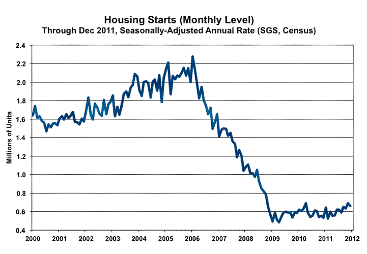


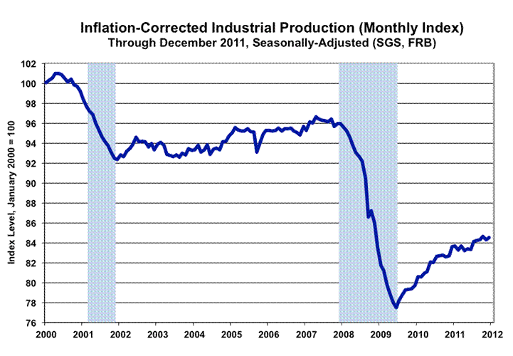
Chapter 6—Historical U.S. Inflation and U.S. Dollar Debasement
Fire and Ice
Some say the world will end in fire,
Some say in ice.
From what I’ve tasted of desire
I hold with those who favor fire.
But if it had to perish twice,
I think I know enough of hate
To say that for destruction ice
Is also great
And would suffice.
– Robert Frost
Updated text in this chapter includes year-end 2011 inflation data, an expanded “Loss of Purchasing Power Table,” and expanded comments on the inflation/deflation issues.
As to the fate of the developing U.S. great depression, it will encompass the fire of a hyperinflation, instead of the ice of deflation seen in the major U.S. depressions prior to World War II. What promises hyperinflation this time is the lack of monetary discipline formerly imposed on the system by the gold standard; a fiscally bankrupt federal government; and a Federal Reserve dedicated to debasing the U.S. dollar and to preventing a banking system collapse at all costs.
Both the federal government and the Federal Reserve demonstrated in 2008 and in the months and years following that they will not tolerate a systemic collapse and a great deflation, as seen during the Great Depression. As more fully discussed in Chapter 7—Federal Reserve, Systemic Solvency and Inflation versus Deflation, those risks are being fought, and will be fought, at any cost that can be covered by the unlimited creation of new money, including whatever spending, lending or guarantees are needed. It was a devil’s choice, but the choice has been made. Extreme systemic interventions, and formal measures to debase the U.S. dollar through the effective unlimited creation of money to cover systemic needs and the government’s obligations, pushed the timing of a systemic collapse—threatened in September 2008—several years into the future. The cost of instant, as well as ongoing, systemic salvation, though, is inflation.
Current efforts at systemic salvation eventually will pummel the U.S. dollar against other currencies and likely will evolve into the proximal trigger for hyperinflation. Systemic collapse is unavoidable at this point, but it will be in a hyperinflationary great depression, instead of a deflationary one. A direct result of Fed and U.S. government efforts to delay systemic collapse, as long as possible, the hyperinflation will have been born beyond the reach of official containment, the child of last-ditch efforts to salvage a system that had been methodically pushed to long-range insolvency by decades of federal political malfeasance.
Putting the current environment in historical perspective, the following two graphs measure the level of consumer prices since 1665 in the American Colonies and later the United States. The first, Graph 30, shows what appears to be a fairly stable level of prices up to the founding of the Federal Reserve in 1913 (began activity in 1914) and to Franklin Roosevelt’s abandoning of the gold standard in 1933. Then, inflation takes off in a manner not seen in the prior 250 years, and at an exponential rate when viewed using the SGS-Alternate Measure of Consumer Prices in the last several decades. The price levels shown prior to 1913 were constructed by Robert Sahr of Oregon State University. Price levels since 1913 either are Bureau of Labor Statistics (BLS) or SGS-based, as indicated.

The magnitude of the increase in price levels in the last 50 years or so, however, visually masks the inflation volatility of the earlier years. That early volatility becomes evident in the next graph, where the CPI history is plotted using a logarithmic scale. Seeing such detail is a particular benefit of using such a plot, although the full scope of what is happening may be lost to those not used to thinking log-based. The pattern of the rising CPI level, however, still looks rather frightening even in the modified form. Nonetheless, since inflation ideally is something that is flat over time—not compounding like the population and related series that grow with it—I do not have any issue with using a non-log scale for the visual impact of what is happening.
Persistent year-to-year inflation (and the related compounding effect) did not take hold until post-Franklin D. Roosevelt. Additionally, the CPI level reflects purchasing power lost over time for those holding dollars, which is cumulative, and which has reached extremes (as will be discussed shortly) due to the late-era compounding effect. If my assessment is correct on where this is headed, the log-based graph shortly will look like the arithmetic-based graph, as was seen the latter months of the Weimar circumstance and as shown in the Weimar Republic section.
Indicated by the visible detail in the second graph, Graph 31, are the regular periods of inflation—usually seen around wars—offset by periods of deflation, up through the Great Depression. Particular inflation spikes can be seen at the time of the American Revolution, the War of 1812, the Civil War, World War I and World War II (which lacked an ensuing, offsetting deflation). As a result, consumer prices at the time of the Fed’s founding in 1913 were about the same as they had been in New Amsterdam (today’s New York City) in 1665.

The inflation peaks and the ensuing post-war depressions and deflationary periods, tied to the War of 1812, the Civil War and World War I, show close to 60-year cycles, which is part of the reason some economists and analysts have been expecting a deflationary depression in the current period. There is some reason behind 30- and 60-year financial and business cycles, as the average difference in generations in the United States is 30 years, going back to the 1600s. Accordingly, it seems to take two generations to forget and repeat the mistakes of one’s grandparents. Similar reasoning accounts for other cycles that tend to run in multiples of 30 years.
Allowing for minor, average-annual price-level declines in 1949, 1955 and 2009, the United States has not seen a major deflationary period in consumer prices since before World War II. The reason for this is the same as to why there has not been a formal depression since before World War II: the abandonment of the gold standard and recognition by the Federal Reserve of the impact of monetary policy—free of gold-standard system restraints—on the economy.
The gold standard was a system that automatically imposed and maintained monetary discipline. Excesses in one period would be followed by a flight of gold from the system and a resulting contraction in the money supply, economic activity and prices.
Faced with the Great Depression, and unable to stimulate the economy, partially due to the monetary discipline imposed by the gold standard, Franklin Roosevelt used those issues as an excuse to abandon gold and to adopt close to a fully-fiat currency under the auspices of what I call the debt standard, where the government effectively could print and spend whatever money it wanted to create.
Roosevelt’s actions were against the backdrop of the banking system being in a state of collapse. The Fed stood by twiddling its thumbs as banks failed and the money supply imploded. A depression collapsed into the Great Depression, with intensified price deflation. Importantly, a sharp decline in broad money supply is a prerequisite to significant goods and services price deflation. Messrs Greenspan and Bernanke are students of the Great Depression period. As did Mr. Greenspan before him, "Helicopter Ben" has vowed not to allow a repeat of the 1930s money supply collapse and a resulting severe deflation.
Where the Franklin Roosevelt Administration abandoned the gold standard and its financial discipline for the debt standard, twelve successive administrations have pushed the debt standard to the limits of its viability, as seen now in the continuing threat of systemic collapse. At present, it is the Obama Administration that has to look at abandoning the debt standard (hyperinflation) and starting fresh. Yet, the Administration and many in Congress have taken recent actions showing the lack of political will to address the nation’s long-range insolvency, hoping to push off the day of reckoning for the economic and systemic solvency crises until after the 2012 presidential election. They likely do not have that much time.
The effect of the post-Roosevelt policies has been a slow-motion destruction of the U.S. dollar’s purchasing power, per the accompanying table, since the gold standard was abandoned in 1933. With the dollar’s purchasing power down by 95.6% (based on the CPI) and by 98.4% (based on the SGS-Alternate) since 1933, equivalent or greater purchasing power loss was seen against the precious metals, down by 98.8% versus gold, and down 98.6% versus silver. That means that money invested in the precious metals, since 1933 (in 1933 it became illegal to own gold privately in the United States, but it became legal again in the early 1970s after Nixon closed the gold window; holding silver was legal throughout the full period), more than preserved the purchasing power against the losses from CPI inflation, and fully preserved the purchasing power against the losses from SGS inflation.
|
Loss of U.S. Dollar Purchasing Power
|
|
|
Through December 2011
|
|
|
|
Since January of
|
|
Versus
|
1914
|
1933
|
1970
|
2002
|
|
Swiss Franc
|
-81.7%
|
-81.7%
|
-77.7%
|
-44.1%
|
|
CPI-U
|
-95.6%
|
-94.3%
|
-83.3%
|
-21.5%
|
|
Silver*
|
-98.5%
|
-98.6%
|
-94.6%
|
-85.2%
|
|
Gold
|
-98.8%
|
-98.8%
|
-96.1%
|
-83.0%
|
|
SGS-Alternate CPI
|
-98.8%
|
-98.4%
|
-95.3%
|
-59.4%
|
|
*December 2011 measured versus annual averages for 1914, 1933 and 1970.
|
|
Please note in the above table that gold and the Swiss franc were held constant by the gold standard versus coins in 1914 and 1933. The data are from the Federal Reserve Board, the Bureau of Labor Statistics, Kitco and from SGS data and calculations. The magnitude of the loss in the U.S. dollar’s purchasing in the span of almost one century could be repeated in the span of less than 12 months starting in the next year or so. Again, fiscal and monetary malfeasance by the federal government and the Federal Reserve are to blame.
The table showing the loss of purchasing power of the U.S. dollar against various inflation measures and assets has been expanded to include silver in the assets, as well as to include January 2002 as a base, showing the loss of purchasing power in just the last ten years. With most of the CPI reporting gimmicks in place by 2001, the differential between the CPI and SGS is close to maximum.
Chapter 7—Federal Reserve, Systemic Solvency and Inflation versus Deflation
In an ongoing effort to prevent a collapse of the banking and financial system, Federal Reserve Chairman Ben Bernanke has taken extreme efforts to liquefy the system. The pending systemic collapse in September 2008 was real, and that forced the Fed and the U.S. government to act to save the domestic financial system at any cost. Whatever was needed to back-up or bailout the system in terms of lending, spending and financial guarantees was supported by the Fed’s ability to create any amount of money that was needed. The actions of the time brought short-lived stability to the system, but they did nothing fundamentally to remedy the systemic-solvency issues.
The housing industry had begun to collapse in 2006, which pulled the broad economy into recession and helped to create a crisis with mortgage backed securities. The ensuing financial crisis and related panics exacerbated the economic downturn but did not start the recession. None of the actions taken by the Fed and/or the federal government have had significant impact on the worst economic downturn since the Great Depression. As discussed in Chapter 4—Current Economic and Inflation Conditions in the United States and in Chapter 5—Key Economic Reporting Varies by Inflation Assumptions, a severe structural downturn collapsed the broad economy from late-2007 into 2009, and the economy basically has not recovered, bottom-bouncing for the two-to-three years since with no recovery in sight.
There is nothing the Fed can do to have meaningful positive impact on the economy. There is nothing the Fed can do to make the U.S. banking system healthy. What Mr. Bernanke has done has been little more than trying to delay a day-of-reckoning for the banks and the financial system. Keeping the banking system sound is the Fed’s primary responsibility; fostering sustainable economic growth and contained inflation are secondary considerations. The quantitative easings were an effort to provide the banking system with adequate liquidity, but the related actions were sold to the public and the media as an effort to boost economic activity. Future Fed “stimulus” actions should be of a similar nature.
By preventing systemic collapse at all costs, the Fed is preventing a 1930s-style deflation. As banks failed in the 1930s and depositors lost their funds, the money supply collapsed, as did consumer prices in the Great Depression. In the current circumstance, so long as the bank failures are controlled and those with money in the system are made whole, that type of money supply collapse is not in the works. The debt collapse of the current crisis did not collapse the money supply. Instead, it impaired banks’ balance sheets, restricting lending ability. That, in turn, slowed broad money supply growth—even fostered a period of minor contraction in money growth—but it did not created a significant deflationary environment for consumer prices, as was seen in the 1930s.
Despite the Fed’s extreme efforts at liquefying the system in the last four or five years, growth in broad liquidity (i.e., money supply M3) generally has been inadequate to support normal economic activity, although there currently are tentative signs of some pick-up in M3. Where the Fed’s “easing” actions have generated temporary, apparent systemic stability, ongoing efforts—or jawboning of same—for still further systemic liquefaction, suggest that the systemic-solvency crisis is far from over.
Nonetheless, formal efforts by the Federal Reserve in the last couple of years to debase the U.S. dollar have met with early “success” in exacerbating selling pressures on the U.S. dollar, and in boosting oil and gasoline prices as part of the plan to increase the pace of consumer inflation. The misguided inflation results do not reflect increased economic activity, only rising commodity prices from monetary policies aimed at debasing the dollar. The event of the Fed actually pushing these policies into full force would be an indication of panic on the part of the U.S. central bank and likely a measure of how close Mr. Bernanke believes the United States is to a systemic collapse.
Indeed, threats to the system remain in place, including global systemic-solvency issues tied to the euro area. With significant time to prepare for threats to the U.S. banking or financial system from the euro-area crises, the Fed (and presumably the U.S. Treasury) again can be counted on to create whatever money, or to take whatever short-term action is needed to forestall systemic collapse in the United States. The next round of easing or emergency actions, however, also runs a high risk of being the proximal trigger of a collapse in the value of the highly-vulnerable U.S. dollar in the global markets, and of the onset of a domestic hyperinflation.
Federal Reserve Chairman Ben Bernanke picked up his various helicopter nicknames and references as the result of a November 21, 2002 speech he gave as a Fed Governor to the National Economists Club entitled Deflation: Making Sure ‘It’ Doesn’t Happen Here. The phrase that the now-Fed Chairman Bernanke likely wishes he had not used was a reference to “Milton Friedman’s famous ‘helicopter drop’ of money.”
Attempting to counter concerns of another Great Depression-style deflation, Bernanke explained in his remarks: “I am confident that the Fed would take whatever means necessary to prevent significant deflation in the United States …”
As expounded upon by Bernanke, “Indeed, under a fiat (that is, paper) money system, a government (in practice, the central bank in cooperation with other agencies) should always be able to generate increased nominal spending and inflation, even when the short-term nominal interest rate is at zero.”
“Like gold, U.S. dollars have value only to the extent that they are strictly limited in supply. But the U.S. government has a technology, called a printing press (or, today, its electronic equivalent), that allows it to produce as many U.S. dollars as it wishes at essentially no cost. By increasing the number of U.S. dollars in circulation, or even by credibly threatening to do so, the U.S. government can also reduce the value of a dollar in terms of goods and services, which is equivalent to raising the prices in dollars of those goods and services. We conclude that, under a paper-money system, a determined government can always generate higher spending and hence positive inflation.”
The full text of then-Fed Governor Bernanke’s remarks can be found at: http://federalreserve.gov/boarddocs/speeches/2002/20021121/default.htm.
Faced with extreme risk of systemic collapse in the wake of the Lehman failure, Bernanke launched his first round of anti-deflation actions back in 2008, but they did not work fully as advertised. While the systemic solvency crisis had been contained at least temporarily in key areas, and depositor funds did not suffer heavy losses, the broad money supply began to decline month-to-month in June of 2009 and turned down year-to-year in December 2009. The deepest annual decline in the SGS-Ongoing M3 Measure in the crisis has been 6.1% in June 2010. Although that was the worst annual decline in broad money growth since the Great Depression, as discussed earlier, that was not significant enough to generate a 1930s-style great deflation. In contrast, the great deflation reflected roughly a one-third contraction in money supply from bank failures and loss of depositor money. Year-to-year change in M3 turned to the plus-side in April 2011. As of December 2011, annual growth was at 3.2% and beginning to accelerate to the upside.
Back in September 2008, the Fed started dropping cash from helicopters, as shown in the graphs of the monetary base. The process was repeated with the introduction of QE2 in November 2010, with the Fed monetizing Treasury debt (see the graphic in Chapter 1—Overview and Executive Summary).
As shown in the two graphs of level and year-to-year change (Graphs 32 and 33), Bernanke’s spiking of the monetary base has been extraordinary and without precedent. The Fed’s renewed panic with QE2 provided a second spike in the monetary base. Again, though, despite the active fleet of choppers, systemic liquidity and solvency remain in deep trouble.
The monetary base remains the Federal Reserve’s primary tool for impacting money supply growth. As has been the case for the bulk of the extraordinary expansion of the monetary base since late-August 2008—an increase of 204%—the monetary base growth has not been reflected meaningfully in money supply growth, unless it has been holding off an even greater money contraction.


Fundamentally, banks are placing high levels of excess reserves with the Fed, instead of lending the funds into the normal flow of commerce. As a result, bank lending is down, and small businesses and consumers are experiencing a horrific liquidity squeeze. This pattern continues despite the Fed’s QE2 buying of Treasury securities.
The monetary base is not part of the money supply. It consists of currency (which is in M1 money supply) plus bank reserves. If the banks were lending normally, M1 and the broader measures would be growing. The ratio of M1 to the monetary base, the monetary base multiplier simply is not a meaningful measure under this circumstance.
As discussed earlier and as shown in Graphs 34 and 35, year-to-year change in the SGS-Ongoing M3 Measure (the Fed abandoned reporting its broadest money supply measure, M3, back in March 2006) went through a period of contraction from December 2009 through April 2011, with annual growth showing tentative signs of acceleration as of December 2011.
Recent high growth seen in M1 and M2 (M3 includes M2, which includes M1) reflected nothing more than funds shifting from M3 accounts such as institutional money funds and large time deposits into “safer” M1 and M2 accounts.
Inflation-adjusted annual M3 growth also turned negative year-to-year in December 2009, a leading indicator to an economic downturn in normal times, and a signal of deteriorating conditions in an existing economic contraction, discussed in Already in Depression, Economy Continues to Bottom Bounce.

Graph 35: Year-to-Year U.S. Money Supply Growth with SGS M3 Continuation
Banks Not Increasing Lending into the Regular Flow of Commerce
As discussed previously in Structural Consumer Liquidity Problems, consumer credit outstanding has been in historic contraction, with recently reported growth in the series due solely to federal lending on student loans, not to traditional bank lending to consumers. The lack of growth in bank lending to consumers has intensified liquidity constraints there, and has exacerbated the structural problems with inflation-adjusted household income.
The following two graphs show the historical levels of commercial and industrial (C&I) loans by commercial banks and commercial paper outstanding. The first, Graph 36, shows the history of C&I lending since 2000. While the downturn in lending in the current economic cycle has been the deepest of the post-World War II era, the upturn in the last year has been offset largely by reduced bank lending in other areas, and in reduced levels of commercial paper outstanding (see Graph 37).
As of December 2011, C&I loans were higher by 10.2% year-to-year, but total loans and leases in bank lending by commercial banks was up by just 2.1%, with C&I gains offset by consumer lending (non-mortgage) down by 1.9%, and by real estate lending down by 3.6%. On the residential lending front, revolving home equity loans were down by 33.8% for the year, closed-end residential lending was down by 0.8%, and commercial real estate lending was down by 5.7%


Graph 37 of commercial paper outstanding includes both financial and nonfinancial firms, with both sub series currently in decline.
Per the Federal Reserve’s third-quarter 2011 flow-of-funds accounting, total U.S. credit market debt outstanding stood at $53.8 trillion, up by 1.7% from third-quarter 2010. The annual increase, however, was more than accounted for by the 12.3% growth in U.S. government debt. The balance of the system saw an outright annual contraction of 0.5% in total credit.
Unlike the initial stages of quantitative easing that focused on the Fed buying up troubled mortgage-backed securities, the QE2 round of buying Treasuries—effectively monetizing fully net Treasury issuance—should have had some positive effect on the money supply. Funds paid out by the Treasury usually end up in private checking accounts, which are part of the money supply, and M3 recently has begun to show some upside momentum. Banks need to increase lending, though, in order for the money supply to pick up its full and excessive potential.
Some banks are not lending, because they claim there is a lack of credit-worthy borrowers. Anecdotal evidence and still-soft money supply growth suggest that the biggest issue remains still-impaired bank balance sheets. The systemic-solvency crisis has constrained many banks’ ability to increase lending.
Inflation and Money Growth
The Fed’s efforts at currency debasement were reflected in a weakening of the U.S. dollar’s value in foreign exchange markets. In theory, though, slowing or outright contraction in broad money supply growth should be reflected in slower inflation or outright deflation. As with most economic theories, however, there often are simplifying assumptions that may not be appropriate under certain circumstances, and there often are unusual circumstances. Money supply, for example, works best as a predictor of inflation in a closed system, as was seen with Zimbabwe. Also, perversely, contracting money supply can spur inflation when the economy is declining faster than the money supply.
Money Supply outside the United States. Unlike Zimbabwe, the United States has a significant amount of dollars (currency and near-cash) held outside the country, where shifting dynamics may have significant impact on U.S. inflation. To the extent that aggregate foreign holdings of U.S. dollars are static, with demand and supply in balance, then the circumstances of the simplified money supply model tend to work. The dollar’s global position, though, is not in balance, particularly with the Fed generally working to debase the U.S. currency and to create inflation.
One distortion up front is in the U.S. currency in circulation, as reported in the narrowest money supply measure, M1. More than half of the $1.0 trillion reflected in recent M1 (and monetary base) reporting is physically outside the United States in “dollarized” countries and elsewhere.
Separately, as reported by the Fed in its third-quarter 2011 flow-of-funds analysis, foreign holders of U.S. assets have something in excess of $12 trillion in liquid, dollar-denominated assets that could be dumped at will into the global and U.S. markets. In perspective, U.S. M3 is somewhat above $14 trillion.
As excess dollars get dumped into the global markets, a shift in the tide against the U.S. dollar gets reflected in a weakening exchange rate, which in turn spikes dollar-denominated commodity prices, such as oil. Increasingly, that effect has been in response to intensifying dollar-debasement efforts by the Fed. The result is that U.S. consumer inflation has been increasing during the last year, once again, not from strong economic demand and a surging domestic money supply, but from distended monetary policies and a global glut of dollars that has been encouraged by the U.S. central bank.
Demand and supply affect the U.S. dollar. Supply soars and demand shrinks with the increasing unwillingness of major dollar holders to continue holding the existing volume of U.S. currency and dollar-denominated assets, let alone to absorb new exposure.
Therein lies a significant threat to near-term U.S. inflation. Heavy dumping of the U.S. dollar and dollar-denominated assets would be highly inflationary to U.S. consumer prices. It also likely would activate heavy Fed intervention in buying unwanted U.S. Treasuries. When the Fed moves to buy Treasuries as the lender of last resort—to monetize U.S. debt still well beyond anything seen to date—that also would tend to trigger renewed growth in the otherwise flagging broad money growth.
In order to get the broad money supply to grow, the federal government has to spend and borrow more money, where the Fed will have to buy large quantities of the Treasury’s securities, monetizing the federal debt. The liquidity action pre-QE2 was primarily in buying otherwise illiquid mortgage-backed securities off the balance sheets of troubled banks. The domestic banks in turn have leant substantial excess reserves back to the Fed, rather than lending into the normal stream of commerce, which would spike the money supply and otherwise be something of an economic positive.
The Fed remains the U.S. Treasury’s lender of last resort. Panicked dollar selling and dumping of dollar-denominated paper assets—particularly U.S. Treasuries—likely would force the Fed’s hand in an increasingly rapid monetizing of Treasury debt.
Economy Growing Slower or Shrinking Faster Than Money Supply? As noted in the Money Supply Special Report, inflation discussed in the financial markets, financial media and SGS Commentaries, usually centers on price changes in goods and services as traditionally measured by the CPI survey. Such, however, is not the same measure of price changes as encompassed in general monetary theory (it also is far removed from being a measure of asset inflation or deflation), where the relationship between money supply and inflation commonly is expressed as:
M x V = P x Q
In the preceding equation, M is the money supply. V is the velocity of money, as measured by the number of times the money supply turns over in a year, relative to the economy as reflected in nominal (not-adjusted for inflation) gross national product (GNP), where V = GNP/M. GNP is the broadest measure of U.S. economic activity and encompasses the more popularly reported gross domestic product (GDP).
In turn, nominal GNP = P x Q, where P is some measure of GNP deflator (prices/inflation) and Q represents some measure of physical quantity/volume, or a real (inflation-adjusted) GNP, as a measure of economic output.
So, the P, or inflation measure here, effectively is the GNP deflator. The change in P is a broader inflation measure than the consumers’ CPI, since it also covers costs of consumption for businesses, government and net exports, in addition to the costs of consumer spending on goods and services. In terms of the other variables, the price equation is:
P = (M x V) / Q,
where price level (P) equals money supply times velocity (M x V), divided by real GNP (Q). Typically, increases in the combination of money supply and velocity, relative to Q (real GNP) result in higher prices. A drop in Q (real GNP), as seen in recessions, also would be inflationary, in theory, if money supply times velocity increased or otherwise did not drop as quickly as real GNP.
The latter case may be happening. Although none of the equation components can be measured accurately, the theoretical relationships can be useful. As discussed in Chapter 5—Key Economic Reporting Varies by Inflation Assumptions, based on key underlying economic series, the inflation-adjusted broad economy does appear to be declining faster than has been suggested by official GDP reporting. If the pace of decline in the economy is faster (or weak growth slower) than the pace of decline (or weak growth) in the money supply times velocity, then that circumstance is inflationary, even with the declining or low money growth.
Nonetheless, I expect that money supply growth and velocity will pick up at excessive rates with the hyperinflation.
Consider, too, the following variation on the monetary equation:
Q = (M/P) x V
Activity, the inflation-adjusted economy (Q), is the same thing as inflation-adjusted money supply (M/P) times velocity (V). Such is the theoretical basis as to why a decline in year-to-year inflation-adjusted M3 signals an economic downturn, as graphed at the beginning of Already in Depression, Economy Continues to Bottom Bounce.
Money Growth and Velocity Will Increase. The U.S. hyperinflation very much will reflect a complete loss of confidence in the U.S. dollar. The Fed has primed the system for explosive money supply growth; all that is needed is a pickup in bank lending.
The Fed’s initial moves to debase the U.S. dollar worked, impairing the U.S. currency’s exchange rate value and triggering commodity inflation fueled by the weak-dollar policy. This also has helped to set the stage for a global dumping of the dollar and dollar-denominated paper assets, a rapid influx of unwanted dollars from abroad that either would collapse the financial markets or would force the Fed to flood the system with the incoming liquidity, monetizing dumped U.S. Treasury securities among other assets.
As dollar selling intensifies anew and debased-dollar inflation mounts, people in the United States are going to need higher earnings to buy necessities such as gasoline and food. Even with a weak economy and high unemployment, wages will increase. Companies paying higher costs for labor and goods increasingly will raise their prices, and their borrowing needs will increase. Holders of dollars increasingly will not want to hold them long, in turn, raising the velocity of money, and so the cycle of inflation will begin to accelerate, all with still-impaired economic activity.
Chapter 8—U.S. Government Cannot Cover Existing Obligations
The continuing $5 trillion GAAP-based federal deficit remains unsustainable, uncontainable and is unstable. Against a headline, official quasi-cash-basis and gimmicked reporting of a $1.3 trillion federal budget deficit in 2011, GAAP-based accounting (using generally accepted accounting principles) indicated that the actual 2011 deficit ran somewhat in excess of $5 trillion for the year. The largest difference between these estimates was that the GAAP-based number includes the widening shortfall of unfunded liabilities for social insurance programs, such as Social Security and Medicare.
As shown in the accompanying table of “U.S. Government – Alternative Fiscal Deficit and Debt Numbers” (SGS Table), the various 2011 deficit estimates remained close to the same horrendous levels as estimated for 2010. Based on the 2011 Financial Report of the United States Government the 2011 cash-based federal deficit at $1.299 trillion was little changed against the $1.294 trillion estimate for 2010. The limited GAAP-based deficit (before consideration of changes in social insurance unfunded liabilities), narrowed to $1.313 trillion in 2011, from $2.080 trillion in 2010, but that was due almost entirely to one-time reporting/assumption changes in Veterans Benefits and U.S. government liabilities tied to Fannie Mae and Freddie Mac. Accordingly, the operating deficits effectively were about the same level in both 2010 and 2011.
In like manner, the indicated full GAAP-based deficits (including annual change in the net present value of social insurance programs) of $4.6 trillion in 2011 and $5.3 trillion in 2010, effectively were about $5 trillion in each of 2011 and 2010, adjusted for one-time reporting changes.
The numbers discussed in the text here are those from the GAO-Based Alternative version of the 2011 numbers as shown in the SGS Table. Unfortunately, the government’s financial reporting has become nearly as heavily politicized as some of its economic reporting. Unlike the economic numbers, though, the financial data are audited (where possible) by the GAO (Government Accountability Office, formerly the General Accounting Office).
In the 2010 statement, consistent year-to-year accounting was not shown, with a large, one-time reduction in reported Medicare liabilities being based on overly optimistic assumptions of the impact from the then recently enacted healthcare legislation. Referred to in the government’s statements as the Affordable Care Act (ACA), the full GAAP-based results from the ACA accounting showed an annual surplus of $7.0 trillion in 2010, but again, that was not in terms of consistent reporting, which would have been along the lines of a $5 trillion annual deficit.
The new health-care enhanced Medicare results used in the government’s statements were prepared under the auspices of the Obama Administration, but the GAO did not fully buy into the happy numbers in 2010 or again in 2011, with disclaimers of opinion. The GAO went so far as to run an “Illustrative Alternative Scenario” (pages 130 and 134, respectively of the 2010 and 2011 statements) to the government’s overly optimistic Medicare adjustments. The “Alternative” versions appear to have more realistic assumptions than the politicized data used in official ACA-based data. Unfortunately, under present accounting conditions there simply is no way of coming up with truly meaningful hard number, in terms of total government obligations.
Where the “Alternative” data used here show $80.9 trillion of U.S. government debt, obligations and the net present value of the unfunded social security liabilities, as of September 30, 2011, that likely is shy of reality. Adding estimates of government liabilities in, and exposures to Fannie Mae, Freddie Mac, the PBGC and FDIC easily could take that total into the $100 trillion range. Publicized estimates of U.S. government exposure beyond the $100 trillion mark usually included gross unfunded liabilities, which are not adjusted for net present value (NPV). NPV reflects the amount of cash needed in hand today to be able to cover a future obligation. In any event, $80.9 trillion in U.S. government obligations in excess of five-times U.S. GDP.
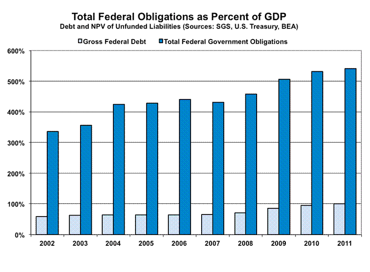
Those looking at the current $80 trillion of government debt and obligations, who think such is stable, need to consider that the circumstance is not static, but rather it is getting worse each year by at least $5 trillion. Taxes cannot be raised enough to bring the system into balance for one year, let alone for the ongoing future. Every penny of government spending—except for Social Security and Medicare—could be cut and the system still would be in annual deficit. Massive cuts would have to be put in place now (an absolute necessity with the social insurance), if there were to be any hope of restoring long-term solvency for the United States government. (Continued following table.)
U.S. Government - Alternative Fiscal Deficit and Debt Numbers
Reported by U.S. Treasury
|
|
Sources: U.S. Treasury, Shadow Government Statistics.
|
|
(I) Fiscal
Year(1)
|
(II) Formal
Cash-Based
Deficit
($Billions)
|
(III) GAAP
Ex-SS Etc.
Deficit
($Billions)
|
(IV) GAAP
With SS Etc.
Deficit
($Trillions)
|
(V) GAAP
Federal
Negative
Net Worth
($Trillions)
|
(VI) Gross
Federal
Debt
($Trillions)
|
(VII) Total(2)
Federal
Obligations
(GAAP)
($Trillions)
|
|
GAO- Alternative Based(3)
|
|
2011
|
$1,298.6
|
$1,312.6
|
$4.6(5)
|
$73.5
|
$14.9
|
$80.9
|
|
2010
|
1,294.1
|
2,080.3
|
5.3(3)
|
68.9(3)
|
13.6
|
$76.3(3)
|
|
Official ACA- Assumption Based(3)
|
|
2011
|
$1,298.6
|
$1,312.6
|
$4.5(5)
|
$61.1
|
$14.9
|
$68.5
|
|
2010
|
1,294.1
|
2,080.3
|
(7.0)(3)
|
56.5(3)
|
13.6
|
64.0(3)
|
|
Pre-ACA Distortions(3)
|
|
2009(4)
|
1,417.1
|
1,253.7
|
4.3
|
63.6
|
11.9
|
70.5
|
|
2008
|
454.8
|
1,009.1
|
5.1
|
59.3
|
10.0
|
65.6
|
|
2007
|
162.8
|
275.5
|
1.2(5)
|
54.3
|
9.0
|
59.8
|
|
2006
|
248.2
|
449.5
|
4.6
|
53.1
|
8.5
|
58.2
|
|
2005
|
318.5
|
760.2
|
3.5
|
48.5
|
7.9
|
53.3
|
|
2004
|
412.3
|
615.6
|
11.0(6)
|
45.0
|
7.4
|
49.5
|
|
2003
|
374.8
|
667.6
|
3.0
|
34.0
|
6.8
|
39.1
|
|
2002
|
157.8
|
364.5
|
1.5
|
31.0
|
6.2
|
35.4
|
|
(1) Fiscal year ended September 30th; the numbers are subject to rounding differences.
(2) Includes gross federal debt, not just “public” debt. While the non-public debt is debt the government owes to itself for Social Security, etc., the obligations there are counted as “funded” and as such are part of total government obligations.
(3) Fiscal years 2011 and 2010 are broken out into “Alternative” and “Official” measures necessitated by “Official” 2010 reporting including a large, one-time reduction in the estimated net present value of unfunded Medicare liabilities, due to unrealistically favorable assumptions tied to the passage of the Affordable Care Act (ACA) healthcare legislation. With consistent accounting, SGS estimates the GAAP shortfall with Social Security and Medicare for 2010 to be roughly $5 trillion. The “GAO-Alternative” numbers here are being used as a placeholder until such time as better accounting estimates are available, and reflect results using the “Illustrative Alternative Scenario” on Medicare costs shown on page 130 of the 2010 report and on page 134 of the 2011 report.
(4) The 2009 data predate December 2009 guarantees of Fannie Mae and Freddie Mac (GSEs) and do not reflect PBGC or FDIC liabilities. Even so, accounting for neither 2010 nor 2011 reflected what might be considered direct, full faith and credit guarantees of the U.S. government in those areas. Please note that mid-year 2009 accounting redefinitions for TARP knocked off roughly $500 billion from the reported formal cash-based estimate and contributed to a TARP “profit” in the GAAP numbers. Accordingly, post-2008 reporting may understate annual operating shortfalls and federal debt obligations by significant amounts.
(5) On a consistent reporting basis, net of one-time changes in assumptions (actuarial and otherwise) and accounting, SGS estimates that the GAAP-based deficit for 2011 topped $5 trillion. In like manner, SGS estimates that the GAAP-based deficit for 2007 topped $4 trillion, with negative net worth of $57.1 trillion and total obligations of $59.8. So as to maintain consistency with the official GAAP statements, the “official” numbers are shown.
(6) SGS estimates a $3.4 trillion 2004 deficit, excluding one-time unfunded setup costs of the Medicare Prescription Drug, Improvement, and Modernization Act of 2003 (enacted December 2003). Again, in order to maintain consistency with the official GAAP statements, the “official” numbers are shown in the table for 2004. The 2011 GAAP statements were released on December 26, 2011: http://fms.treas.gov/fr/index.html.
Sources for the SGS Table Data
Fiscal Year (Column I) – All numbers are for the indicated fiscal-year (ended September 30th), in either billions or trillions of dollars as shown.
Formal Cash-Based Deficit (Column II) – headline deficit number from Table 3 on page 7 of the 2011 report, “Management’s Discussion and Analysis” (hereinafter referred to as MDA). Please note that the latest (November 2011) monthly statements from the U.S. Treasury show a 2011 deficit of $1,296.8 billion and a 2010 deficit of $1,294.2 billion.
GAAP ex-SS Etc. Deficit (Column III) – euphemistically referred to as “Net Operating Cost” in MDA (Table 3 on page 7). It excludes annual change social insurance unfunded liabilities.
GAAP with SS Etc. Deficit (Column IV) – previous number (Column III) plus year-to-year change in the net present value (NPV) of social insurance unfunded liabilities, which comes from MDA (Table 8 on page 21) line “Closed Group” under “Statement of Social Insurance,” 2011 minus 2010 (for the 2011 “Official” number). The “Closed Group” is used here for consistency, as it has been the preferred measure used by the U.S. government in its earlier statements. The “Official” closed group NPV for fiscal 2011 and 2010 respectively are $46,273 and $43,057 billion.
The “Alternative” accounting adds in the differential to the MDA line “Closed Group” and the $12.4 trillion additional net present value of excess expenditures over income for Medicare shown in the “Illustrative Alternative Scenario,” shown in the table on page 130 of the 2010 report (for the 2010 “Alternative” estimate), and the differential between the 2011 “Illustrative Alternative Scenario,” data on page 134 of the 2011 Report, and the 2010 data, to estimate the 2011 number. The resulting “Alternative” closed group NPV estimates for fiscal 2011 and 2010 respectively are $58,707 and $55,410 billion.
GAAP Federal Negative Net Worth (Column V) – “Net Position” from MDA Table 5 on page 11, plus the 2011 “Closed Group” “Official” and “Alternative” total net present value unfunded liabilities of social insurance as indicated and adjusted in Column IV.
Gross Federal Debt (Column VI) – from “Note 14. Federal Debt …” pages 90 to 92 of the 2011 report. Total held by public (p. 90) plus Total intragovernmental (p. 92).
Total Federal Obligations (Column VII) – “Total Liabilities” from the MDA Table 5 on page 11, in the 2011 report, plus the 2011 “Closed Group” “Official” and “Alternative” total net present value unfunded liabilities of social insurance as indicated and adjusted in Column IV, plus total intragovernmental debt of $4,710.9 billion from (p. 92) of the 201 report.
|
|
___________________
|
(Continued from before the table.) As seen in the debt limit and deficit negotiations of the least year, there is no political will apparent among those currently controlling the White House and Congress to restore solvency. Accordingly, the U.S. will be doomed to an eventual hyperinflation, following the course taken by most sovereign states who have spent beyond their ability to raise money, eventually printing the money it needs to meet its obligations. As noted earlier, that process already has started. There is little time. The next Fed action to help the economy (a.k.a. prop-up banking system liquidity), easily could be the one that pushes the U.S. dollar into the abyss.
Chapter 9—Hyperinflationary Great Depression
MoveTowards Hyperinflation Accelerated by Current Fed and Government Actions
Even with the government’s spending, debt and obligations running far beyond the ability of the government to cover with taxes or the political willingness of the government to cut entitlement spending, the inevitable inflationary collapse, based solely on these funding needs, possibly could have been pushed well towards the end of the current decade. Yet, the effects of various systemic crises, the extraordinary economic downturn, and the government’s responses to same, have advanced the turning of Social Security funding from being in net surplus, to net deficit, by several years, to the present day.
Federal Reserve and government responses to those crises also have destroyed global confidence in the U.S. dollar and otherwise have rapidly accelerated the pace of movement towards a hyperinflation crisis in the United States.
Conceivably, massive and fiscally painful action now by the federal government to restore and maintain long-range U.S. government solvency still could avoid the looming dollar collapse, but the political will to do so does not exist among those who control the federal government, at present. That has been evident in actions by both the White House and Congress in the last six months.
The printing presses already are running, and the Fed has been working actively to debase the U.S. dollar, effectively funding fully net U.S. Treasury debt issuance to the public during QE2. Global rejection of the U.S. dollar and criticism of U.S. government fiscal actions and Federal Reserve monetary policy generally have been accelerating, along with calls for a new world reserve currency. Heavy selling pressure against the U.S. dollar has been relieved at key times by the markets turning their focus to the euro. As discussed in Chapter 1—Overview and Executive Summary, though, I contend the euro has been targeted artificially, in an effort to distract global markets from the elephant in the bathtub of sovereign-solvency concerns: the U.S. dollar. Interventions, jawboning and manipulations of the markets tend to be short-lived in their impact.
Beyond the various actions that have failed to contain the systemic-solvency crisis or to stimulate the economy; the devastating impact of the unexpected continuation of economic weakness on tax revenues and Treasury funding needs; and some form of renewed stimulus package by the Fed aimed at helping banking-system solvency; all have helped set the stage for the ultimate dollar crisis well before the end of this decade. Risks remain high for the prerequisites for and early stages of the hyperinflation to continue breaking in the months ahead. The hyperinflation crisis likely cannot be avoided beyond 2014; it already may be beginning to unfold.
It is in this environment of rapid fiscal deterioration and related massive funding needs that the U.S. dollar remains open to a rapid and massive decline, along with a dumping of domestic- and foreign-held U.S. Treasuries. The Federal Reserve would be forced to monetize further significant sums of Treasury debt, triggering the early phases of a monetary inflation. Under such circumstances, current multi-trillion dollar deficits would feed rapidly into a vicious, self-feeding cycle of currency debasement and hyperinflation.
With the economy already in depression, hyperinflation kicking in quickly would push the economy into a great depression, since disruptions from uncontained inflation are likely to bring normal commercial activity to a halt.
What happens next is anyone’s speculation. How long would a hyperinflation last before the government brought its fiscal house into order and established a sound currency? I would be surprised if the hyperinflation crisis lasted beyond a year or two, since the system is not positioned to handle the crisis well and pressures for rapid resolution would be extremely strong. All that depends, however, on what evolves out of what otherwise would be highly unstable political, economic, financial and social environments. Accordingly, the best individuals can do is to take actions to protect themselves and their families, through the worst of foreseeable circumstances, both in terms of personal safety and in terms of the purchasing power of pre-crisis assets.
The following is an exploration of certain problems that likely would have to be handled in a hyperinflation.
The United States, in a hyperinflation, likely would experience the quick disappearance of cash as we know it. In Zimbabwe, there was the back-up of a well-functioning black market in U.S. dollars, but no such back-up exists in the United States.
In the last year, Congressman Ron Paul introduced legislation that would make gold a legal currency, directly convertible and exchangeable at market rates with Federal Reserve notes, and with no tax consequences. If such a system were in place, that would provide a back-up system that conceivably would do much to mitigate the severe economic damage that otherwise would occur in the early stages of a U.S. hyperinflation.
Shy of a back-up system, and shy of the rapid introduction of a new currency and/or the highly problematic adaptation of the current electronic commerce system to new pricing realities, a barter system is the most likely circumstance to evolve for regular commerce. Such would make much of the current electronic commerce system useless and add to what would become an ongoing economic implosion. It also could take a number of months to become reasonably functional.
Some years back, I happened to be in San Francisco, having dinner with a former regional Federal Reserve Bank president and the chief economist for a large Midwestern bank. Market rumors that day had been that there was a run on a major bank in the City by the Bay. So I queried the regional Fed president as to what would be happening if the rumors were true.
He had had some personal experience with a run on banks in his region and explained how the Fed had a special team designed to handle such a crisis. The biggest problem he had had was getting adequate cash to the troubled banks to cover depositors, having to fly cash in by helicopters to meet the local cash-flow needs.
The troubled bank in San Francisco, however, was much larger than the example cited, and the former Fed bank president speculated that there was not enough cash in the vaults of the regional Federal Reserve Bank, let alone the entire Federal Reserve System, to cover a true run on deposits at the major bank.
Therein lies an early problem for a system headed into hyperinflation: adequate currency. Where the Fed may hold roughly $185 billion in currency outside of roughly $60 billion in commercial bank vault cash, the bulk of roughly $1.0 trillion in currency outside the banks is not in the United States. Back in 2000, the Fed estimated that 50% to 70% of U.S. dollar cash was outside the system. That number probably is higher today, with perhaps as less than $300 billion in physical cash in circulation in the United States, or roughly 2% of M3. The rest of the dollars are used elsewhere in the world as a store of wealth, or as an alternate currency, free of the woes of unstable domestic financial conditions. Those conditions would change severely in the event of a U.S. hyperinflation.
Given the extremely rapid debasement of the larger denomination notes, with limited physical cash in the system, existing currency would become worth more as kindling for a fire than as currency, and would disappear quickly as a hyperinflation broke.
For the system to continue functioning in anything close to a normal manner, the government would have to produce quickly an extraordinary amount of new cash, and electronic commerce would have to be able to adjust to rapidly changing prices.
In terms of cash, new bills of much higher denominations would be needed, but production lead time is a problem. Conspiracy theories of recent years have suggested the U.S. Government already has printed a new currency of red-colored bills, intended for some dual internal and external U.S. dollar system. If something like that indeed were the case, then there might be a store of “new dollars” that could be released at a 1-to-1,000,000 ratio, or whatever ratio was needed to make the new currency meaningful, but such would not resolve any long-term problems—as seen in the multiple Zimbabwe devaluations—unless it was part of an overall restructuring of the global currency system, and unless the U.S. government first put its fiscal house in order.
From a practical standpoint, however, currency would disappear, at least for a period of time in the early period of a hyperinflation.
For those who have foreign-currency denominated bank accounts outside the United States, something along the lines of a debit or credit card against that account—let’s say a Swiss franc account—could help, in theory. In the U.S., one could buy $100,000 worth of groceries with the credit card, and 50 Swiss francs would be deducted overnight from the account in Zurich, based on the then-current exchange rate. Such presumes, though, the ongoing functioning of a system in the U.S. that could handle the transaction.
Where the vast bulk of today’s money is not physical, but electronic, however, chances of the system adapting there are virtually nil. Think of the time, work and effort that went into preparing computer systems for Y2K, or even problems with the recent early shift to daylight savings time. Systems would have to be adjusted for variable, rather than fixed pricing, credit card lines would need to be expanded daily, the number of digits used in tallying dollar-denominated transactions would need to be expanded sharply. I have had assurances from some in the computer field, though, that a number of businesses have accounting software that can handle any number of digits.
From a practical standpoint, however, the electronic quasi-cashless society of today likely also would shut down early in a hyperinflation. Unfortunately, this circumstance rapidly would exacerbate an ongoing economic collapse.
Barter System
With standard currency and electronic payment systems non-functional, commerce quickly would devolve into black markets for goods and services and a barter system. Gold and silver both are likely to retain real value and would be exchangeable for goods and services. Silver would help provide smaller change for less costly transactions. One individual indicated to me that he had found airline bottles of high-quality scotch to be ideal small change in a hyperinflationary environment.
Other items that would be highly barterable would include full bottles of liquor or wine, or canned goods, for example. Similar items that have a long shelf life can be stocked in advance of the problem, and otherwise would be consumable if the terrible inflation never came. Separately, individuals, such as doctors and carpenters, who provide broadly useable services, already have services to barter.
A note of caution was raised once by one of my old economics professors, who had spent part of his childhood living in a barter economy. He told a story of how his father had traded a shirt for a can of sardines. The father decided to open the can and eat the sardines, but he found the sardines had gone bad. Nonetheless, the canned sardines had taken on a monetary value.
Howard J. Ruff, who has been writing about these problems and issues since Nixon closed the gold window, rightly argued that it would take some time for a barter system to be established, and suggests that individuals should build up a six-month store of goods to cover themselves and their families in the difficult times. Such is within the scope of normal disaster planning in some areas of the country (for example, I sit almost on top of the Hayward Fault). Stories out of the great Japanese earthquake just reinforce those common-sense principles.
Financial Hedges and Investments
During these times, safety and liquidity remain key concerns for investments, as investors look to preserve their assets and wealth through what likely are going to be the most difficult of times. Those who can preserve their wealth and maintain liquidity will have the ability to take advantage of extraordinary investment opportunities during and after the crises.
The nature of what lies beyond the onset of the hyperinflation cannot be predicted by anyone with much confidence, given the extreme systemic and economic disorder and political instability that likely would follow. Any number of outcomes is possible, and the following comments reflect concepts that should offer some asset protection given the reality of a hyperinflation, or where certain behavior can be anticipated. Beyond that point, whether there are functioning stock markets or financial institutions, or how society, the economy and government would function are open questions. I’m an economist, not an investment advisor. Individuals simply have to use their own common sense in preparing for and handling whatever may arise.
Gold and Silver. In a hyperinflation, holding physical gold and silver would be primary hedges for maintaining the purchasing power of assets. The precious metals would retain real value and also be portable in the event of possible civil turmoil. Sovereign coins have the greatest liquidity. At some point, the failure of the world’s primary reserve currency will lead to the structuring of a new global currency system. I would not be surprised to find gold or silver as part of the new system, structured in there in an effort to help sell a new non-fiat currency system to the public.
Real Estate. Real estate also would provide a basic long-range inflation hedge, but it lacks the portability and liquidity of gold. That could become an issue if the political environment shifted so radically that ownership of private property became impossible.
Allowing for periods of possible illiquidity, over the long-term, real estate in general should tend to retain much of the purchasing of the dollars invested into it. Depending on location and function, agricultural, residential and commercial real estate could appreciate relative to each other in that sequence through a hyperinflation, but nothing is set. As before, individual common sense has to be applied to particular circumstances.
Currencies. Having some funds invested offshore—outside of the U.S. dollar—would be a plus in circumstances where the government might impose currency or capital controls. I still look at the Swiss franc, the Canadian dollar and the Australian dollar as currencies likely to maintain their purchasing power against the U.S. dollar. Any suggestions here in terms of currencies, gold and silver, etc. are for holding same over the long term. Extreme near-term price volatility remains a risk in most markets. The current intervention by the Swiss National Bank to provide a quasi-fixed exchange rate versus the euro, effectively propping both the euro and the U.S. dollar, should prove to be short-lived.
Taking on Debt. Inflation is supposed to be the debtor’s friend, where debtors, like the U.S. government, end up paying off their obligations in cheap dollars. A note of caution is offered here. The current circumstances are extraordinary. Borrowers should consider their ability to carry debt through extremely difficult economic times, including possible loss of employment, etc., before high inflation might kick in. Consider, too, the U.S. government recently has intervened in altering terms and conditions of mortgages. Could a radical political change end up recasting the terms of personal obligations?
Bonds. If inflation increases, so too should bond yields. Yields would continue to rise in a situation with rising inflation. That would reduce the value of bonds already held at lower yields.
TIPS. The U.S. Treasury offers securities where yields and principal get adjusted regularly for the rate of inflation. In a hyperinflation, price changes can be so rapid that the principal and/or yield adjustment would lag enough so as to make the adjustments worthless. The reporting lag in calculating the adjusting CPI index—if it even could be calculated—still would wipe out investors, unless the Treasury became particularly creative and began benchmarking to spot gold or such, but nothing like that is in place.
As to the potential rapidity of price change, consider some anecdotal evidence. One story out of Weimar Germany involved buying an expensive bottle of wine for dinner. The empty bottle was worth more as scrap glass the next morning than it had been worth as a full bottle of wine the night before. Another story involved negotiating the price and paying for a meal, before sitting down, as the price of the meal would be higher by the time it was finished.


Equities. While equities do provide something of a traditional inflation hedge—revenues and profits get expressed in current dollars—they also tend to reflect underlying economic and political fundamentals. I still look for U.S. stocks to take an ultimate 90% hit, peak-to-trough, net of inflation, during this period. Where all stocks are tied to a certain extent to the broad market—to the way investors are valuing equities—such a large hit on the broad market would tend to have a dampening effect on nearly all equity prices, irrespective of the quality of a given company or a given industry.
The preceding graphs show the year-end Dow Jones Industrial Average (DJIA) in current terms, as well as adjusted for the CPI-U and the SGS-Alternate Consumer Inflation. While stocks may rally based on high inflation, in inflation-adjusted terms, a bear market remains a good shot. An early-hyperinflation DJIA at 100,000 could be worth 1,500 in today’s terms.
As consumer prices begin to spike, as the Fed moves to accommodate funding needs for ever-exploding federal fiscal shortfalls, and as the U.S. dollar comes under ever-heavier global selling pressures—all at high risk in the coming months—the federal government and the Federal Reserve could react with a variety of measures that could delay the hyperinflation’s onset for brief periods. Those possible actions, though, would not alter the hyperinflation outlook fundamentally or meaningfully. Potential official responses or external events include, but are not limited to:
Currency and Other Market Interventions. The U.S. Treasury can have the New York Federal Reserve Bank intervene in the currency markets in support of the dollar. Even when coordinated with other central banks, intervention usually is counter to fundamental pressures, and does nothing to turn a currency beyond the period of intervention. Intervention becomes expensive and usually fails in a short period of time. Unless underlying fundamentals are changed at the same time (i.e. interest rates are raised against the rest of the world), supportive intervention provides a selling opportunity for those looking to dump dollars. At present, the Swiss National Bank has been intervening and artificially propping both the euro and U.S. dollar.
Intervention often is preceded by jawboning, which usually fails even faster than the intervention.
Then there is the President’s Working Group on Financial Markets (aka the “Plunge Protection Team”), which has been directed to do what it has to do in order to keep financial markets orderly. Actions here, however, usually have been worked through what formerly were investment banks, and are short-lived in impact, as with the currency interventions. Action here appears to have been taken in advance of S&P’s downgrade of U.S. Treasuries.
Also, as argued earlier, someone has been focusing market concerns on the euro as a foil for distracting from U.S. dollar problems.
Wage and Price Controls. The federal government can freeze wages and prices or limit the pace of increase in same, but such tends to distort economic activity, creating product shortages and black markets. Fundamental inflation pressures are not relieved.
Nationalization of the Banking System. One “solution” to ongoing and likely deepening systemic insolvency within the banking system would be a nationalization of the banks by the U.S. government. Such likely would accelerate dollar debasement and the onset of the hyperinflation, but it most certainly would be fought by the banking system and the Federal Reserve.
Restricted Capital Flows. The federal government can impose restrictions on capital outflows from the United States, impairing the ability of those in the United States to seek financial safe-haven elsewhere. This likely would exacerbate a global dollar panic.
Release of Strategic Petroleum Reserves. Administrations irregularly have tapped U.S. strategic oil reserves in order to help provide relief from rising oil or gasoline prices. Effects from those actions usually have been temporary, and usually have been short-sighted from a supply standpoint, given the political problems still festering in the Middle East and North Africa. Oil price problems increasingly will be difficult to contain when they are driven by weakness in the U.S. dollar
Balanced-Budget Effort. The government could move to balance its fiscal condition, to restore long-range fiscal solvency. With those currently controlling the U.S. government demonstrating a lack of political will to address the serious issues, any budget deals in the near-term likely would be dominated by accounting gimmicks stretched over many years. With limited actual impact on both near- and long-term fiscal solvency, such deals likely would do more damage than good to global confidence in the U.S. dollar.
Return to Gold Standard. Suggestions have been floated as to returning the U.S. dollar to full gold backing. While something like that is likely—probably a necessity—in the aftermath of the hyperinflation ahead, the problem (perhaps the desired effect) is that the gold standard would restrict the government’s deficit spending. As such, in order for the new system to work, the government first would have to balance its GAAP-based spending—which I contend is not politically feasible at present. Unless fiscal circumstances are in balance, a new gold-based system would see continuous devaluations of the dollar against gold, as unsupportable money was created. On the other hand, if fiscal conditions were in balance, returning to a gold standard likely would not be under serious consideration at present.
Government Seizure of Privately Held Gold. A question commonly raised by subscribers is the potential for the federal government to seize privately held gold, today, as it did back in 1933, when President Franklin Roosevelt abandoned the domestic gold standard. While there is little the federal government might do that would be too surprising in the current environment, seizure of privately-held gold most likely would be tied to some reform of the monetary system, not just as an action aimed at punishing gold investors.
Back in 1933, the use of gold continued for the settlement of international accounts between sovereign states, and the U.S. government’s needs under that circumstance were used as an excuse for the seizure of the public’s gold holdings. While there were some exceptions to the seizure, such as coin collections and jewelry, U.S. investors ended up shifting funds into gold stocks as surrogates for the precious metal.
Private U.S. ownership of physical gold became legal, again, after President Richard Nixon closed the gold window on international settlements in 1971. The shift in private-gold-ownership policy, then, also was tied to the international monetary system’s backing, or lack of same, in gold.
Meaningful reform of the global monetary system and creation of a new U.S. currency, of whatever form, most likely would be post-hyperinflation events.
Major Natural Disasters. The catastrophic earthquake in Japan is a reminder of unpredictably of the natural disasters that can befall a nation. Physical damages are not adjusted in GDP, although insurance payments can have positive impact when the payments are made by a foreign-based insurer or reinsurer. Disruptions in normal commerce are a GDP negative, but rebuilding activity is a positive. To the extent the federal government funds rebuilding efforts with deficit spending or pays out unfunded government insurance, such actions add to the deficit and inflation issues.
Military Action. Beyond their horrors, wars historically have roots in economic problems, and they usually have the effect of spiking economic activity and inflation, as well as distracting public attention from other concerns. Orders for military goods at the outbreak of World War II in Europe, for example, helped to pull the United States out of the Great Depression.
Today, defense accounts for just six-percent of durable goods orders in the consumer-driven U.S. economy. A major new military conflict—beyond conflicts already impacting U.S. economic activity and fiscal planning—might provide the economy with some boost, but that would be at the expense of an offsetting further sharp deterioration in fiscal conditions and inflation prospects.
Some production gains also might be problematic, where the United States has lost significant manufacturing capacity to offshore competition. When the big gun on the U.S.S. Iowa exploded in 1989, the machine tools needed to manufacture a replacement gun no longer were available in the United States. They were available, however, in China. At the extreme, the outbreak of a global conflict of the magnitude of World War II, today, would be at the horrific risk of becoming nuclear.
Back to the Fed: A New Round of Easing and Other Non-Effective Policies. The Federal Reserve fairly easily can have negative impact on the economy and inflation, but positive results are not so simple. The Fed can kill economic activity by shrinking systemic liquidity, and it can increase inflation by “printing” money. Efforts to stimulate economic growth or to reduce inflation, however, historically have been much more difficult to accomplish. At present, though, Fed policies perversely have been creating new inflation at the same time that an ongoing systemic liquidity squeeze is intensifying the economic downturn. Continued efforts to debase the dollar should be successful, but not in stimulating economic activity, only in triggering an accelerating pace of inflation.
Significant efforts to cut back on, or to reverse, the so-called quantitative easing actions are not likely. The liquidity that the Fed has put into the system has been deemed necessary by the Fed, likely more from the standpoint of helping banking-system liquidity than really expecting the measures would boost economic activity. As discussed throughout this report, the economic and systemic-solvency crises appear to be worsening, not improving, suggesting more, not less, quantitative easing is likely.
Volcker-Like Inflation Containment. Back in the oil-based inflation of the late-1970s, early-1980s, Federal Reserve Chairman Paul Volcker earned a reputation as an effective inflation fighter. What he did was to raise interest rates so high as to drive the economy into the ground, creating one of the worst (double-dip) recessions of the post-World War II era. He killed economic demand enough so as to offset oil-price distortions, at least partially. With current economic activity already in severe contraction—even more severe than that of the early-1980s—chances of such a policy being pursued or even having the potential of working, at present, are slim.
Restraining the Federal Reserve. Efforts in Congress to restrain government spending could contain federal spending activity when the system next moves to the brink of collapse. As long as the Federal Reserve remains independent, however, it still likely would do whatever it had to in order to prevent systemic collapse into a deflationary great depression. If the Fed were reined-in, then whether the system ended in fire or ice, or somehow bought new life with a miraculous political shift that allowed for fiscal balance, would be in the hands of the President and Congress.
What lies ahead for the economy and inflation will have significant impact on the U.S. political process, as economic woes did on the 2010 mid-term election. Historically, the concerns of the electorate have been dominated by pocketbook issues. Prior to gimmicked methodologies making the reporting of disposable personal income largely meaningless, that measure was an excellent predictor of presidential elections.
In every presidential race since 1908, in which consistent, real (inflation-adjusted) annual disposable income growth was above 3.3%, the incumbent party holding the White House won every time. When income growth was below 3.3%, the incumbent party lost every time. Again, with redefinitions to the national income accounts in the last two decades, a consistent measure of disposable income as reported by the government has disappeared. Yet, even with the upside biases in official reporting, third-quarter 2011 annual growth in real disposable income was 0.1%, well below the traditional 3.3% limit. This cannot be a happy prospect for the incumbent party holding the White House in 2012.
As was suggested would be the case in the 2008 hyperinflation report, the economy contributed to the Republicans losing the White House in 2008. In the 2010 report, it was suggested that, “Present economic conditions are bleak enough to impair re-election prospects severely for incumbents in the 2010 mid-term election.”
As noted in the 2011 report, “A wide variety of possibilities would follow or coincide politically with a hyperinflationary great depression, but the political status quo likely would not continue. Times would be financially painful enough to encourage the development of a third party that could move the Republicans or Democrats to third-party status in the 2012 presidential and congressional elections.”
That circumstance remains true, given current and likely deteriorating economic conditions, irrespective of the hyperinflation’s timing.
Where I always endeavor to keep my political persuasions separate from my analyses, for purposes of full disclosure, my background is as a conservative Republican with a libertarian bent.
Common Sense
A U.S. hyperinflationary great depression would be extremely disruptive to the lives, businesses and economic welfare of most individuals. Such severe economic pain could lead to extreme political change and/or civil unrest.
What has been discussed here remains well shy of a comprehensive overview of all possible issues, but rather at least has raised some questions and touched upon some likely consequences. No one can figure out better than you the peculiarities of this circumstance and how you, your family and/or your business might be affected and best be protected. Using common sense remains the best advice I can give.
These matters will continue to be expanded upon in the SGS regular Commentaries and Special Commentaries, as circumstances and subscriber interests dictate. As always, I extend by deep thanks to the various readers who have raised questions and provided ideas, comments and material. Please feel free to offer your thoughts or raise your questions by e-mail to johnwilliams@shadowstats.com.
Recommended Further Reading
As mentioned elsewhere in the text, and as recommended to subscribers for years, there is:
Fiat Paper Money, The History and Evolution of Our Currency
by Ralph T. Foster (Privately Published)
2189 Bancroft Way, Berkeley, CA 94704
E-mail: tfdf@pacbell.net
To my knowledge, Ralph Foster’s extraordinary volume is the most comprehensive and informative analysis available on the history of fiat currencies. Continually updated and expanded, the privately printed book is offered with a novel binding that incorporates authentic worthless fiat currency notes.