No. 647: July Employment and Unemployment, June Construction Spending
COMMENTARY NUMBER 647
July Employment and Unemployment, June Construction Spending
August 1, 2014
__________
Minimally Weaker-Than-Consensus Labor Numbers—
Unremarkable Except for the Regular, Horrendous Reporting Quality
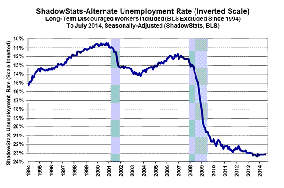
July Unemployment: 6.2% (U.3), 12.2% (U.6), 23.2% (ShadowStats)
Real Construction Spending—Stagnation with a Recent Downside Bias
Economy Remains in Serious Trouble
__________
PLEASE NOTE: The next regular Commentary is scheduled for Wednesday, August 6th, covering the June 2014 trade deficit.
ALSO: While the employment Commentary usually covers the latest monthly money-supply M3 annual growth estimate, the first-of-month release of the June labor data is too early in the current money-data cycle for a solid estimate of M3 growth for July. That will be covered in the next regular Commentary. July M3 currently is trending towards stronger year-to-year growth of about 4.7%, versus a benchmark-revised (Federal Reserve revisions to underlying data) of 4.5% (previously 4.4%) in June.
Best wishes to all — John Williams
OPENING COMMENTS AND EXECUTIVE SUMMARY
Construction and Labor Reporting Do Not Mirror “Booming” GDP. The purported headline boom in gross domestic product (see Commentary No. 646) did not receive strong support from the July employment and unemployment reporting, released today (August 1st) by the Bureau of Labor Statistics (BLS). The boom also ran into some contradiction, with a suggestion of downside-revision pressures— from construction spending—for the August 28th second estimate of second-quarter GDP. The August 6th estimate of the June trade deficit also is likely to provide pressure for a downside GDP revision (see Week Ahead section). More will follow in the next Commentary No. 648, covering the trade data release.
Today’s (August 1st) Commentary concentrates on the July labor and June construction-spending data.
Employment and Unemployment—July 2014—Seriously-Flawed Headline Reporting Continues, Month-after-Month. Although both the July 2014 headline jobs growth of 209,000 and headline unemployment rate at 6.2% were somewhat worse than market expectations, they remained far removed from common experience and underlying reality. As discussed frequently in these Commentaries, common experience generally would reflect headline monthly payroll-employment changes of flat-to-minus, with an unemployment rate—encompassing all short- and long-term discouraged workers—running above 23%.
Headline employment gains are no more than statistical illusions resulting from hidden shifts in seasonal factors, and from phantom jobs creation with the Birth-Death Model’s upside bias factors (see the Birth-Death/Bias-Factor Adjustment and Concurrent Seasonal Factor Distortions sections in the Reporting Detail for extended discussion).
Headline U.3 unemployment rates are contained by, and actually “improve” with the BLS’s removal of increasingly-large numbers of discouraged workers from the counts of the unemployed and the labor force (see ShadowStats-Alternate Unemployment Rate in the Reporting Detail). Separately, month-to-month comparisons of these numbers have no meaning; they simply are not comparable due to the concurrent seasonal factor process as practiced by the BLS (see Concurrent Seasonal Adjustment Distortions).
One item of interest in today’s household survey was the category of headline discouraged workers, which is not seasonally-adjusted and thus is not distorted by concurrent seasonal factor adjustments. Reflecting the influx of new discouraged workers from U.3, net of the outflow into the long-term discouraged workers in the ShadowStats Alternate Unemployment Rate, from the U.6 measure, the short-term discouraged worker count rose sharply, picking up anew from lower levels in May and June.
Headline Payroll Employment—July 2014. The seasonally-adjusted, month-to-month headline payroll employment gain for July was 209,000, somewhat below trend and market expectations. In turn, June payrolls rose by a revised 298,000, with May payrolls up by a revised 229,000. Due to the misleading reporting policies used by the BLS, the headline May 2014 gain became non-comparable and inconsistent with the April 2014 data, as of the July reporting.
Using seasonal-adjustment details available from the BLS, the consistent differential in earlier months can be calculated independently. For April to May 2014 reporting, the increase was 226,000, instead of the headline 229,000 gain, just a 3,000 difference. Consider, though, that the current headline number for the year-ago month of June 2013, is a monthly gain of 201,000. Due to jobs being shifted to other months by the constantly-changing, but not-reported, consistently-adjusted numbers, the actual headline gain for June 2013 versus May 2013 is 135,000, a difference of 66,000 jobs. The factors that make up the distortions of one-year ago, directly impact the seasonally-adjusted levels and headline changes for the current July 2014 and June 2014 numbers.
Annual Change in Payrolls. Not-seasonally-adjusted, year-to-year change in payroll employment is untouched by the concurrent-seasonal-adjustment issues, so the monthly comparisons of year-to-year change are reported on a consistent basis, although the redefinition of the series—not the standard benchmarking process—recently boosted reported annual growth in the last year, as discussed and graphed in the benchmark detail of Commentary No. 598. For July 2014, annual growth was 1.92%, versus a revised 1.88% in June, and a revised 1.75% gain in May. The July 2014 year-to-year gain matches the annual growth of February 2012 for the post-recession high. Of course, had the 2013 benchmark revision been standard, not a gimmicked redefinition, year-to-year jobs growth as of July 2014 would have been about 1.6%, versus about 1.9% in February 2012.
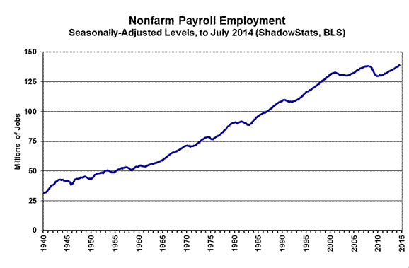
Record Employment Levels. Headline payroll employment also moved to above its pre-recession high, in May, and has continued to rise. This pattern was accelerated by the payroll levels all being redefined favorably with the January 2014 benchmarking, despite the actual benchmark having been negative. This can be seen in the accompanying graph of payroll employment level. The yellow points in that graph reflect the ShadowStats assessment of what payroll employment would be showing, with just a regular benchmarking, rather than the gimmicked redefinition of the series, which added a new upside bias. Even with what should have been a standard benchmarking, however, the pre-recession level likely would have been hit in next two months. Graphs of year-to-year headline payroll change and a longer-term perspective on headline payroll levels are shown in the Reporting Detail.

Counting All Discouraged Workers, July Unemployment Stood at 23.2%. The headline household survey reporting (unemployment-related) is virtually worthless. As previously discussed, the numbers are highly volatile and unstable, inadequately defined—not reflecting common experience—and simply are not comparable on a month-to-month basis. The month-to-month comparability issue again is tied to the concurrent seasonal adjustment process, discussed in the Reporting Detail section.
What removes headline-unemployment reporting from broad underlying economic reality and common experience simply is definitional. To be counted among the headline unemployed (U.3), an unemployed individual has to have looked for work actively within the four weeks prior to the unemployment survey. If the active search for work was in the last year, but not in the last four weeks, the individual is considered a “discouraged worker” by the BLS. ShadowStats defines that group as “short-term discouraged workers,” as opposed to those who become “long-term discouraged workers” after one year.
Moving on top of U.3, the broader U.6 unemployment measure includes only the short-term discouraged workers. The still-broader ShadowStats-Alternate Unemployment Measure includes an estimate of all discouraged workers, including those discouraged for one year or more, as the BLS used to measure the series pre-1994, and as Statistics Canada still does.
When the headline unemployed become discouraged, they roll over from U.3 to U.6. As the headline short-term discouraged workers roll over into long-term discouraged status, they move into the ShadowStats measure, where they remain. Aside from attrition, they are not defined out of existence for political convenience, hence the longer-term divergence between the various unemployment rates. Further detail is discussed in the Reporting Detail section. The resulting difference here is between a headline June 2014 unemployment rate of 6.2% (U.3) and 23.2% (ShadowStats).

The graph immediately preceding reflects headline July 2014 U.3 unemployment at 6.2%, up from 6.1% in June; headline July U.6 unemployment notching higher to 12.2% from 12.1% in June; and the headline ShadowStats unemployment measure notching higher to 23.2% in July, from 23.1% in June. The October 2013 ShadowStats reading of 23.4% was the series high (since 1994).
Two other graphs follow. The first is of the ShadowStats unemployment measure, with an inverted scale. The higher the unemployment rate, the weaker will be the economy, so the inverted plot tends to move in tandem with plots of most economic statistics, where a lower number means a weaker economy.
The inverted-scale ShadowStats unemployment measure also tends to move with the employment-to-population ratio, which is plotted in the second graph. Discouraged workers are not counted in the headline labor force, which generally continues to shrink. The labor force containing all unemployed (including total discouraged workers) plus the employed, however, tends to be correlated with the population, so the employment-to-population ratio tends to be something of a surrogate indicator of broad unemployment, and it has a strong correlation with the ShadowStats unemployment measure.
These graphs reflect detail back to the 1994 redefinitions of the household survey. Before 1994, data consistent with today’s reporting are not available.

Headline Unemployment Rates. Subject to the reporting issues and lack of real-world relevance discussed elsewhere, the headline July 2014 unemployment (U.3) rate was up by 0.11-percentage point at 6.20%, versus 6.09% in June. Again, though, month-to-month comparisons are meaningless, in the context of the month-to-month reporting-inconsistencies created by the concurrent seasonal factors. On an unadjusted basis, however, the unemployment rates are not revised and at least are consistent in reporting methodology. July’s unadjusted U.3 unemployment rate rose to 6.5% from 6.3% in June.
With a minor, seasonally-adjusted decline in people working part-time for economic reasons, and a hefty increase in short-term (unadjusted) discouraged workers, headline July 2014 U.6 unemployment notched higher to 12.2%, from 12.1% in June. The unadjusted U.6 rose to 12.6% in July, up from 12.4% in June.
Adding back into the total unemployed and labor force the ShadowStats estimate of the growing ranks of excluded, long-term discouraged workers, broad unemployment—more in line with common experience, the July 2014 ShadowStats-Alternate Unemployment Measure—notched higher to 23.2% from 23.1% in June. That still was down minimally from 23.4% in October 2013, which was the series high (back to 1994). The ShadowStats estimate shows the increasing toll of unemployed leaving the headline labor force.
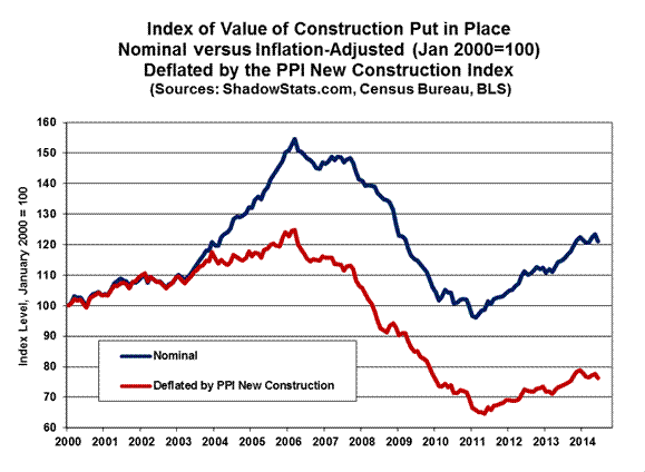
Construction Spending—June 2014—Down-Trending Stagnation. The 1.8% headline monthly contraction (-1.8%) in June construction activity followed, and was in the context of, a 1.2% upside revision to the previously estimated headline level of May activity. Accordingly, net of prior-period revisions, the June 2014 decline in activity was 0.6% (-0.6%).
Net of inflation—as measured by the PPI’s “new construction index” (NCI)—real construction spending showed general, ongoing stagnation, although a new trend to the downside has been developing since late-2013, with first-quarter 2014 in real quarter-to-quarter contraction and second-quarter 2014 now flat on a quarterly basis. It had been trending to the downside, going to the second-quarter GDP reporting.
There is no perfect inflation measure for deflating construction, but the NCI remains the closest found in publicly-available series. Private surveys tend to be more closely linked to real-world activity and usually show higher annual construction costs than seen in the government data.
Headline Reporting for June 2014. The headline, total value of construction put in place in the United States for June 2014 was $950.2 billion, on a seasonally-adjusted—but not-inflation-adjusted—annual-rate basis. That estimate was down month-to-month by a statistically-insignificant 1.8% (-1.8%), against a revised $967.8 billion in May, which was up 0.8% from $960.3 billion revised spending in April.
Adjusted for the NCI inflation in the PPI (see the preceding section), aggregate real spending in June 2014 was down month-to-month by 2.0%, versus a monthly gain of 0.8% in May.
On a year-to-year or annual-growth basis, June 2014 construction spending was up by a statistically-significant 5.5%, versus a revised 7.9% annual gain in May. Net of construction costs indicated by the NCI, year-to-year growth in spending was 2.8% in June, versus 5.6% in May. More-realistic private surveying suggests that annual costs are up by enough to come close to turning some of those annual construction-spending growth rates flat or into outright annual contractions.
The preceding graph reflects the latest detail in aggregate. The graphs in the Reporting Detail section also reflect the headline 1.8% decline (1.8%) in June 2014 total construction, encompassing private residential construction down by 0.3% (-0.3%), private nonresidential construction down by 1.6% (-1.6%), and public construction down by 4.0% (-4.0%).
[For further details on July employment and unemployment, and June construction spending,
see the Reporting Detail section and www.ExpliStats.com.]
__________
HYPERINFLATION WATCH
Hyperinflation Outlook Summary. [PLEASE NOTE: The main text here is as published in Commentary No. 644.] The long-standing hyperinflation and economic outlooks were updated with the publication of 2014 Hyperinflation Report—The End Game Begins – First Installment Revised, on April 2nd, and publication of 2014 Hyperinflation Report—Great Economic Tumble – Second Installment, on April 8th, along with ongoing updates in the regular Commentaries. The pending crises also were reviewed in Commentary No. 639. In the following summary, nothing of substance has changed from prior writings. It will be updated with next week’s trade-report Commentary No. 648 to reflect second-quarter GDP (see Commentary No. 646), and the reporting of July labor market conditions (see today’s Commentary).
Primary Summary. The primary and basic summary of the broad outlook and the story of how and why this crisis has unfolded and developed over the years—particularly the last decade—is found in the Opening Comments and Overview and Executive Summary of that First Installment Revised (linked above). The following section summarizes the underlying current circumstance.
Consistent with the above Special Commentaries, the unfolding economic circumstance discussed in the opening Economic Comment in (Commentary No. 644), in confluence with other fundamental issues, should place mounting and massive selling pressure on the U.S. dollar, as well as potentially resurrect elements of the 2008-Panic. Physical gold and silver, and holding assets outside the U.S. dollar, remain the primary hedges against the pending the total loss of U.S. dollar purchasing power.
Current Economic Issues versus Underlying U.S. Dollar Fundamentals. U.S. economic activity has turned down anew, with headline first-quarter 2014 GDP having contracted at an annualized real pace of 2.9% (-2.9%), following 2.6% fourth-quarter growth, and the second-quarter GDP is set for headline contraction minimally of 1% (-1%), by the September 26th revision to the series. With market expectations for initial second-quarter growth of about 3.0%, the Bureau of Economic Analysis likely will bring in its initial estimate at perhaps 1% to 2% positive growth. As discussed in the Economic Comments of Commentary No. 644, without the expected quarterly economic recovery to fourth-quarter 2013 levels of economic activity, that could be enough below consensus expectations to shock the popular outlook towards a “new recession,” with attendant adjustments hitting the markets.
In turn, as financial-market expectations increasingly shift towards renewed or deepening recession, that circumstance, in confluence with other fundamental issues, should place mounting and massive selling pressures on the U.S. dollar, as well as potentially resurrect elements of the 2008-Panic.
Unexpected economic weakness intensifies the stresses on an already-impaired banking system, hence a perceived need for expanded, not reduced, quantitative easing. The highly touted “tapering” by the FOMC is pre-conditioned by continued “happy” economic news. Banking-system and other systemic (i.e. U.S. Treasury) liquidity needs likely still will be provided as needed by the Fed, under the ongoing political cover of a weakening economy.
Unexpected economic weakness also savages projections of headline, cash-based, federal-budget deficits (particularly the 10-year versions) as well as projected funding needs for the U.S. Treasury. Current fiscal “good news” is based on cash-based, not GAAP-based accounting, and comparative year-ago cash numbers are against Treasury and government activity operating sub rosa in order to avoid the limits of a constraining debt ceiling.
All these crises will combine against the U.S. dollar, likely in the very-near future.
In summary, the fundamental issues threatening the dollar could not be worse. They include, but are not limited to:
· A severely damaged U.S. economy, which never recovered post-2008 and is turning down anew, including a sharply widening trade deficit.
· The U.S. government will not address its long-term solvency issues. Current fiscal “good news” is based on cash-based, not GAAP-based accounting. The GAAP-based version continues to run in the $6-trillion-plus range.
· Monetary malfeasance by the Federal Reserve is seen in its process of seeking to provide liquidity to a troubled banking system, and also to the U.S. Treasury, with a current pace of monetization at 94.1% of effective net issuance of the federal debt to be held by the public, so far, in calendar-year 2014 (through July 16th), 75.3% since the January 2013 expansion of QE3.
· Mounting domestic and global crises of confidence in a dysfunctional U.S. government, where the relative positive rating by the public of the U.S. President tends to have a meaningful correlation with the foreign-exchange-rate strength of the U.S. dollar.
· Mounting global political pressures contrary to U.S. interests, political and military, as well as financial and economic.
· Mounting global efforts to dislodge the U.S. dollar from its primary reserve-currency status.
Intensifying weakness in the U.S. dollar will place upside pressure on oil prices and other commodities, boosting domestic inflation and inflation fears. Domestic willingness to hold U.S. dollars will tend to move in parallel with global willingness to do the same. Both the dollar weakness and resulting higher inflation should boost the prices of gold and silver, where physical holding of those key precious metals remains the ultimate hedge against the pending inflation and financial crises.
__________
REPORTING DETAIL
EMPLOYMENT AND UNEMPLOYMENT (July 2014)
Seriously-Flawed Headline Reporting of Jobs Growth and Unemployment Is Ongoing, Month-after-Month. Although both the July 2014 headline jobs growth of 209,000 and headline unemployment rate at 6.2% were somewhat worse than market expectations, they remained far removed from common experience and underlying reality. As discussed frequently in these Commentaries, common experience generally would reflect headline monthly payroll employment changes of flat-to-minus, with an unemployment rate—encompassing all short- and long-term discouraged workers—running above 23%.
Headline employment gains are no more than statistical illusions resulting from hidden shifts in seasonal factors, and from phantom-jobs creation with the Birth-Death Model’s upside bias factors (see the Birth-Death/Bias-Factor Adjustment and Concurrent Seasonal Factor Distortions sections for extended detail).
Headline U.3 unemployment rates are contained by, and actually “improve” with the BLS removal of increasingly-large numbers of discouraged workers, from the counts of the unemployed and the labor force (see ShadowStats-Alternate Unemployment Rate). Separately, month-to-month comparisons of these numbers have no meaning; they simply are not comparable thanks to the concurrent seasonal factor process as practiced by the BLS (see Concurrent Seasonal Adjustment Distortions).
PAYROLL SURVEY DETAIL. Published today, August 1st, by the Bureau of Labor Statistics (BLS), the seasonally-adjusted, month-to-month headline payroll-employment gain for July was 209,000 +/- 129,000 (95% confidence interval), somewhat below trend and market expectations. In turn, June payrolls rose by a revised 298,000 (previously a 288,000 gain), with May payrolls up by a revised 229,000 (previously 224,000, initially 217,000). Due to the misleading reporting policies used by the BLS, the headline May 2014 gain became non-comparable and inconsistent with the April 2014 data, as of the July reporting.
Using seasonal-adjustment details that can be obtained from the BLS, the actual differential in April to May 2014 reporting was a 226,000 increase instead of the headline 229,000 gain, just a 3,000 difference. Consider, though, that the current headline number for the year-ago month of June 2013, is a monthly gain of 201,000. Due to jobs being shifted to other months by the constantly-changing, but not-reported, consistently-adjusted numbers, the actual headline gain for June 2013 versus May 2013 is 135,000, a difference of 66,000 jobs. The factors that make up the distortions of one-year ago, impact directly the seasonally-adjusted levels and headline changes for the current June and July 2014 numbers.
Where the current employment levels have been spiked by misleading and inconsistently-reported concurrent-seasonal-factor adjustments, the reporting issues suggest that a 95% confidence interval around the monthly headline payroll gain should be well beyond +/- 200,000 around the formal modeling of the headline gain, instead of the official +/- 129,000.
“Trend Model” Estimate Approximated Consensus Jobs Outlook for July. As discussed in Commentary No. 639, and as described generally in Payroll Trends, the trend indication from the BLS’s concurrent-seasonal-adjustment model—prepared by our affiliate www.ExpliStats.com—was for a July 2014 monthly payroll gain of 232,000, based on the trend structured into the BLS modeling of June’s actual reporting. The late-consensus for July appears to have been about 230,000, where the headline gain came in at 209,000.
Based on the July 2014 BLS reporting, the trend number built into the BLS seasonal-adjustment model is for a headline gain of 247,000 in August 2014. The consensus outlook for August 2014 most likely will settle-in around that number.
Construction Payrolls. The graph of July 2014 construction employment is shown in the Construction Spending section, covering the construction-spending release for June 2014. In the context of a revision to headline June activity, headline July 2014 construction employment rose by 22,000 in the month, following a revised 10,000 (previously 6,000) gain in June and an unrevised 9,000 (initially 6,000) gain in May. Total July 2014 construction jobs still were 21.8% shy of the pre-recession peak for the series in April 2006.
Annual Change in Payrolls. Not-seasonally-adjusted, year-to-year change in payroll employment is untouched by the concurrent-seasonal-adjustment issues, so the monthly comparisons of year-to-year change are reported on a consistent basis, although the redefinition of the series—not the standard benchmarking process—recently boosted reported annual growth in the last year, as discussed and graphed in the benchmark detail of Commentary No. 598.
For July 2014, annual growth was 1.92%, versus a revised 1.88% (previously 1.87%) in June, and a revised 1.75% (previously 1.74%, initially 1.75%) gain in May. The July 2014 year-to-year gain matches the annual growth of February 2012 for the post-recession high. Of course, had the 2013 benchmark revision been standard, not a gimmicked redefinition, year-to-year jobs growth as of July 2014 would have been about 1.6%, versus about 1.9% in February 2012.


With bottom-bouncing patterns of recent years, current headline annual growth has recovered from the post-World War II record 5.02% decline seen in August 2009, as shown in the accompanying graphs. That 5.02% decline remains the most severe annual contraction since the production shutdown at the end of World War II (a trough of a 7.59% annual contraction in September 1945). Disallowing the post-war shutdown as a normal business cycle, the August 2009 annual decline was the worst since the Great Depression.
Headline payroll employment moved to above its pre-recession high in May, and it has continued to rise. This pattern was accelerated by the payroll levels all being redefined favorably with the January 2014 benchmarking, despite the actual benchmark having been negative. This can be seen in the shorter-term graph of payroll employment level (see Opening Comments). The yellow points in that graph reflect the ShadowStats assessment of what payroll employment would be showing, with just a regular benchmarking, rather than the gimmicked redefinition of the series, which added a new upside bias. Even with what should have been a standard benchmarking, the pre-recession level likely would have been hit in the next two months.
In perspective, the following longer-term graph of the headline employment level shows the extreme duration of what had been the official non-recovery in payrolls, the worst such circumstance of the post-Great Depression era.
Concurrent Seasonal Factor Distortions. There are serious and deliberate reporting flaws with the government’s seasonally-adjusted, monthly reporting of both employment and unemployment. Each month, the BLS uses a concurrent-seasonal-adjustment process to adjust both the payroll and unemployment data for the latest seasonal patterns. As each series is calculated, the adjustment process also revises the monthly history of each series, recalculating prior reporting for every month, going back five years, on a basis that is consistent with the new seasonal patterns of the headline numbers.
The BLS, however, uses and publishes the current estimate, but it does not publish the revised history, even though it calculates the consistent new data each month. As a result, headline reporting generally is neither consistent with, nor comparable to earlier reporting, and month-to-month comparisons of these popular numbers usually are of no substance, other than for market hyping or political propaganda.

The BLS explains that it avoids publishing consistent, prior-period revisions so as not to “confuse” its data users. No one seems to mind if the published earlier numbers are wrong, particularly if unstable seasonal-adjustment patterns have shifted prior jobs growth or reduced unemployment into current reporting, without any formal indication of the shift from the previously-published historical data. The preceding, accompanying graph shows how far the monthly data have strayed from being consistent, as of the latest July 2014 reporting, versus the most recent benchmark revision to the series.
Note: Issues with the BLS’s concurrent-seasonal-factor adjustments and related inconsistencies in the monthly reporting of the historical time series are discussed and detailed further in the ShadowStats.com posting on May 2, 2012 of Unpublished Payroll Data.
Birth-Death/Bias-Factor Adjustment. Despite the ongoing, general overstatement of monthly payroll employment, the BLS adds in upside monthly biases to the payroll employment numbers, as discussed in the. The continual overstatement is evidenced usually by regular and massive, annual downward benchmark revisions (2011 and 2012, excepted). As discussed in the benchmark detail of Commentary No. 598, the regular benchmark revision to March 2013 payroll employment was to the downside by 119,000, where the BLS had overestimated standard payroll employment growth. At the same time, the BLS separately redefined the payroll survey so as to include 466,000 workers who had been in a category not previously counted in payroll employment. The latter event was little more than a gimmicked, upside fudge-factor, used to mask the effects of the regular downside revisions to employment surveying, and likely is the excuse behind the increase in the annual bias factor, where the new category cannot be surveyed easily or regularly by the BLS.
Indeed, particularly unusual here is that despite the BLS modeling having overstated recent jobs creation by 119,000, adjustment to the annual upside biases added into payroll estimation process each month was increased by about 150,000 on an annual basis, instead of being reduced, which would have been expected otherwise (see short-term graph and comments on payroll levels in the Opening Comments).
Historically, the upside-bias process was created simply by adding in a monthly “bias factor,” so as to prevent the otherwise potential political embarrassment to the BLS of understating monthly jobs growth. The “bias factor” process resulted from such an actual embarrassment, with the underestimation of jobs growth coming out of the 1983 recession. That process eventually was recast as the now infamous Birth-Death Model (BDM), which purportedly models the effects of new business creation versus existing business bankruptcies.
July 2014 Bias. The not-seasonally-adjusted July 2014 bias was a monthly add-factor of plus 80,000, versus what was (post-benchmark) a plus 86,000 bias in July 2013, versus a plus 121,000 add-factor in June 2014. The aggregate upside bias for the trailing twelve months was 737,000, from the pre-benchmark 624,000 twelve-month aggregate as of December 2013, or to a monthly average of 61,000 (52,000 pre-benchmark) jobs created out of thin air, on top of some indeterminable amount of other jobs that are lost in the economy from business closings. Those losses simply are assumed away by the BLS in the BDM, as discussed below.
Problems with the Model. The aggregated upside annual reporting bias in the BDM reflects an ongoing assumption of a net positive jobs creation by new companies versus those going out of business. Such becomes a self-fulfilling system, as the upside biases boost reporting for financial-market and political needs, with relatively good headline data, while often also setting up downside benchmark revisions for the next year, which traditionally are ignored by the media and the politicians. Where the BLS cannot measure meaningfully the impact of jobs loss and jobs creation from employers starting up or going out of business, on a timely basis (within at least five years, if ever), or by changes in household employment that just have been incorporated into the redefined payroll series, such information is guesstimated by the BLS along with the addition of a bias-factor generated by the BDM.
Positive assumptions—commonly built into government statistical reporting and modeling—tend to result in overstated official estimates of general economic growth. Along with these happy guesstimates, there usually are underlying assumptions of perpetual economic growth in most models. Accordingly, the functioning and relevance of those models become impaired during periods of economic downturn, and the current, ongoing downturn has been the most severe—in depth as well as duration—since the Great Depression.
Indeed, historically, the BDM biases have tended to overstate payroll employment levels—to understate employment declines—during recessions. There is a faulty underlying premise here that jobs created by start-up companies in this downturn have more than offset jobs lost by companies going out of business. Recent studies have suggested that there is a net jobs loss, not gain, in this circumstance. So, if a company fails to report its payrolls because it has gone out of business (or has been devastated by a hurricane), the BLS assumes the firm still has its previously-reported employees and adjusts those numbers for the trend in the company’s industry.
Further, the presumed net additional “surplus” jobs created by start-up firms are added on to the payroll estimates each month as a special add-factor. These add-factors are set now to add an average of 61,000 jobs per month in the current year. In current reporting, the aggregate average overstatement of employment change easily exceeds 200,000 jobs per month.
HOUSEHOLD SURVEY DETAILS. Generally, the seasonally-adjusted household-survey data are meaningless in terms of month-to-month changes or comparisons. The monthly concurrent-seasonal-factor adjustment process used in generating the headline numbers regenerates all seasonal factors every month, unique to the most-recent month. Yet, the revamped and consistent historical detail is not published, except once per year, in December. All the historical data shift anew with subsequent monthly reporting, but that new consistent detail never is published.
Where, for example, the seasonally-adjusted headline unemployment rate for July 2014 of 6.20% was based on a set of seasonal adjustments unique to July 2014, and the adjusted unemployment rate for June was revised along with the July seasonal-adjustment calculations, the new historical and not-comparable result for June was not, and never will be, published. The prior headline reporting of 6.09% for the June 2014 unemployment rate remained in place, although it now is inconsistent with the July 2014 number, even though the consistent June estimation is available internally to the BLS. This is true for every month going back for at least five years of BLS accounting, and it is done deliberately by the BLS, even though the consistent and comparable, historical data are calculated by and known to the Bureau.
Headline Household Employment. The household survey counts the number of people with jobs, as opposed to the payroll survey that counts the number of jobs (including multiple job holders more than once). On that basis, headline July 2014 employment rose by 131,000, following an unrevised and not comparable 407,000 gain in June. The employment changes were in the context of a 197,000 increase in July unemployment, versus a non-comparable 325,000 decline in June.
Again, though, the reporting here is virtually worthless. The household-survey numbers are highly volatile and unstable, inadequately defined in that they do not reflect common experience, and simply are not comparable on a month-to-month basis.
Headline Unemployment Rates. In the context of the preceding background, the headline July 2014 unemployment (U.3) rate was up by 0.11-percentage point at 6.20%, versus 6.09% in June. Technically that was not a statistically-significant change, where the official 95% confidence interval around the monthly change in the headline U.3 rate is +/- 0.23-percentage point. That is absolutely meaningless, however, in the context of the comparative month-to-month reporting-inconsistencies created by the concurrent seasonal factors.
On an unadjusted basis, the unemployment rates are not revised and at least are consistent in reporting methodology. July’s unadjusted U.3 unemployment rate rose to 6.5% from 6.3% in June.
U.6 Unemployment Rate. The broadest unemployment rate published by the BLS, U.6 includes accounting for those marginally attached to the labor force (including short-term discouraged workers) and those who are employed part-time for economic reasons (i.e., they cannot find a full-time job).
With a minor seasonally-adjusted decline in people working part-time for economic reasons, and a hefty increase in short-term (unadjusted) discouraged workers, headline July 2014 U.6 unemployment notched higher to 12.2%, from 12.1% in June. The unadjusted U.6 rose to 12.6% in July, up from 12.4% in June.
Discouraged Workers. The count of short-term discouraged workers (never seasonally-adjusted) rose to 741,000 in July, from 676,000 in June 2014, and 697,000 in May 2014. The current, official discouraged-worker number reflected the flow of the unemployed—increasingly giving up looking for work—leaving the headline U.3 unemployment category and being rolled into the U.6 measure as short-term “discouraged workers,” net of those moving from short-term discouraged-worker status into the netherworld of long-term discouraged-worker status. It is the long-term discouraged-worker category that defines the ShadowStats-Alternate Unemployment Measure. There appears to be a relatively heavy, continuing rollover from the short-term to the long-term category, with the ShadowStats measure encompassing U.6 and the short-term discouraged workers, plus the long-term discouraged workers.
In 1994, “discouraged workers”—those who had given up looking for a job because there were no jobs to be had—were redefined so as to be counted only if they had been “discouraged” for less than a year. This time qualification defined away a large number of long-term discouraged workers. The remaining short-term discouraged workers (those discouraged less than a year) were included in U.6.
ShadowStats-Alternate Unemployment Rate. Adding back into the total unemployed and labor force the ShadowStats estimate of the growing ranks of excluded, long-term discouraged workers, broad unemployment—more in line with common experience, as estimated by the ShadowStats-Alternate Unemployment Measure—notched higher to 23.2% in July, versus 23.1% in June, after having held at 23.2% for the prior five months. That still is down minimally from 23.4% in October 2013, which was the series high (back to 1994). The ShadowStats estimate reflects the increasing toll of unemployed leaving the headline labor force. Where the ShadowStats-Alternate estimate generally is built on top of the official U.6 reporting, it tends to follow its relative monthly movements and its annual revisions. Accordingly, the alternate measure often will suffer some of the same seasonal-adjustment woes that afflict the base series, including underlying annual revisions.
[The remaining text in this Household Survey section is unchanged from the Commentary covering the May 2014 labor data.] As seen in the usual graph of the various unemployment measures (in the Opening Comments), there continues to be a noticeable divergence in the ShadowStats series versus U.6, and the ShadowStats series and U.6 versus U.3. The reason for this is that U.6, again, only includes discouraged workers who have been discouraged for less than a year. As the discouraged-worker status ages, those that go beyond one year fall off the government counting, even as new workers enter “discouraged” status. A similar pattern of U.3 unemployed becoming “discouraged” and moving into the U.6 category also accounts for the early divergence between the U.6 and U.3 categories.
With the continual rollover, the flow of headline workers continues into the short-term discouraged workers category (U.6), and from U.6 into long-term discouraged worker status (a ShadowStats measure). There was a lag in this happening as those having difficulty during the early months of the economic collapse, first moved into short-term discouraged status, and then, a year later into long–term discouraged status, hence the lack of earlier divergence between the series. The movement of the discouraged unemployed out of the headline labor force has been accelerating. While there is attrition in long-term discouraged numbers, there is no set cut off where the long-term discouraged workers cease to exist. See the Alternate Data tab for historical detail.
Generally, where the U.6 largely encompasses U.3, the ShadowStats measure encompasses U.6. To the extent that the decline in U.3 reflects unemployed moving into U.6, or the decline in U.6 reflects short-term discouraged workers moving into the ShadowStats number, the ShadowStats number continues to encompass all the unemployed, irrespective of the series from which they otherwise may have been ejected.
Two further related graphs, also found in the Opening Comments section, are of the ShadowStats-Alternate Unemployment Measure, with an inverted scale, the employment-to-population ratio, which has a high correlation with the inverted ShadowStats measure.
Great Depression Comparisons. As discussed in previous writings, an unemployment rate above 23% might raise questions in terms of a comparison with the purported peak unemployment in the Great Depression (1933) of 25%. Hard estimates of the ShadowStats series are difficult to generate on a regular monthly basis before 1994, given the reporting inconsistencies created by the BLS when it revamped unemployment reporting at that time. Nonetheless, as best estimated, the current ShadowStats level likely is about as bad as the peak actual unemployment seen in the 1973-to-1975 recession and in the double-dip recession of the early-1980s.
The Great Depression unemployment rate of 25% was estimated well after the fact, with 27% of those employed working on farms. Today, less than 2% of the employed work on farms. Accordingly, a better measure for comparison with the ShadowStats number would be the Great Depression peak in the nonfarm unemployment rate in 1933 of roughly 34% to 35%.
CONSTRUCTION SPENDING (June 2014)
June Construction Contraction Was in Context of Upside Revisions to Earlier Activity. The 1.8% headline monthly contraction (-1.8%) in June construction activity followed a 1.2% upside revision to the previously estimated headline level of May activity. Accordingly, net of prior-period revisions, the June decline in activity was 0.6% (-0.6%). Net of inflation—the PPI’s “new construction index” (NCI)—real construction spending showed general, ongoing stagnation, although a new trend to the downside has been developing since late-2013, with first-quarter 2014 in real quarter-to-quarter contraction and second-quarter 2014 now flat (it had been trending to the downside, going to the second-quarter GDP reporting).
There is no perfect inflation measure for deflating construction, but the NCI remains the closest found in publicly-available series. Private surveys tend to be more closely linked to real-world activity and usually show higher annual construction costs than seen in the government data.
Headline Reporting for June 2014. The Census Bureau reported this morning (August 1st) that the headline, total value of construction put in place in the United States for June 2014 was $950.2 billion, on a seasonally-adjusted—but not-inflation-adjusted—annual-rate basis. That estimate was down month-to-month by a statistically-insignificant 1.8% (-1.8%) +/- 2.1% (all confidence intervals are at the 95% level), against a revised $967.8 (previously $956.1) billion in May, which was up by a revised 0.8% (previously a 0.1% gain) versus a revised $960.3 (previously $955.1) billion in April spending.
Adjusted for the NCI inflation in the PPI (see the preceding section), aggregate real spending in June 2014 was down month-to-month by 2.0%, versus a monthly gain of 0.8% in May.
On a year-to-year or annual-growth basis, June 2014 construction spending was up by a statistically-significant 5.5% +/- 2.7%, versus a revised 7.9% (previously 6.6%) gain in May. Net of construction costs indicated by the NCI, year-to-year growth in spending was 2.8% in June, versus a revised 5.6% in May. More-realistic private surveying suggests annual costs to be up by enough to come close to turning some of those annual construction-spending growth rates flat or into annual contractions.
The statistically-insignificant 1.8% monthly contraction in June 2014 construction spending, versus the 0.8% gain in May, included a 4.0% decline (-4.0%) in June public spending, versus a 1.6% gain May. June private construction was down by 1.0% (-1.0%) for the month, versus a 0.4% gain in May.
The following graphs reflect the latest detail. The headline 1.8% decline (1.8%) in June 2014 total construction, encompassed private residential construction down by 0.3% (-0.3%), private nonresidential construction down by 1.6% (-1.6%), and public construction down by 4.0% (-4.0%). Also reflected is the 0.8% monthly gain in May total construction, with private residential construction down by 1.1% (-1.1%), private nonresidential construction up by 2.1% and public construction up by 1.6%.
Construction and Related Graphs. The first two graphs following reflect total construction spending through June 2014, both in headline nominal dollar terms, and the aggregate series in real terms, after inflation adjustment. The inflation-adjusted graph is on an index basis, with January 2000 = 100.0. Adjusted for the PPI’s NCI measure, real construction spending showed the economy slowing in 2006, plunging into 2011, then turning minimally higher in an environment of low-level stagnation and now showing some pullback, in the last several months of reporting.


The pattern of inflation-adjusted activity here—net of government inflation estimates—does not confirm the economic recovery shown in the headline GDP series (see prior Commentary No. 646). To the contrary, the latest construction reporting, both before (nominal) and after (real) inflation adjustment, shows a pattern of ongoing stagnation, as reflected in the preceding two graphs.
The first of the two following graphs reflects today’s (August 1st) reporting of July 2014 construction employment (see detail in the Payroll Employment section). In theory, payroll levels should move more closely with the inflation-adjusted aggregate series, where the nominal series reflects the impact of costs and pricing, as well as a measure of the level of physical activity. Nontheless, the heavily-biased payroll numbers, as well as the heavily-guessed-at related construction activity in the GDP, have been running counter to the most-recent indications of construction activity.
The second of the second graph following shows total nominal construction spending, broken out by the contributions from total-public (blue), private-nonresidential (yellow) and private-residential spending (red).


The next two graphs following cover private residential construction along with housing starts (single- and multiple-unit starts) for June (see Commentary No. 642). Keep in mind that the construction spending series is in nominal (not-adjusted-for-inflation) dollars, while housing starts reflect unit volume, which should tend to be more parallel to the real (inflation-adjusted) series. Where the private residential construction spending had been in recent upturn, that now has turned to the downside anew.
The final set of two graphs, the third and fourth, following, show the patterns of the monthly level of activity in private nonresidential construction spending and in public construction spending. The spending in private nonresidential construction remains well off its historic peak, but has bounced higher recently off a secondary, near-term dip in late-2012, and has headed higher recently. Public construction spending, which is 98% nonresidential, has continued in a broad downtrend with intermittent bouts of fluttering stagnation.


__________
WEEK AHEAD
Much-Weaker-Economic and Stronger-Inflation Reporting Likely in the Months and Year Ahead. Although shifting to the downside, amidst fluctuations, market expectations generally still are overly optimistic as to the economic outlook. Expectations should continue to be hammered, though, by ongoing downside corrective revisions and an accelerating pace of downturn in headline economic activity. The initial stages of that process have been seen in the recent headline reporting of many major economic series (see 2014 Hyperinflation Report—Great Economic Tumble – Second Installment), including the sharp pace of economic decline seen in real first-quarter 2014 GDP, which is the first contemporary reporting of a quarterly GDP contraction since the formal end of the 2007 recession, in mid-2009.
Weakening, underlying economic fundamentals indicate still further deterioration in business activity. Accordingly, weaker-than-consensus economic reporting should become the general trend until such time as the unfolding “new” recession receives general recognition, which likely would follow the reporting of a headline contraction in second-quarter 2014 GDP real growth.
Stronger inflation reporting also remains likely, as has been seen in recent reporting. Upside pressure on oil-related prices should reflect intensifying impact from global political instabilities and a weakening U.S. dollar in the currency markets. Food inflation has been picking up as well. The dollar faces pummeling from the weakening economy, continuing QE3, the ongoing U.S. fiscal-crisis debacle, and deteriorating U.S. and global political conditions (see Hyperinflation 2014—The End Game Begins (Updated) – First Installment). Particularly in tandem with a weakened dollar, reporting in the year ahead generally should reflect much higher-than-expected inflation.
A Note on Reporting-Quality Issues and Systemic-Reporting Biases. Significant reporting-quality problems remain with most major economic series. Ongoing headline reporting issues are tied largely to systemic distortions of seasonal adjustments. The data instabilities were induced by the still-evolving economic turmoil of the last eight years, which has been without precedent in the post-World War II era of modern economic reporting. These impaired reporting methodologies provide particularly unstable headline economic results, when concurrent seasonal adjustments are used (as with retail sales, durable goods orders, employment and unemployment data). These issues have thrown into question the statistical-significance of the headline month-to-month reporting for many popular economic series.
PENDING RELEASE:
U.S. Trade Balance (June 2014). The Commerce Department and Bureau of Economic Analysis (BEA) will release their estimate of the June 2014 trade-balance data on Wednesday, August 6th. The June estimate will be decisive in determining the magnitude of the second-quarter deterioration in the trade deficit, and in the GDP’s net-export account contribution to headline second-quarter GDP growth, which will be revised on August 28th. As noted last month, the second-quarter trade data were on track to subtract at least 1.0% (-1.0%) from the initial reporting of second-quarter GDP growth on July 30th, but the BEA guesstimated a negative 0.61% (-0.61%) contribution to the initial headline, quarterly real GDP growth rate of 3.95% (see Commentary No. 646).
Irrespective of wherever the consensus outlook settles, look for the June deficit to widen versus May; for second-quarter trade deficit deterioration to widen versus early imputations; for the net-export account to become an increasingly negative factor in the GDP; and for headline second-quarter GDP growth to shrink in revision.
__________