No. 624: Employment and Unemployment, Construction Spending, Retail-Sales Benchmark, M3
COMMENTARY NUMBER 624
Employment and Unemployment, Construction Spending, Retail-Sales Benchmark, M3
May 2, 2014
__________
April Unemployment Numbers Showed Deepening Economic Disaster
Unemployed Dropped by 733,000, but
Employed Dropped by 73,000, and Labor Force Fell by 806,000
February-to-April Payroll Jobs Gains Were Bloated Heavily by
Concealed and Constantly-Shifting Seasonal Adjustments
April Unemployment: 6.3% (U.3), 12.3% (U.6), 23.2% (ShadowStats)
Revised Retail Sales Growth Was Slower 2011-to-Date;
Downside Corrections to Prior GDP Reporting Loom in July
Construction Spending Remained Stagnant
Year-to-Year M3 Growth Rose to 4.0% in April
__________
PLEASE NOTE: The next regular Commentary is scheduled for Tuesday, May 6th, covering the March trade deficit, with implications for the first revision to first-quarter 2014 GDP.
Best wishes to all — John Williams
OPENING COMMENTS AND EXECUTIVE COMMENTARY
April Labor Data Were Nonsense, at Best. To the extent that the headline April unemployment data are to be believed, the labor situation is spinning negatively out of control, and the happy cheerleading from the Bureau of Labor Statistics (BLS) is without merit. Most likely, there are unstable seasonal adjustments at work here, as with the payroll series, but the BLS keeps those household-survey numbers secret. On the payroll employment front, the BLS is more open about the statistical-adjustment games being played, and recent upside revisions and above-consensus jobs gains have been boosted by current changes in seasonal adjustments, which have shifted greater employment activity into the present period of active reporting.
Other Reporting. Also covered in today’s (May 2nd) Commentary is the annual benchmark to the retail sales series, which showed downside revisions to the last three years of activity (Opening Comments section). Additionally, annual growth in April M3 is on track to hit 4.0% (Hyperinflation Watch section). The analysis on the unstable April labor data and stagnant March construction spending are covered in the Opening Comments with other specifics covered in the Reporting Detail section.
Unstable Labor Data. The often discussed, unconscionable concurrent-seasonal-adjustment practices of the BLS result in uniquely-determined headline data that generally are not consistent or comparable with other periods (see the Concurrent Seasonal Adjustment Distortions section in the Reporting Detail). This process has contributed to exaggerated gains in recent payroll-employment reporting, and the process most likely is responsible for some of the extreme volatility reported in the April headline unemployment numbers. In the case of the unemployment data, however, with no detail available on the reporting distortions, the headline numbers have to be assessed as published.
Unemployment Disaster. The April unemployment rate dropped, but that was in a manner that reflected horrendous deterioration in labor-market conditions. The “good” news was that the headline unemployment rate U.3 dropped to 6.28% in April from 6.71% in March. The bad news is that of the 733,000 people no longer counted as unemployed in the aggregate numbers, an even greater number effectively stopped looking for work or lost their employment, with total employment in decline. There was a loss of 73,000 employed, plus 733,000 unemployed, with a resulting, combined 806,000 drop in the headline labor force.
How does the unemployment rate plunge when there is a net drop in employment? The key is the breakout of the 806,000 leaving the labor force. Here is how the math works, where the unemployment rate is calculated as a percent of the labor force. For March, 10.486 million unemployed / 156.227 million labor force = 6.71%. For April, [(10.486 – .733 = 9.753 million unemployed] / [156.227 -.733 (decline in unemployed) -.073 (decline in employed) = 155.421 million labor force] = 6.28%.
In their press release, among other issues the BLS touted, “The number of long-term unemployed (those jobless for 27 weeks or more) declined by 287,000 in April to 3.5 million.” Had those individuals actually taken jobs, employment likely would have gained. By definition, the long-term unemployed have looked for work actively in the last four weeks; they are not discouraged workers. Large portions of the headline “improvement” here, and of the 908,000 reported decline in long-term unemployed over the last year, most likely were due to those individuals giving up looking for work and being moved out of their status as headline unemployed and labor-force participants, into discouraged-worker status.
Moving on top of U.3, the broader U.6 unemployment measure, which includes a partial measure of discouraged workers, also declined, from 12.7% in March to 12.3% in April. Where U.6 includes “headline” discouraged workers, discouraged for less than a year, the broader ShadowStats-Alternate Unemployment Measure includes an estimate of all discouraged workers, including those discouraged for one year or more, as the BLS used to measure the series pre-1994 and as Statistics Canada still does.
As the headline unemployed become discouraged, they rollover from U.3 to U.6. As the headline short-term discouraged workers rollover into long-term discouraged status, they move into the ShadowStats measure, where they remain. Aside from attrition, they are not defined out of existence for political convenience, hence the longer-term divergence between the various unemployment rates. Further detail is discussed in the Reporting Detail section.
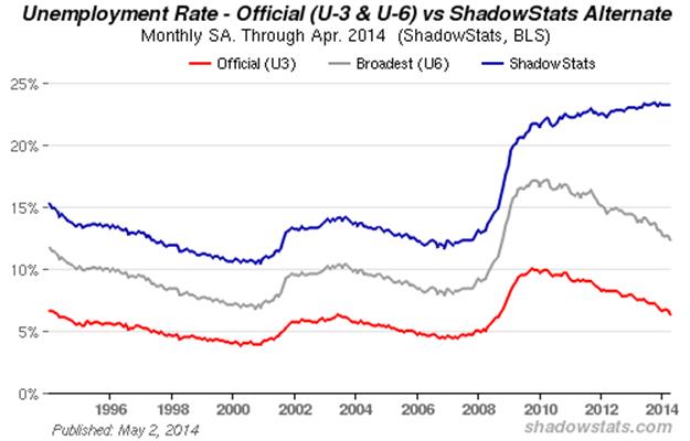
The preceding graph reflects headline April 2014 U.3 unemployment at 6.3%, down from 6.7% in March; headline U.6 unemployment at 12.3% in April, down from 12.7% in March; and the headline ShadowStats unemployment measure holding at 23.2% for the fourth month. The October 2013 ShadowStats reading of 23.4% was the series high (since 1994).
Two other graphs follow. The first is of the ShadowStats unemployment measure, with an inverted scale. The higher the unemployment rate, the weaker will be the economy, so the inverted plot tends to move in tandem with plots of most economic statistics, where a lower number means a weaker economy.

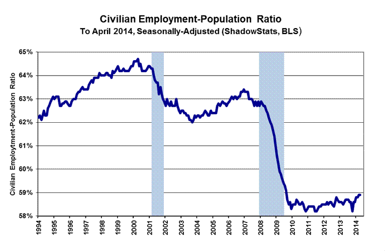
The inverted-scale ShadowStats unemployment measure also tends to move with the employment-to-population ratio, which is plotted in the second graph (preceding). Discouraged workers are not counted in the headline labor force, which generally continues to shrink. The labor force containing all unemployed (including total discouraged workers) plus the employed, however, tends to be correlated with the population, so the employment-to-population ratio tends to be something of a surrogate indicator of broad unemployment, and it has a strong correlation with the ShadowStats unemployment measure.
These graphs reflect detail back to the 1994 redefinitions of the household survey. Before 1994, data consistent with today’s reporting are not available.
Headline Unemployment Rates. Subject to the reporting issues and otherwise collapsing-labor conditions discussed earlier, headline unemployment (U.3) plunged by 0.43-percentage point to 6.28% in April 2014, from 6.71% in March, technically a statistically-significant change (+/- 0.23-percentage point, 95% confidence interval, which is meaningless in the context of the comparative month-to-month reporting-inconsistencies created by the concurrent seasonal factors. On an unadjusted basis, the unemployment rates are not revised, and at least they are consistent in reporting methodology. April’s unadjusted U.3 unemployment rate declined to 5.9%, from 6.8% in March.
Despite a seasonally-adjusted gain in people working part-time for economic reasons, and an increase in short-term (unadjusted) discouraged workers (to 783,000 in April, from 698,000 in March), headline April 2014 U.6 unemployment dropped to 12.3%, from 12.7% in March, dominated by the large swings in underlying U.3 data. The unadjusted April U.6 rate dropped to 11.8%, from 12.8% in March.
Adding back into the total unemployed and labor force of U.6, the ShadowStats-Alternate Unemployment Measure estimate of the growing ranks of excluded, long-term discouraged workers, broad unemployment—more in line with common experience—held at 23.2% in April 2014, for the fourth month. That was down minimally from 23.4% in October 2013, which was the series high (back to 1994). The ShadowStats estimate reflects the increasing toll of unemployed leaving the headline labor force.
Seasonal Boosts to Payrolls. The BLS uses a concurrent seasonal factor process to seasonally-adjust its payroll-data series. Beyond the instabilities of concurrent seasonal adjustments, though, the BLS simply does not report its historical series on a consistent or comparable basis. Each month, new seasonal factors are calculated in determining the adjusted payrolls, which revise the seasonally-adjusted historical series going back at least five years. The BLS, however, only publishes three months of consistent data, where, for example, the adjusted April 2014 payroll numbers are not comparable with data before February 2014.
The seasonally-adjusted, month-to-month headline payroll employment gain for April was a 288,000 +/- 129,000 (95% confidence interval), which was stronger than market expectations. With the current employment levels spiked by misleading and inconsistently reported concurrent-seasonal-factor adjustments, however, a much larger 95% confidence interval easily could be justified.
Where the unadjusted payroll levels were virtually unrevised in March and February, the seasonally-adjusted monthly change in payroll levels revised higher in March and February, again, as a result of shifting seasonals that were not consistent with data before February 2014. March payrolls rose by a revised, seasonally-adjusted 203,000 (previously 192,000), versus a revised gain of 222,000 (previously 197,000) in February.
Therein lies an example of the reporting fraud by the BLS. The February revision was due largely to revamped seasonal factors that were not reported or treated consistently. Where the BLS makes available enough background data so that third parties can calculate the consistent reporting (payroll employment only, not the unemployment rate), the actual, consistent headline monthly gain for February 2014 was 202,000, not 220,000.
Beyond other distortions to the reporting, the point remains that the seasonally-adjusted changes in headline labor data are of little substance. Not seasonally-adjusted data, however, are free of these distortions. On a year-to-year basis, the unadjusted annual payroll growth was 1.75% in April 2014, versus 1.64% in March, and 1.55% in February.
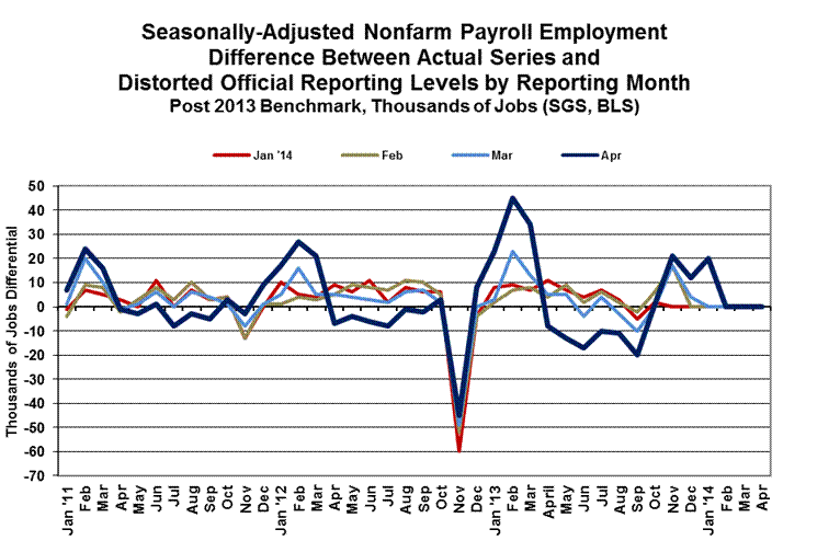
The regular plot showing how far the concurrent seasonally-adjusted monthly data have strayed from being consistent with the official historical series (usually in the Reporting Detail section) is shown below. The heavy blue line reflects revisions of the last month. If the data were consistent, the line would be flat at zero. Note the recent surge in the historical February and March seasonals, setting up a higher level in the headline April data.
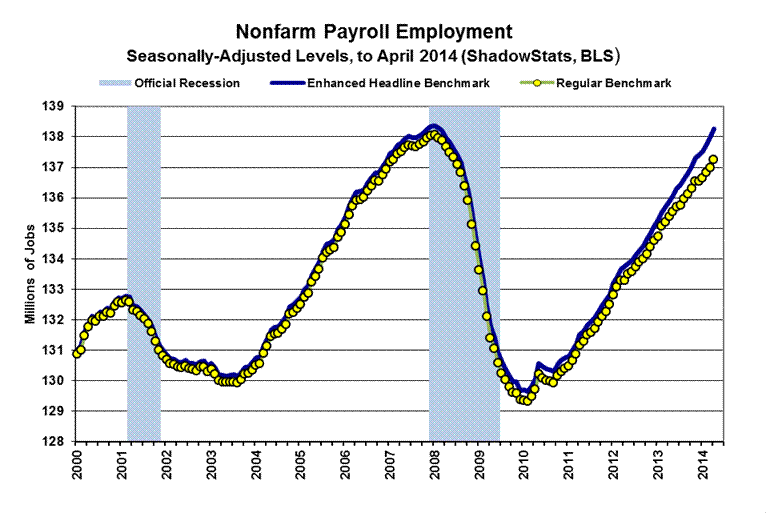
Separately, the following graph of payroll employment levels (prepared initially for the Second Installment of the 2014 Hyperinflation report), plots not only the official current headline payroll levels, but also what ShadowStats estimates the headline levels would be if the benchmark revision of February 7th (see Commentary No. 598) had been handled as a regular benchmark revision, and not as a series redefinition that introduced gimmicked, new upside biases to the headline numbers. The difference is that the headline nonfarm payroll level for April 2014 is about one-million jobs higher than it would have been with the regular reporting and revision procedures. As an aside, the headline series appears to be within one month of recovering its pre-recession high.
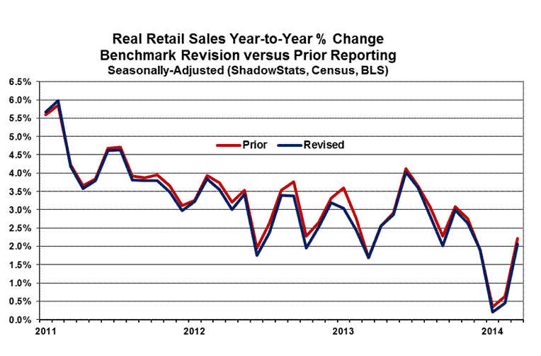
Retail Sales Growth Overstated in Recent Years. The Census Bureau published its annual benchmark revision of retail sales on April 30th, incorporating new seasonal factors, corrected data and the 2012 census of retail sales. The dominant factor in the revisions was the 2012 census, which lowered monthly year-to-year growth rates by an average of 0.1% in 2011, and by 0.2% from January 2012 onward, through March 2014. For the year of 2012, the level of retail sales activity was restated lower by 0.24%. These revisions should reduce prior GDP growth estimates back through 2011, but that effect will not be seen until the annual revisions to the GDP due for July 30th.
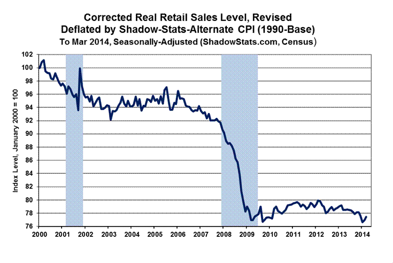
Following are two sets of graphs of real or inflation-adjusted retail sales that show or incorporate the retail sales revisions (see Commentary No. 620 for the last regular reporting and graphs for this series). The initial set of graphs shows level of activity. The first graph shows the period 2011-to-date, where the differences between the revisions and prior reporting are visible. The blue line reflects the revised series in each graph. The second graph shows the revised series back to 2000 (revised data start in July 2006). The third graph shows “corrected” real retail sales, where the understated deflating inflation series, and resulting overstated growth of headline real retail sales are corrected (again, see Commentary No. 620).


The second set of graphs shows revised year-to-year growth, with the same time scales as in the first set.

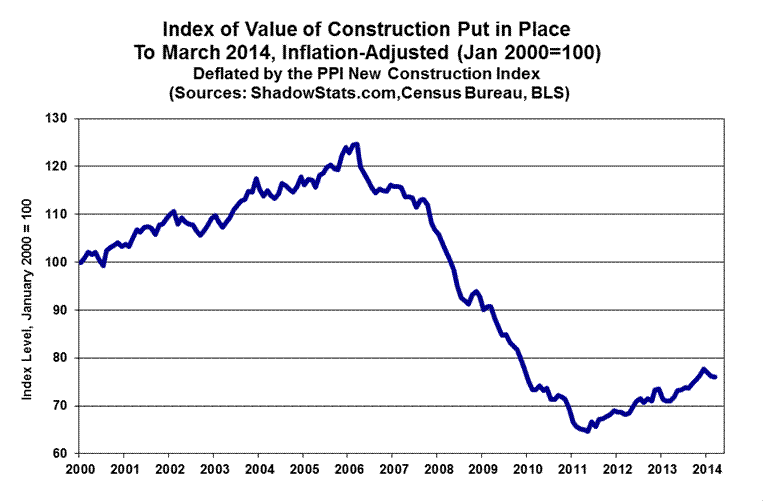
Minimal Growth in Headline Construction Spending Was in Context of Unstable Downside Revisions. The statistically-insignificant 0.2% headline gain in March 2014 construction spending left March activity at 0.3% below the initial reporting for February. Such is typical of the unstable reporting and volatile revisions in a series where the regular monthly reporting rarely is statistically-significant. As reflected in the accompanying graph here, and as plotted in the eight graphs in the Reporting Detail section, the collapse in construction spending since early-2006 into a period of protracted stagnation has not been close to an economic recovery, particularly after adjustment for inflation.
The pattern of plunge and stagnation in the recession increasingly appears to be the common activity seen in the less-gimmicked economic series. That pattern likely will be reinforced by a benchmark revision scheduled for the release of the May 2014 data in early-July.
Adjusting Construction Spending for Inflation. There is no perfect inflation measure for deflating construction, but the PPI’s “new construction index” (NCI) remains the closest found in publicly-available series. ShadowStats continues to use it while looking for a more-comprehensive index for construction that also is available to the public or for public release. Private surveys tend to be more closely linked to real-world activity and usually show higher annual construction costs than seen in the government data.
Official Reporting. The headline, total value of construction put in place in the United States for March 2014 was $942.5 billion, on a seasonally-adjusted—but not-inflation-adjusted—annual-rate basis. That estimate was up month-to-month by a statistically-insignificant 0.2%, against a revised $940.8 (previously $945.7) billion in February, which was down by 0.2% from a revised $942.5 (previously $944.6, initially $943.1) billion in January. The headline construction spending amount in March 2014 was down by 0.3% from the initial reporting for February 2014, before prior-period revisions.
Adjusted for inflation, aggregate real spending in March 2014 was down month-to-month by 0.6%, versus a revised monthly decline in February 2014 of 0.9%.
On a year-to-year or annual-growth basis, March 2014 construction spending was up by a statistically-significant 8.4%, versus a revised 8.1% gain in February. Net of PPI construction costs, year-to-year growth in spending was 7.1% in March, versus a revised 7.3% in February. More-realistic private surveying suggests annual costs to be up by enough to come close to turning some of those annual construction-spending growth rates flat or into annual contractions.
The graphs in the Reporting Detail section reflect the 0.2% monthly gain in March total construction, with private residential construction up by 0.8%, private nonresidential construction up by 0.2%, and public construction down by 0.6%. Also reflected is the 0.2% monthly decline in February total construction, with private residential construction virtually unchanged, private nonresidential construction down by 0.5% and public construction down by 0.1%.

[For further detail on April employment and unemployment, and March construction spending,
see the Reporting Detail section]
__________
HYPERINFLATION WATCH
Money Supply M3 Annual Growth at 4.0% in April 2014. Annual growth in April 2014 M3 is on track to hit 4.0%, up from a revised 3.8% (previously 3.7%) in March. Monthly year-to-year growth began to slow after hitting a near-term peak of 4.6% in January 2013, the onset of expanded QE3, then hitting a near-term trough of 3.2% in January 2014. The initial estimate of annual growth in April 2014 M3 will be posted on the Alternate Data tab of www.shadowstats.com by the end of the day on May 3rd.
Any revisions in the following numbers are due to the revisions of underlying data by the Federal Reserve. The seasonally-adjusted, preliminary estimate of month-to-month change for April 2014 money supply M3 is on track for a 0.3% gain, versus an unrevised 0.4% gain in March. Estimated month-to-month M3 changes, however, remain less reliable than are the estimates of annual growth.
Initial Growth Estimates for April M1 and M2. For April 2014, early estimates of year-to-year and month-to-month changes follow for the narrower M1 and M2 measures (M2 includes M1, M3 includes M2). Full definitions of the measures are found in the Money Supply Special Report. M2 for April 2014 is estimated to have shown year-to-year growth of roughly 6.1%, versus an unrevised 6.0% in March, with month-to-month change estimated at roughly a 0.3% gain in April, versus a revised 0.3% (previously 0.4%) gain March. The early estimate of M1 for April is for year-to-year growth of roughly 10.3%, versus a revised 10.8% (previously 11.3%) in March, with a month-to-month April gain of 1.2%, versus an unrevised 0.9% gain in March.
Hyperinflation Summary Outlook. The hyperinflation and economic outlook were updated with the publication of 2014 Hyperinflation Report—The End Game Begins – First Installment Revised, on April 2nd, and publication of 2014 Hyperinflation Report—Great Economic Tumble – Second Installment, on April 8th. Consistent with those Special Commentaries and incorporating the renewed business slowdown/downturn evident in the initial headline estimate of first-quarter 2014 GDP (see Commentary No. 623), a revised summary outlook for this section will follow in the next regular Commentary.
__________
REPORTING DETAIL
EMPLOYMENT AND UNEMPLOYMENT (April 2014)
Comparative Headline Jobs and Unemployment Data Remain Meaningless. The Bureau of Labor Statistics (BLS) deliberately publishes its seasonally-adjusted historical payroll-employment and household-survey (unemployment) data so that the numbers are neither consistent nor comparable with current headline reporting, particularly on a month-to-month basis, and such is having clear distorting impact on current headline reporting. The reporting distortions have bloated recent payroll reporting, and likely explain some of the unusual volatility seen the headline reporting of the April unemployment data.
A circumstance where the headline unemployment rate drops from 6.7% in one month, to 6.3% the next, as seen in March and April 2014, usually would be great news, with a large number of unemployed gaining jobs, and with employment rising. Instead, the current circumstance is a horror story, with all of the reduced unemployment and a portion of the previous employment disappearing from the labor force, with the disappearing individuals presumably giving up looking for work.
Distortions in both the unemployment and payroll-employment reporting for April 2014 are discussed in the Opening Comments section in some detail.
PAYROLL SURVEY DETAIL. The April 2014 payroll data were published today, May 2nd, by the Bureau of Labor Statistics (BLS). Headline payroll employment stood at 138.252 million in April, just 113,000 shy of the 138.365 million number estimated as the peak employment level at the beginning of the recession. Accordingly, barring unusual reporting activity, the jobs count likely will hit a pre-recession high with May’s reporting.
The seasonally-adjusted, month-to-month headline payroll employment gain for April was 288,000 +/- 129,000 (95% confidence interval), which was stronger than market expectations and the trend model. The current employment levels have been spiked by misleading and inconsistently reported concurrent-seasonal-factor adjustments. These reporting issues suggest that a 95% confidence interval of +/- 200,000 easily could be justified.
In turn, March payrolls rose by a revised 203,000 (previously 192,000), versus a revised gain of 222,000 (previously 197,000) in February.
Therein lies an example of the reporting fraud. The February revision was due largely to revamped seasonal factors that were not reported or treated consistently. Due the reporting policies used by the BLS, the headline February gain became non-comparable and inconsistent with the January data, as of the April reporting. Where the BLS makes available enough background data so that third parties can calculate the consistent reporting (payroll employment only, not the unemployment rate), the actual, consistent headline monthly gain for February 2014 was 202,000, not 220,000.
“Trend Model” and Consensus were Well Shy of the Headline Payroll Gain. As discussed in Commentary No. 618 and as described generally in Payroll Trends, the trend indication from the BLS’s concurrent-seasonal-adjustment model—prepared by our affiliate www.ExpliStats.com—was for an April 2014 monthly payroll gain of 210,000, based on the trend structured by BLS modeling of March’s reporting. The consensus appears to have held near the trend, and both numbers were exceeded sharply by the headline gain of 288,000.
Due to continuing difficulties with the related data, the trend estimate for May 2014 headline payroll change, based on April 2014 reporting will be published in a later Commentary.
Construction Payrolls. The graph of April construction employment is found in the Construction Spending section, following. In the context of prior-period revisions, headline April 2014 construction employment rose by 24,000 in the month, following a revised 17,000 (previously 19,000) gain in March, and a revised 24,000 (previously 18,000, initially 15,000) in February. Total April 2014 construction jobs still were 22.3% shy of the pre-recession peak for the series in April 2006.
Annual Change in Payrolls. Not-seasonally-adjusted, year-to-year change in payroll employment is untouched by the concurrent-seasonal-adjustment issues, so the monthly comparisons of year-to-year change are reported on a consistent basis, although the redefinition of the series—not the standard benchmarking process—recently boosted reported annual growth in the last year, as discussed and graphed in the benchmark detail of Commentary No. 598. For April 2014, annual growth was 1.75%, versus an unrevised 1.64% in March, and an unrevised 1.55% (initially 1.54%) in February 2014, and down from a near-term peak in annual growth of 1.85% in November 2013. As an aside, had the 2013 benchmark revision been standard, not a gimmicked redefinition, year-to-year jobs growth as of April 2014 would have been about 1.3%.
With the bottom-bouncing patterns of recent years, current headline annual growth has recovered from the post-World War II record 5.02% decline seen in August 2009, as shown in the accompanying graphs. That 5.02% decline remains the most severe annual contraction since the production shutdown at the end of World War II (a trough of a 7.59% annual contraction in September 1945). Disallowing the post-war shutdown as a normal business cycle, the August 2009 annual decline was the worst since the Great Depression.
The narrowing headline gap versus the pre-recession high—again, likely to be closed next month—(with levels all favorably redefined with the January benchmarking, despite the actual benchmark having been negative) can be seen in the shorter-term graph of payroll employment level (see Opening Comments). The yellow points reflect the ShadowStats assessment of what payroll employment would be showing, with just a regular benchmarking, rather than the gimmicked redefinition of the series, which added a new upside bias.
In perspective, the longer-term graph of the headline employment level—the third graph following—shows the extreme duration of the non-recovery in payrolls, the worst such circumstance of the post-Great Depression era.


Concurrent Seasonal Factor Distortions. There are serious and deliberate reporting flaws with the government’s seasonally-adjusted, monthly reporting of both employment and unemployment. Each month, the BLS uses a concurrent-seasonal-adjustment process to adjust both the payroll and unemployment data for the latest seasonal patterns. As each series is calculated, the adjustment process also revises the history of each series, recalculating prior reporting, for every month, going back five years, on a basis that is consistent with the new seasonal patterns of the headline numbers.
The BLS, however, uses the current estimate but does not publish the revised history, even though it calculates the consistent new data each month. As a result, headline reporting generally is neither consistent with, nor comparable to earlier reporting, and month-to-month comparisons of these popular numbers usually are of no substance, other than for market hyping or political propaganda.
The BLS explains that it avoids publishing consistent, prior-period revisions so as not to “confuse” its data users. No one seems to mind if the published earlier numbers are wrong, particularly if unstable seasonal-adjustment patterns have shifted prior jobs growth or reduced unemployment into current reporting, without any formal indication of the shift from the previously-published historical data.
The regular plot, showing how far the monthly data have strayed from being consistent is located in the Opening Comments section, today. Note the recent surge in the February and March seasonals, leading into the April data.
Note: Issues with the BLS’s concurrent-seasonal-factor adjustments and related inconsistencies in the monthly reporting of the historical time series are discussed and detailed further in the ShadowStats.com posting on May 2, 2012 of Unpublished Payroll Data.
Birth-Death/Bias-Factor Adjustment. Despite the ongoing, general overstatement of monthly payroll employment, the BLS adds in upside monthly biases to the payroll employment numbers. The continual overstatement is evidenced usually by regular and massive, annual downward benchmark revisions (2011 and 2012, excepted). As discussed in the benchmark detail of Commentary No. 598, the regular benchmark revision to March 2013 payroll employment was to the downside by 119,000, where the BLS had overestimated standard payroll employment growth. At the same time, the BLS separately redefined the payroll survey so as to include 466,000 workers who had been in a category not previously counted in payroll employment. The latter event was little more than a gimmicked, upside fudge-factor, used to mask the effects of the regular downside revisions to employment surveying, and likely is the excuse behind the increase in the annual bias factor, where the new category cannot be surveyed easily or regularly by the BLS.
Indeed, particularly unusual here is that despite the BLS modeling having overstated recent jobs creation by 119,000, adjustment to the annual upside biases added into payroll estimation process each month was increased by about 150,000 on an annual basis, instead of being reduced, which would have been expected otherwise (see short-term graph and comments on payroll levels in the Opening Comments).
Historically, the upside-bias process was created simply by adding in a monthly “bias factor,” so as to prevent the otherwise potential political embarrassment to the BLS of understating monthly jobs growth. The “bias factor” process resulted from such an actual embarrassment, with the underestimation of jobs growth coming out of the 1983 recession. That process eventually was recast as the now infamous Birth-Death Model (BDM), which purportedly models the effects of new business creation versus existing business bankruptcies.
April 2014 Bias. The not-seasonally-adjusted April 2014 bias was a monthly add-factor of plus 234,000, versus what was (post-benchmark) a plus 236,000 in bias April 2013, versus a plus 75,000 add-factor in March 2014. The aggregate upside bias for the trailing twelve months was 767,000, from the pre-benchmark 624,000 twelve-month aggregate as of December 2013, or to a monthly average of 64,000 (52,000 pre-benchmark) jobs created out of thin air, on top of some indeterminable amount of other jobs that are lost in the economy from business closings. Those losses simply are assumed away by the BLS in the BDM, as discussed below.
Problems with the Model. The aggregated upside annual reporting bias in the BDM reflects an ongoing assumption of a net positive jobs creation by new companies versus those going out of business. Such becomes a self-fulfilling system, as the upside biases boost reporting for financial-market and political needs, with relatively good headline data, while often also setting up downside benchmark revisions for the next year, which traditionally are ignored by the media and the politicians. Where the BLS cannot measure meaningfully the impact of jobs loss and jobs creation from employers starting up or going out of business, on a timely basis (within at least five years, if ever), or by changes in household employment that just have been incorporated into the redefined payroll series, such information is guesstimated by the BLS along with the addition of a bias-factor generated by the BDM.
Positive assumptions—commonly built into government statistical reporting and modeling—tend to result in overstated official estimates of general economic growth. Along with these happy guesstimates, there usually are underlying assumptions of perpetual economic growth in most models. Accordingly, the functioning and relevance of those models become impaired during periods of economic downturn, and the current, ongoing downturn has been the most severe—in depth as well as duration—since the Great Depression.
Indeed, historically, the BDM biases have tended to overstate payroll employment levels—to understate employment declines—during recessions. There is a faulty underlying premise here that jobs created by start-up companies in this downturn have more than offset jobs lost by companies going out of business. So, if a company fails to report its payrolls because it has gone out of business (or has been devastated by a hurricane), the BLS assumes the firm still has its previously-reported employees and adjusts those numbers for the trend in the company’s industry.
Further, the presumed net additional “surplus” jobs created by start-up firms are added on to the payroll estimates each month as a special add-factor. These add-factors are set now to add an average of 64,000 jobs per month in the current year. The aggregate average overstatement of employment change easily exceeds 100,000 jobs per month.
HOUSEHOLD SURVEY DETAILS. Generally, the seasonally-adjusted household-survey data are worthless. The monthly concurrent-seasonal-factor adjustment process used in generating the headline numbers regenerates all seasonal factors every month, unique to the most-recent month. Yet, the revamped and consistent historical detail is not published, except once per year, in December. All the historical data shift anew with subsequent monthly reporting, but that new detail never is published.
Where, for example, the seasonally-adjusted headline unemployment rate for April 2014 of 6.28% was based on a set of seasonal adjustments unique to April 2014, and the adjusted unemployment rate for March was revised along with the April seasonal-adjustment calculations, the new historical result for March was not published. The prior headline reporting of 6.71% for the March 2014 unemployment rate remained in place, although it was inconsistent with and no longer comparable to the April 2014 number. This is true for every month going back for at least five years of BLS accounting, and it is done deliberately by the BLS, even though consistent, historical data are calculated by and known to the Bureau.
Headline Household Employment. The household survey counts the number of people with jobs, as opposed to the payroll survey that counts the number of jobs (including multiple job holders more than once). On that basis, headline April 2014 employment fell by 73,000, versus a 476,000 gain in March. The employment decline was despite a 733,000 drop in the number of unemployed. Again, though, the household-survey numbers simply are not comparable month-to-month on a meaningful basis.
Headline Unemployment Rates. Skewed by serious ongoing issues with seasonal adjustments, and otherwise reflecting collapsing labor conditions (see the extensive discussion in Opening Comments) headline unemployment (U.3) plunged by 0.43-percentage point to 6.28% in April 2014, from 6.71% in March, technically a statistically-significant change. The official 95% confidence interval around the monthly change in the headline U.3 rate is +/- 0.23-percentage point. That is absolutely meaningless, however, in the context of the comparative month-to-month reporting-inconsistencies created by the concurrent seasonal factors.
On an unadjusted basis, the unemployment rates are not revised and at least are consistent in reporting methodology. April’s unadjusted U.3 unemployment rate declined to 5.9%, from 6.8% in March.
U.6 Unemployment Rate. The broadest unemployment rate published by the BLS, U.6 includes accounting for those marginally attached to the labor force (including short-term discouraged workers) and those who are employed part-time for economic reasons (i.e., they cannot find a full-time job).
Despite a seasonally-adjusted gain in people working part-time for economic reasons, and an increase in short-term (unadjusted) discouraged workers, headline April 2014 U.6 unemployment dropped to 12.3%, from 12.7% in March, dominated by the large swings in underlying U.3 data. The unadjusted April U.6 rate dropped to 11.8%, from 12.8% in March.
Discouraged Workers. The count of short-term discouraged workers (never seasonally-adjusted) increased to 783,000 in April, from 698,000 in March 2014. The current, official discouraged-worker number reflected the flow of the unemployed—increasingly giving up looking for work—leaving the headline U.3 unemployment category and being rolled into the U.6 measure as short-term “discouraged workers,” net of those moving from short-term discouraged-worker status into the netherworld of long-term discouraged-worker status. It is the long-term discouraged-worker category that defines the ShadowStats-Alternate Unemployment Measure. There appears to be a relatively heavy, continuing rollover from the short-term to the long-term category, with the ShadowStats measure encompassing U.6 and the short-term discouraged workers, plus the long-term discouraged workers.
In 1994, “discouraged workers”—those who had given up looking for a job because there were no jobs to be had—were redefined so as to be counted only if they had been “discouraged” for less than a year. This time qualification defined away a large number of long-term discouraged workers. The remaining short-term discouraged workers (those discouraged less than a year) were included in U.6.
ShadowStats-Alternate Unemployment Rate. Adding back into the total unemployed and labor force the ShadowStats estimate of the growing ranks of excluded, long-term discouraged workers, broad unemployment—more in line with common experience, as estimated by the ShadowStats-Alternate Unemployment Measure—held at 23.2% in April 2014, for the fourth month. That is down minimally from 23.4% in October, which was the series high (back to 1994). The ShadowStats estimate reflects the increasing toll of unemployed leaving the headline labor force. Where the ShadowStats-Alternate estimate generally is built on top of the official U.6 reporting, it tends to follow its relative monthly movements and its annual revisions. Accordingly, the alternate measure often will suffer some of the same seasonal-adjustment woes that afflict the base series, including underlying annual revisions.
As seen in the usual graph of the various unemployment measures (in the Opening Comments), there continues to be a noticeable divergence in the ShadowStats series versus U.6, and the ShadowStats series and U.6 versus U.3. The reason for this is that U.6, again, only includes discouraged workers who have been discouraged for less than a year. As the discouraged-worker status ages, those that go beyond one year fall off the government counting, even as new workers enter “discouraged” status. A similar pattern of U.3 unemployed becoming “discouraged” and moving into the U.6 category also accounts for the early divergence between the U.6 and U.3 categories.
With the continual rollover, the flow of headline workers continues into the short-term discouraged workers category (U.6), and from U.6 into long-term discouraged worker status (a ShadowStats measure). There was a lag in this happening as those having difficulty during the early months of the economic collapse, first moved into short-term discouraged status, and then, a year later into long–term discouraged status, hence the lack of earlier divergence between the series. The movement of the discouraged unemployed out of the headline labor force has been accelerating. While there is attrition in long-term discouraged numbers, there is no set cut off where the long-term discouraged workers cease to exist. See the Alternate Data tab for historical detail.
Generally, where the U.6 largely encompasses U.3, the ShadowStats measure encompasses U.6. To the extent that the decline in U.3 reflects unemployed moving into U.6, or the decline in U.6 reflects short-term discouraged workers moving into the ShadowStats number, the ShadowStats number continues to encompass all the unemployed, irrespective of the series from which they otherwise may have been ejected.
Two further related graphs, also found in the Opening Comments section are of the ShadowStats-Alternate Unemployment Measure, with an inverted scale, the employment-to-population ratio, which has a high correlation with the inverted ShadowStats measure.
Great Depression Comparisons. As discussed in previous writings, an unemployment rate above 23% might raise questions in terms of a comparison with the purported peak unemployment in the Great Depression (1933) of 25%. Hard estimates of the ShadowStats series are difficult to generate on a regular monthly basis before 1994, given the reporting inconsistencies created by the BLS when it revamped unemployment reporting at that time. Nonetheless, as best estimated, the current ShadowStats level likely is about as bad as the peak actual unemployment seen in the 1973-to-1975 recession and in the double-dip recession of the early-1980s.
The Great Depression unemployment rate of 25% was estimated well after the fact, with 27% of those employed working on farms. Today, less that 2% of the employed work on farms. Accordingly, a better measure for comparison with the ShadowStats number would be the Great Depression peak in the nonfarm unemployment rate in 1933 of roughly 34% to 35%.
CONSTRUCTION SPENDING (March 2014)
Minimal Growth in Headline Construction Spending Was in the Context of Downside Prior-Period Revisions. The statistically-insignificant 0.2% headline gain in March 2014 construction spending left March activity at a level 0.3% below that initially reported for February. Such is typical of the unstable reporting and volatile revisions in a series where the regular monthly reporting rarely is statistically-significant. As shown in the graphs that follow, the collapse in construction spending since early-2006 into a period of protracted stagnation has not been close to an economic recovery, particularly after adjustment for inflation.
The pattern of plunge and stagnation in the recession increasingly appears to be the common activity seen in the less-gimmicked economic series. That pattern likely will be reinforced by benchmark revisions here, scheduled for the release of the May 2014 data in early July.
Adjusting Construction Spending for Inflation. There is no perfect inflation measure for deflating construction, but the PPI’s “new construction index” (NCI) remains the closest found in publicly-available series. ShadowStats continues to use it while looking for a more-comprehensive index for construction that also is available to the public or for public release. Private surveys tend to be more closely linked to real-world activity and usually show higher annual construction costs than seen in the government data.
Official Reporting. The Census Bureau reported yesterday (May 1st) the headline, total value of construction put in place in the United States for March 2014 was $942.5 billion, on a seasonally-adjusted—but not-inflation-adjusted—annual-rate basis. That estimate was up month-to-month by a statistically-insignificant 0.2% +/- 1.5% (all confidence intervals are at the 95% level), against a revised $940.8 (previously $945.7) billion in February, which was down by 0.2% from a revised $942.5 (previously $944.6, initially $943.1) billion in January.
The headline construction spending amount in March 2014 was down by 0.3% from the initial reporting for February 2014, before prior-period revisions.
Adjusted for the NCI inflation in the PPI (see the preceding section), aggregate real spending in March 2014 was down month-to-month by 0.6%, versus a revised monthly decline in February 2014 of 0.9% (previously down by 0.6%).
On a year-to-year or annual-growth basis, March 2014 construction spending was up by a statistically-significant 8.4% +/- 2.1%, versus a revised 8.1% (previously 8.7%) gain in February. Net of construction costs indicated by the NCI, year-to-year growth in spending was 7.1% in March, versus a revised 7.3% (previously 7.9%) in February. More-realistic private surveying suggests annual costs to be up by enough to come close to turning some of those annual construction-spending growth rates flat or into annual contractions.
The statistically-insignificant 0.2% monthly gain in February 2014 construction spending, versus the 0.2% monthly decline in February, included a 0.6% contraction in March public spending, versus a revised 0.1% contraction in February. March private construction was up by 0.5% for the month, versus a revised 0.2% monthly decline in February.
The following graphs reflect the 0.2% monthly gain in March total construction, with private residential construction up by 0.8%, private nonresidential construction up by 0.2%, and public construction down by 0.6%. Also reflected is the 0.2% monthly decline in February total construction, with private residential construction virtually unchanged, private nonresidential construction down by 0.5% and public construction down by 0.1%.
Construction and Related Graphs. The two graphs following reflect total construction spending through March 2014, before and after inflation adjustment. The inflation-adjusted graph is on an index basis, with January 2000 = 100.0.
Adjusted for the PPI’s NCI measure, real construction spending showed the economy slowing in 2006, plunging into 2011, then turning minimally higher in an environment of low-level stagnation and now showing some pullback, in the last several months of reporting. The pattern of inflation-adjusted activity here does not confirm the economic recovery shown in the headline GDP series (see Commentary No. 623). To the contrary, the latest construction reporting, both before (nominal) and after (real) inflation adjustment, shows a pattern of ongoing stagnation, as reflected, again, in the next two graphs.


The the first of the two preceding graphs reflects the reporting of April 2014 construction employment, as reported today. In theory, payroll levels should move more closely with the inflation-adjusted aggregate series, where the nominal series reflects the impact of costs and pricing, as well as a measure of the level of physical activity. The reporting detail is included in the Payroll Reporting section, seen earlier in the Reporting Detail section.
The second of the two preceding graphs shows total nominal construction spending, broken out by the contributions from total-public (blue), private-nonresidential (yellow) and private-residential spending (red).
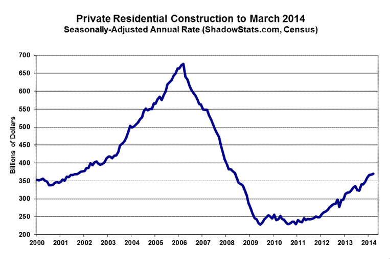
The next two graphs cover private residential construction, including housing starts data, for March. Keep in mind that the construction spending series is in nominal (not-adjusted-for-inflation) dollars, while housing starts reflect unit volume, which should tend to be more parallel to the real (inflation-adjusted) series.
The last two graphs (third and fourth graph following), show the patterns of the monthly level of activity in private nonresidential construction spending and in public construction spending. The spending in private nonresidential construction remains well off its historic peak, but has bounced higher recently off a secondary, near-term dip in late-2012, and is headed lower, once again. Public construction spending, which is 98% nonresidential, continues in a broad downtrend, with intermittent, short-lived bounces.


__________
WEEK AHEAD
Much-Weaker-Economic and Stronger-Inflation Reporting Likely in the Months and Year Ahead. Although shifting to the downside, market expectations generally still appear to be overly optimistic as to the economic outlook. Expectations should continue to be hammered, though, by ongoing downside corrective revisions and further, disappointing headline economic activity. The initial stages of that process have been seen in the recent headline reporting of many major economic series (see 2014 Hyperinflation Report—Great Economic Tumble – Second Installment), including the initial estimate of first-quarter 2014 GDP.
That corrective circumstance and underlying weak economic fundamentals remain highly suggestive of deteriorating business activity. Accordingly, weaker-than-consensus economic reporting should become the general trend until such time as the unfolding “new” recession receives general recognition.
Stronger inflation reporting also remains likely. Upside pressure on oil-related prices should reflect intensifying impact from a weakening U.S. dollar in the currency markets, and from ongoing global political instabilities. Food inflation has started to pick up as well. The dollar faces pummeling from continuing QE3, the ongoing U.S. fiscal-crisis debacle, a weakening U.S. economy and deteriorating U.S. and global political conditions (see Hyperinflation 2014—The End Game Begins (Updated) – First Installment). Particularly in tandem with a weakened dollar, reporting in the year ahead generally should reflect much higher-than-expected inflation.
A Note on Reporting-Quality Issues and Systemic Reporting Biases. Significant reporting-quality problems remain with most major economic series. Ongoing headline reporting issues are tied largely to systemic distortions of seasonal adjustments. The data instabilities were induced by the still-evolving economic turmoil of the last eight years, which has been without precedent in the post-World War II era of modern economic reporting. These impaired reporting methodologies provide particularly unstable headline economic results, where concurrent seasonal adjustments are used (as with retail sales, durable goods orders, employment and unemployment data), and they have thrown into question the statistical-significance of the headline month-to-month reporting for many popular economic series.
PENDING RELEASES:
U.S. Trade Deficit (March 2014). The Commerce Department and Bureau of Economic Analysis (BEA) will release the March 2014 trade-balance data on Tuesday, May 6th. Based just on the reporting of the January and February 2014 trade detail, the BEA’s estimate of the first-quarter 2014 net-export deficit was responsible for removing 0.83% from the annualized headline GDP growth in the first-quarter, which ended up at a total of 0.11%, as a result (see Commentary No. 623).
Accordingly, any significant widening of the first-quarter trade deficit, due to either March reporting or February revisions, could push first-quarter GDP into a revised headline contraction as of the first revision to this GDP number, due on May 30th. A narrowing quarterly deficit would tend to boost the GDP in revision.
Market expectations appear to be for some narrowing of the March trade shortfall, but an unexpected widening in the deficit, which is in long-term deterioration, remains a fair bet.
__________