No. 790: Labor Conditions, Money Supply M3, Trade Deficit and Construction Spending
COMMENTARY NUMBER 790
Labor Conditions, Money Supply M3, Trade Deficit and Construction Spending
March 6, 2016
___________
February Payroll and Unemployment Details Were Nonsense,
Well Removed from Underlying Economic Reality
Annual Payroll Growth Held at Twenty-Month Low
Headline Payrolls Gained 242,000; Full-Time Employment Gained 65,000
February 2016 Unemployment Rates:
U.3 at 4.9%, U.6 at 9.7%, and ShadowStats at 22.8%
First-Quarter 2016 Real Trade Deficit on Track for Continuing Deterioration,
with Negative Implications for First-Quarter GDP
Real Construction Spending Remained in Non-Recovery,
Ongoing Low-Level Stagnation
February 2016 Annual Growth Declined Sharply for M1 and M3,
Dropping to Levels Last Seen Surrounding the Economic Collapse
___________
PLEASE NOTE: The next regular Commentary, Friday, March 11th will be of a general nature covering domestic fiscal and economic conditions. There are no meaningful economic releases in the week ahead.
This Commentary was pushed back a day to accommodate unusual developments and new material. The posting of same has faced some further delay, due to the effects of a power outage from a large storm currently hitting the San Francisco area.
Best wishes to all — John Williams
OPENING COMMENTS AND EXECUTIVE SUMMARY
Monetary Distortions, Nonsense Reporting from the Household Survey and Trade and GDP Deterioration. Unusually-weak annual growth patterns in the most-recent monthly money supply reporting were not good news for the broad, domestic economic outlook. Something unusual is happening within systemic liquidity, as detailed in the Hyperinflation Watch. Separately, headline February labor conditions appeared to be relatively strong and positive, but clear distortions and otherwise upside-biased and not-comparable detail indicated something well shy of recovered, expanding economic activity. Separately, unexpected revisions and deterioration in the headline January trade-deficit reporting had negative implications for GDP growth, going forward. The money, labor and the trade details are expanded upon in these opening paragraphs.
Discussed primarily in the main text of the Commentary, real construction spending continued in a general pattern of low-level stagnation, never having recovered from the economic collapse, despite a headline January 2016 gain, and in the context of prior-period upside revisions. Such remained consistent with continued constraints on consumer conditions.
Faltering Money Supply Growth. February 2016 saw the pace of annual money growth slow across the board, with increasingly extreme patterns in M1 and M3 (the ShadowStats Ongoing M3 Measure), respectively the narrowest and broadest measures of what once was the headline money supply. The seasonally-adjusted level of M1 (basically cash and checking accounts—basic systemic liquidity) has been stagnant since November 2015, with the annual-growth rate for the series—usually much-higher than M3—down to 3.5%, from its post-recession peak of 20.6% in September 2011, the lowest level seen since the economy was in free-fall in August 2008. In 2008, however, annual M1 growth was on the rise. M1 annual growth dropping to 3.5% has not been seen since March of 2005, at the early onset of the housing and economic collapse.
In February 2016, annual growth in the broadest measure of the money supply, M3, dropped to a two-year low of 3.6%, the weakest showing since February 2014, and down from its post-recession peak of 5.9% in August 2015. In 2014, however, annual M3 growth was on the rise. M3 annual growth dropping to 3.6% has not been seen since September 2009, just following the headline trough in the economic collapse.
M1 and M3 have not been this weak together since the “non-recession” economic slowdown of the mid-1990s (see alternate economic activity discussed in 2014 Hyperinflation Report—Great Economic Tumble – Second Installment). Separately, the monetary base still appears well removed from its pre-crisis relationship with the formal money supply measures. The base appears to be stable, at present, in terms of level and annual growth, some two-plus months following the FOMC’s hike in the federal funds rate.
Extreme Distortions in Month-to-Month Household Survey Employment. The headline February U.3 unemployment rate of 4.92% was unchanged at the second decimal point versus January. That reflected perfectly-offsetting and proportional surges in the seasonally-adjusted levels of employment, unemployment and the labor force, with headline employed jumping by a nonsensical 530,000 people in the month, coincident with an equally inconsistent jump of 24,000 unemployed people. It was unfortunate that the unemployed did not enjoy any net positive change, given the surging employment.
Where 88.3% of that gain in February employed purportedly was due to those now in part-time employment, those holding at least one job are counted only once in the Household Survey (unemployment detail), unlike the Payroll Survey which counts just the number of jobs, not people.
What almost certainly is at work here in the aggregate Household-Survey employment gain remains the non-comparability of the adjusted headline month-to-month data (see the Reporting Detail section Headline Distortions from Shifting Concurrent-Seasonal Factors). Despite two months of surging counts of employed people on a seasonally adjusted basis (February up by 530,000 and January gaining 409,000 before the effects of population revisions), gains close to those magnitudes were not-picked up in the otherwise heavily-inflated Payroll-Survey details. As an aside, roughly 4% of the headline Household-Survey January-February employment gains were in agriculture, not counted in the Payroll Survey.
Nonetheless, the exaggerated headline-payroll monthly gains (comparable month-to-month) were for 242,000 in February and 172,000 in January, some 56% shy of the aggregate Household-Survey numbers (not comparable month-to-month). Beyond excessive upside-biases usually added into the monthly payroll detail, the series counts multiple times those holding multiple jobs, part-time or otherwise (see the Reporting Detail). As a result, with the U.3 employment gains in January and February at 227% of the already exaggerated jobs in payrolls in the same period, headline unemployment rates most assuredly have been understated, and both the Employment-to-Population and Participation Rates have been spiked artificially in the last two months.
Graph 1: Inflation-Adjusted, Quarterly U.S. Merchandise Trade Deficit

Deteriorating First-Quarter 2016 Real Trade-Deficit—On Track for Worst Reading Since 2007. Already having had significant negative impact on real growth in fourth-quarter 2015 GDP (see Commentary No. 789), the fourth-quarter 2015 real merchandise-trade deficit, though narrowed some in its revision of March 4th, still was the deepest since third-quarter 2007.
The initial January 2016 real merchandise trade deficit was worse than for any month in fourth-quarter 2015. With the initial trend for the first-quarter 2016 real merchandise trade deficit widening versus the prior quarter, early implications are for a negative-growth contribution to first-quarter 2016 GDP, with a deficit that would be the new worst reading since third-quarter 2007 (see Graph 1).
Today’s Commentary (March 5th). The balance of these Opening Comments provides summary coverage of the February 2016 employment and unemployment detail, and the January 2016 trade deficit and construction spending, along with an updated Consumer Conditions section. The latest Hyperinflation Watch covers developments in domestic monetary conditions, along with the usual monthly reporting of M3 annual growth for February 2016. The latest Hyperinflation Outlook Summary is found in Commentary No. 783.
Employment and Unemployment—February 2016—Headline Details Were Nonsense. Underlying reality for U.S. labor conditions in February 2016 was in the realm of a 22.8% broad unemployment rate, with headline monthly payroll employment change likely flat, plus-or-minus, month-to-month, with year-to-year growth slowing sharply, as reviewed in the main text.
Discussed in Commentary No. 784 and Commentary No. 784-A, last month’s annual benchmark revisions to the Payroll-Employment or Establishment Survey were negative, and the February headline payroll detail was published in the context of those revisions, with renewed and exaggerated upside monthly biases now being added into the headline monthly detail by the Bureau of Labor Statistics (BLS). BLS use of the Birth-Death Model (BDM) artificially inflates headline month-to-month payroll gains with add-factors that currently exceed 200,000 jobs per month (see the discussion in the Birth-Death/Bias-Factor Adjustment section).
The second major issue with the payroll estimates, as well as particularly with the unemployment-related detail, is the lack of historical comparability of the seasonally-adjusted monthly headline numbers. That problem results from the BLS using concurrent seasonal adjustment factors, a process that revises the last five years of seasonally-adjusted headline data, each and every month, but where BLS does not publish the revised historical data (see the discussion in Headline Distortions from Shifting Concurrent-Seasonal Factors section).
On the Household-Survey side, data-quality was worse than usual in February, as discussed in the opening paragraphs of these Opening Comments. In a return to the non-comparability of the month-to-month seasonally-adjusted Household-Survey detail (as referenced in the previous paragraph), the unemployment-related data were nonsense in the extreme.
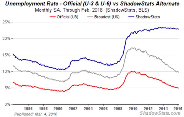
Unemployment. Looking just at the headline detail, the U.3 unemployment rate (Household-Survey) held at 4.9% in February 2016, the same as in January 2016. The broader U.6 unemployment measure, encompassing those “marginally attached” to the workforce and those working part-time for economic reasons, eased to 9.7% in February from 9.9% in January. Adding back into the total unemployed and labor force the ShadowStats estimate of the ever-growing ranks of long-term discouraged workers—effectively displaced workers—the ShadowStats-Alternate Unemployment Estimate notched lower to 22.8% in February 2016, from 22.9% in January.
Payrolls. In the context of heavy upside biases and shifting seasonal-factors inconsistencies, nonfarm payroll activity increased to a headline monthly gain of 242,000 jobs in February 2016, up from a revised 172,000 gain in January 2016 and a revised gain in December 2015 of 271,000 (a number the BLS knows to be wrong). With the aggregate, monthly upside biases in excess of 200,000 jobs, the actual February 2016 headline payroll change most likely was flat, plus-or-minus. On a not-seasonally-adjusted basis, year-to-year annual growth in February 2016 held at a twenty-month-low reading of 1.9%.
Headline Payroll-Employment. In the context of last month’s payroll benchmarking, the seasonally-adjusted, headline payroll gain for February 2016 was 242,000 jobs, which followed a revised headline gain of 172,000 jobs [previously up by 151,000] in January, and a revised gain of 271,000 [previously benchmarked to 262,000] in December, but which really was 265,000 if reported on a basis consistent with the headline February 2016 detail. In contrast, the headline monthly gain in February 2016 full-time employment, out of the Household-Survey, was 65,000.
Not-seasonally-adjusted, year-to-year growth in nonfarm payrolls held at 1.91% in February 2016, unchanged from a revised 1.91% [previously 1.89%] in January 2016, still at a twenty-month low. December 2015 and November 2015 both were unrevised, holding at their benchmarked annual growth rates of 1.97% [also up by 1.91% pre-benchmark for both months].
Counting All Discouraged Workers, February 2016 Unemployment Was at About 22.8%. Discussed frequently in these Commentaries on monthly unemployment conditions, what removes headline-unemployment reporting from common experience and broad, underlying economic reality, simply is definitional. To be counted among the headline unemployed (U.3), an individual has to have looked for work actively within the four weeks prior to the unemployment survey. If the active search for work was in the last year, but not in the last four weeks, the individual is considered a “discouraged worker” by the BLS, not counted in the headline labor force. ShadowStats defines that group as “short-term discouraged workers,” as opposed to those who, after one year, no longer are counted by the government and enter the realm of “long-term discouraged workers,” as defined and counted by ShadowStats (see the extended comments in the ShadowStats Alternate Unemployment Measure in the Reporting Detail).
In the ongoing economic collapse into 2008 and 2009, and the non-recovery thereafter, the broad drop in the U.3 unemployment rate from its headline peak of 10.0% in 2009, to holding at a “post-recession” low of 4.9% in February 2016, has been due largely to unemployed giving up looking for work (common in severe economic contractions and major economic displacements). Those giving up looking for work are redefined out of headline reporting and the labor force, as discouraged workers. The declines in the headline unemployment reflect same, much more so than the unemployed finding new and gainful employment.
As new discouraged workers move regularly from U.3 into U.6 unemployment accounting, those who have been discouraged for one year are dropped from the U.6 measure. As a result, the headline +U.6 measure has been declining along with headline U.3 for some time, but those being pushed out of U.6 still are counted in the ShadowStats-Alternate Unemployment Measure, which has remained relatively steady, near its historic-high rate for the last couple of years.
Moving on top of U.3, the broader U.6 unemployment rate—the government’s broadest unemployment measure—includes only the short-term discouraged workers (those marginally attached to the labor force). The still-broader ShadowStats-Alternate Unemployment Measure includes an estimate of all discouraged workers, including those discouraged for one year or more, as the BLS used to define and measure the series more broadly, before 1994.
Again, when the headline unemployed become “discouraged,” they are rolled over from U.3 to U.6. As the headline, short-term discouraged workers roll over into long-term discouraged status, they move into the ShadowStats measure, where they remain. Aside from attrition, they are not defined out of existence for political convenience, hence the longer-term divergence between the various unemployment rates. The resulting difference here is between headline-February 2016 unemployment rates of 4.9% (U.3) and 22.8% (ShadowStats).
Graph 2 reflects headline February 2016 U.3 unemployment at 4.92%, unchanged versus 4.92% in January 2016; headline February 2016 U.6 unemployment at 9.71%, versus 9.89% in January; and the headline February 2016 ShadowStats unemployment estimate at 22.8%, down a notch from the headline level of 22.9% in January.
Graph 2: Comparative Unemployment Rates U.3, U.6 and ShadowStats
Graphs 3 to 5 reflect longer-term unemployment and discouraged-worker conditions. Graph 3 is of the ShadowStats unemployment measure, with an inverted scale. The higher the unemployment rate, the weaker will be the economy, so the inverted plot tends to move in tandem with plots of most economic statistics, where a lower number means a weaker economy.
The inverted-scale of the ShadowStats unemployment measure also tends to move with the employment-to-population ratio, which notched higher, again, in February 2016. That ratio, though, still remains near its post-1994 record low, the historic low and bottom since economic collapse (only the period following the series redefinition in 1994 reflects consistent reporting), as shown in Graph 4. The labor force containing all unemployed (including total discouraged workers) plus the employed, however, tends to be correlated with the population, so the employment-to-population ratio remains something of a surrogate indicator of broad unemployment, and it has a strong correlation with the ShadowStats unemployment measure.
Shown in Graph 5, the February 2016 participation rate also notched higher. Both the near-term Employment-to Population Ratio and the Participation Rate appear to have received near-term spikes from a combination of population redefinition in January and the lack of any consistency or comparability in the month-to-month seasonally-adjusted detail from the source Household survey in February 2016 and in January, as discussed in the opening paragraphs of these Opening Comments. The nature of such distortions is such that there should be some corrective catch-up in the months ahead.
The Participation-Rate remains off the historic low hit in September 2015 (again, pre-1994 estimates are not consistent with current reporting). The labor force used in the Participation-Rate calculation is the headline employment plus U.3 unemployment. As with Graph 4 of employment-to-population, its holding near a post-1994 low in current reporting is another indication of problems with long-term discouraged workers, the loss of whom continues to shrink the headline (U.3) labor force, and the plotted ratio.
Graph 3: Inverted-Scale ShadowStats Alternate Unemployment Measure

Graph 4: Civilian Employment-Population Ratio

Graphs 2 through 5 reflect data available in consistent detail only back to the 1994 redefinitions of the Household Survey and the related employment and unemployment measures. Before 1994, employment and unemployment data consistent with February’s Household-Survey reporting simply are not available, irrespective of protestations to the contrary by the BLS.
Graph 5: Participation Rate

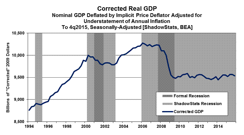
Separately, consider Graph 6, which shows the ShadowStats version of the GDP, also from 1994 to through the February 26th first-revision to fourth-quarter 2015 activity, where the GDP plot has been corrected for the understatement of inflation used in deflating the headline GDP series (a detailed description and related links are found in GDP Commentary No. 789).
Graph 6: Corrected Real GDP through 4q2015, Second Estimate
Graph 7: Real S&P 500 Sales Adjusted for Share Buybacks (2000 - 2015), Indexed to January 2000 = 100

Graph 8: CASS Freight Index for North America (2000 - 2016), Indexed to January 2000 = 100
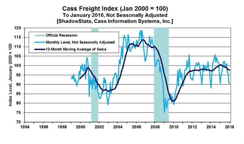
In particular, the broad patterns of activity seen in Graphs 3 and 4 generally are mirrored in Graph 6 of the “corrected” GDP. They also are largely consistent with the post-2000 period shown in Graph 7 of real S&P 500 revenues, previously published in Commentary No. 789 and No. 777 Year-End Special Commentary, and in Graph 8 of the CASS Freight Index, previously published in Commentary No. 789.
Graph 7 usually is plotted with quarterly data beginning in 2000, but the time scale of the plot was shifted here back to 1994 to show the S&P 500 revenue detail on roughly a comparative, coincident basis with the detail in Graphs 3 to 6. A similar re-plotting of the monthly time scale was used for the freight index detail in Graph 8. Of note, unlike Graphs 3 to 6, Graphs 7 and 8 are not seasonally adjusted, although the primary plot in Graph 8 is a trailing 12-month average. As an aside, apparent recession-band widths in the graphs vary depending on whether the base plotting period is monthly (such as seen in Graphs 3 to 5 and 8), or quarterly (such as seen here in Graphs 6 and 7).
Headline Unemployment Rates. At the first decimal point, the headline February 2016 unemployment rate (U.3) held at 4.9%, versus 4.9% in January 2016. The same held true at the second decimal point, with headline February 2016 U.3 at 4.92%, versus 4.92% in January. Technically, the “unchanged” change in the headline February U.3 was statistically-insignificant.
The headline “unchanged” in U.3, however, also is without meaning, given that the seasonally-adjusted, month-to-month details simply are not comparable, thanks to the BLS’s reporting methodology and use of concurrent-seasonal-adjustment factors (see Headline Distortions from Shifting Concurrent Seasonal Factors and the opening paragraphs of the Opening Comments). This issue remains separate from official questions raised as to falsification of the Current Population Survey (CPS), from which are derived the unemployment details.
On an unadjusted basis, the unemployment rates are not revised and are consistent in post-1994 reporting methodology. The unadjusted U.3 unemployment rate eased to 5.19% in February 2016 from 5.28% in January 2016.
Noted in the opening paragraphs, the unchanged seasonally-adjusted, headline February 2016 U.3 unemployment rate reflected perfectly-offsetting and proportional surges in the seasonally-adjusted levels of employment, unemployment and the labor force, with headline employed jumping by a nonsensical 530,000 people in the month, coincident with an equally inconsistent jump of 24,000 unemployed people.
What most almost certainly was at work here is the non-comparability of the adjusted headline monthly data (again, see the Reporting Detail section on Headline Distortions from Shifting Concurrent-Seasonal Factors), with the result that the headline month-to-month changes in everything from the employed and unemployed counts to the Employment-to-Population Ratio and Participation Rate simply were meaningless.
New discouraged and otherwise marginally-attached workers always are moving into U.6 unemployment accounting from U.3, while those who have been discouraged for one year, continuously are dropped from the U.6 measure. As a result, the U.6 measure has been easing along with U.3, for a while, but those being pushed out of U.6 still are counted in the ShadowStats-Alternate Unemployment Estimate, which has remained relatively stable.
U.6 Unemployment Rate. The broadest unemployment rate published by the BLS, U.6 includes accounting for those marginally attached to the labor force (including short-term discouraged workers) and those who are employed part-time for economic reasons (i.e., they cannot find a full-time job).
Despite the unchanged, underlying seasonally-adjusted U.3 rate, and zero change in the adjusted number of people working part-time for economic reasons, a decline in those marginally attached to the workforce (including short-term discouraged workers) fell for the month, and the headline February 2016 U.6 unemployment declined to 9.71% from 9.89% in January 2016. The unadjusted U.6 unemployment rate was at 10.07% in February 2016, versus 10.54% in January 2016.
ShadowStats Alternate Unemployment Estimate. Adding back into the total unemployed and labor force the ShadowStats estimate of effectively displaced workers, of long-term discouraged workers—a broad unemployment measure more in line with common experience—the ShadowStats-Alternate Unemployment Estimate for February 2016 was taken down a notch to a near-term low 22.8% (last seen in October 2015), from 22.9% in January 2016. The February reading was down by 50 basis points or 0.5% (-0.5%) from the 23.3% series high last seen in December 2013.
In contrast, the February 2016 headline U.3 unemployment reading of 4.9% held at its lowest level since February 2008, down by a 510 basis points or 5.1% (-5.1%) from its peak of 10.0% in October 2009. The broader U.6 unemployment measure, including those marginally attached to the workforce (including short-term discouraged workers) and those working part-time for economic reasons, eased to 9.7% in February 2016, down from its April 2010 peak of 17.2% by 750 basis points or 7.5% (-7.5%).
Trade Deficit—January 2016—Nominal 2015 Deficit Widened in Revision; Real First-Quarter 2016 Merchandise Deficit on Track for Worst Showing Since 2007. With the initial estimate of the inflation-adjusted real January 2016 merchandise trade deficit in hand, reporting of the first-quarter 2016 real merchandise trade deficit is on an early track for the worst quarterly trade shortfall since third-quarter 2007 (see Graph 1 in the opening paragraphs of these Opening Comments). That position currently still is held by the just-revised real merchandise quarterly trade shortfall for fourth-quarter 2015. Where the fourth-quarter deficit narrowed some in revision, in line with the first revision to fourth-quarter 2015 GDP, the new January 2016 trade detail provided an initial signal that first-quarter 2016 GDP also will suffer a negative-growth contribution from the continuing U.S. trade balance deterioration.
Nominal trade deficit revisions just published for goods and services in calendar year 2015, also suggested that downside revisions loom for 2015 GDP, come the July 29th GDP benchmark revisions.
Nominal (Not-Adjusted-for-Inflation) January 2016 Trade Deficit. The nominal, seasonally-adjusted monthly trade deficit in goods and services for January 2016, on a balance-of-payments basis, widened by $0.969 billion to $45.677 billion, versus a revised $44.698 billion in December 2015. That was in the context of revisions widening the previously estimated annual 2015 goods and services trade shortfall to $539.775 [previously $531.503] billion. While the revisions largely were to second-half 2015 activity, the changes were revised throughout the year, with new seasonal-factor redistributions.
That January 2016 nominal deficit also widened versus a now-comparable $43.601 billion trade shortfall in January 2015 (see Ongoing Cautions… section in the Reporting Detail).
In terms of month-to-month trade patterns, the headline $0.979 (-$0.979) billion deterioration in the January deficit reflected a decline of $3.828 (-$3.828) billion in monthly exports with a less than offsetting decline of $2.850 ($2.850) billion in monthly imports (difference is in rounding). Where the decline in exports largely reflected lower exports of capital and consumer goods and petroleum products, the decline in imports primarily reflected declining capital goods and petroleum products. Once again, declining oil prices skewed the relative deterioration in the nominal versus real deficits (greater real deterioration).
Energy-Related Petroleum Products. For January 2016, the not-seasonally-adjusted average price of imported oil declined to $32.06 per barrel, versus $36.60 per barrel in December 2015, and versus $58.96 per barrel in January 2015. Separately, not-seasonally-adjusted physical oil-import volume in January 2016 averaged 7.312 million barrels per day, down from 8.207 million in December 2015 and up from 7.186 million in January 2015.
Real (Inflation-Adjusted) January 2016 Trade Deficit. Adjusted for seasonal factors, and net of oil-price swings and other inflation (2009 chain-weighted dollars, as used in GDP deflation), the January 2016 merchandise trade deficit (no services) widened to $61.973 billion from a revised $60.085 billion in December 2015. The January 2016 shortfall also widened sharply versus a $54.334 billion real deficit in January 2015. There were minimal revisions to earlier months in 2015, but nothing that affected the quarterly estimates.
As currently reported, the annualized quarterly real merchandise trade deficit was $588.6 billion for third-quarter 2014, $605.5 billion for fourth-quarter 2014, $692.4 billion for first-quarter 2015, $694.8 billion for second-quarter 2015, $706.1 billion for third-quarter 2015, and a revised estimate of $721.7 billion for fourth-quarter 2015. That last number purportedly subtracted 0.25% (-0.25%) annualized quarterly real growth from the second headline estimate of fourth-quarter 2015 GDP.
As suggested in prior Commentaries, the real fourth-quarter 2015 deficit was the worst quarterly shortfall since third-quarter 2007, and the real first-quarter 2016 deficit is on track to be even worse (again, see Graph 1). Based solely on the initial January 2016 real merchandise trade deficit, the first-quarter 2016 real merchandise trade deficit is on track for an annualized shortfall of $743.7 billion, which would make that reporting the new worst such shortfall since third-quarter 2007, and which would contribute negative growth to the first-quarter 2016 GDP estimate.
Headline deficits likely will get even deeper in the months ahead, intensifying the already negative impact on GDP growth.
Construction Spending—January 2016—Broad-Based Real Spending Continued in Low-Level, Stagnating Non-Recovery. Still shy of its March 2006 pre-recession peak by 24.2% (-24.2%), inflation-adjusted real construction spending fell in fourth-quarter 2015 and otherwise has continued to stagnate, at a low-level of activity, albeit somewhat up-trending in the initial reporting of January 2016.
With revised reporting in place, fourth-quarter 2015 real construction spending contracted quarter-to-quarter at an annualized pace of 2.9% (-2.9%), following annualized quarterly real gains of 4.1% in third-quarter 2015, 25.0% in second-quarter 2015, and 6.0% in first-quarter 2015. The latest detail still was consistent with a contraction in annualized real fourth-quarter 2015 GDP, although that GDP measure currently is up by 1.0%. Yet, in conjunction with other underlying economic detail, real construction spending still is suggestive ultimately of a pending downside revision to fourth-quarter GDP growth.
Based solely on the initial and unstable reporting for January 2016, and in the context of sharply contracting headline construction inflation, first-quarter 2016 real construction spending was on track for annualized real quarterly growth of 9.1%.
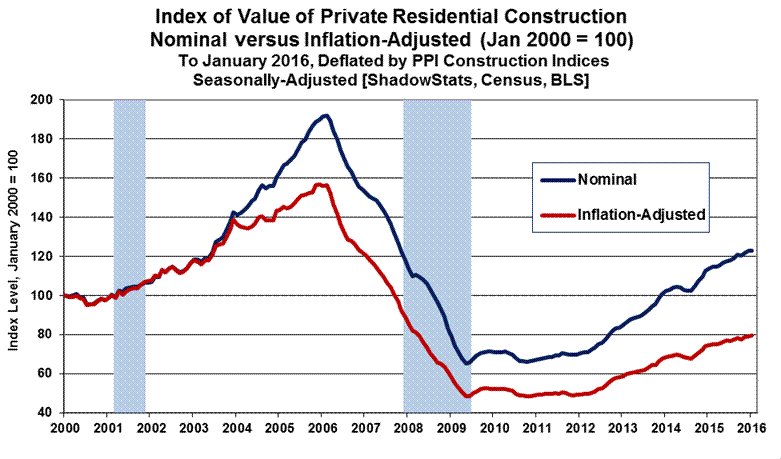
Accompanying Graphs 9 to 12 show comparative nominal and real construction activity for the aggregate series as well as for private residential- and nonresidential-construction and public-construction spending. Seen after adjustment for inflation, the real aggregate series had remained in low-level stagnation into first-quarter 2015, with some short-lived gains that turned down anew in the fourth-quarter 2015, and then with some rebound in January 2016. Areas of recent relative real strength in all of the major subcomponents have flattened out, or turned down in revision, both before and after construction inflation, except for the highly-volatile public sector, which just bounced higher. The general pattern of real activity remains one of low-level, up-trending stagnation.
PPI Final Demand Construction Index (FDCI). ShadowStats uses the Final Demand Construction Index (FDCI) component of the Producer Price Index (PPI) for deflating the current aggregate activity in the construction-spending series. The subsidiary private- and public-construction PPI series are used in deflating the subsidiary series, again, all as shown in Graphs 9 to 12.
Seasonally-adjusted January 2016 FDCI month-to-month inflation contracted by 0.35% (-0.35%), having been “unchanged” at 0.00% in December 2015. In terms of year-to-year inflation, the January 2016 FDCI was up by 1.16%, versus 1.88% annual inflation in December 2015. The subsidiary series often track the aggregate inflation detail. Further deflation details and discussion follow in the Reporting Detail.
Headline Reporting for January 2016. The headline, total value of construction put in place in the United States for January 2016 was $1,140.8 billion, on a seasonally-adjusted, but not-inflation-adjusted annual-rate basis. That estimate was up by a statistically-significant 1.5% versus an upwardly-revised $1,123.5 billion in December 2015. Net of prior-period revisions, the January monthly gain was 2.1%.
December spending was up by a revised 0.6% versus a revised $1,117.0 billion in November 2015. November’s spending declined by a revised 0.5% (-0.5%) versus an unrevised $1,122.7 billion of spending in October 2015.
Adjusted for FDCI inflation (again, negative inflation in January), total real monthly spending in January 2016 was up by 1.9%, versus a monthly gain of 0.6% in December 2015 and a decline of 0.3% (-0.3%) in November.
On a year-to-year annual-growth basis, January 2016 nominal construction spending rose by a statistically-significant 10.4%, versus revised year-to-year gains of 8.9% in December 2015 and 9.9% in November 2015. Net of construction inflation, the year-to-year gain in total real construction spending was at 9.1% in January 2016, 6.9% in December 2015 and 7.8% in November 2015.
The statistically-significant, headline monthly nominal gain of 1.5% in aggregate January 2016 construction spending, versus a gain of 0.6% in aggregate December 2015 spending, included a headline monthly jump of 4.5% in January public spending, versus a 3.5% gain in December. Private spending gained 0.5% month-to-month in January, following a decline of 0.3% (-0.3%) in December. Within total private construction spending, the residential sector was “unchanged” at 0.0% in January, following a decline of 0.8% (-0.8%) in December, while the nonresidential sector rose by 1.0% in January, having contracted by 1.5% (-1.5%) in December.
Construction Graphs. Despite protracted and variable stagnation in broad activity, the pattern of inflation-adjusted activity here—net of government inflation estimates—does not confirm the economic recovery indicated by the headline GDP series (see Commentary No. 789 and No. 777 Year-End Special Commentary). To the contrary, the latest broad construction reporting, both before (nominal) and, more prominently, after (real) inflation adjustment, generally has shown a pattern of low-level, albeit variably up-trending stagnation, where activity not only never had recovered pre-recession highs, but also now has continued to stagnate.
A variety of construction spending and related, comparative graphs (Graphs 31 to 38) are found in the Reporting Detail section. Graphs 9 to 12, which follow here, show plots of the comparative construction series both before and after adjustment for headline inflation.
[Graphs 9 to 12 begin on the next page]
Graph 9: Index, Nominal versus Real Value of Total Construction

Graph 10: Index, Nominal versus Real Value of Private Residential Construction
Graph 11: Index, Nominal versus Real Value of Private Nonresidential Construction

Graph 12: Index, Nominal versus Real Value of Public Construction

Consumer Conditions Continue to Prevent Sustainable Economic Growth. Underlying fundamentals to consumer economic activity, such as liquidity, have been severely impaired in the last decade or so, having driven economic activity into collapse and prevented meaningful or sustainable economic rebound, recovery or ongoing growth. Now, with the economy never having fully recovered from the collapse into 2009, consumers again are pulling back on consumption as evidenced by a renewed slowdown of broad economic activity.
The level of and growth in real income, and the ability and willingness to take on new debt remain at the root of consumer liquidity issues. Generally, the higher and stronger those measures are, the healthier is consumer spending. Although most measures of consumer liquidity and attitudes are off their lows, underlying economic fundamentals simply have not supported, and do not support a turnaround in broad economic activity. There has been no economic recovery, and there remains no chance of meaningful, broad economic growth, without a meaningful, fundamental upturn in consumer- and banking-liquidity conditions.
The relative distribution of income among the general population—income variance—also is a significant indicator of the health of an economy as well as the attendant financial markets. At its current extremes, the imbalances are consistent with continued economic disruption and significant, negative financial-market turmoil (see general discussion in No. 777 Year-End Special Commentary).
The following detail updates the regular review of consumer liquidity circumstances last seen in No. 777 Year-End Special Commentary and the frequent, brief supplements up through Commentary No. 788. Again, structural liquidity woes continue to constrain economic activity, as they have since before the Panic of 2008. Never recovering in the post-Panic era, limited growth in household income and credit, and a faltering consumer outlook, have eviscerated and continue to impair broad, domestic U.S. business activity, which feeds off the financial health and liquidity of consumers.
Such has driven the housing-market collapse and ongoing stagnation in consumer-related real estate and construction activity, as well as constraining both nominal and real retail sales activity and the related, personal-consumption-expenditures and residential construction categories of the GDP. Together, those sectors still account for more than 70% of total economic activity in the United States, as measured by the Gross Domestic Product (GDP).
Household Income Measures Signal Broad-Based Economic Difficulties. Discussed and graphed in Commentary No. 752 are the Census Bureau’s most-recent (2014) annual measures of household income. Unexpected weakness in some of the headline annual income data, though partially masked by changes in survey questions, signaled increasing liquidity difficulties for U.S. households.
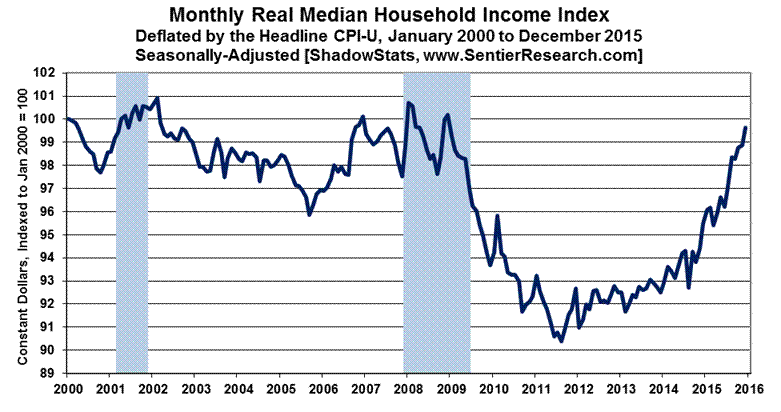
Shown first in Graph 13 is the latest monthly real median household income detail through December 2015, as reported February 29th by www.SentierResearch.com. The December detail does not reflect the recent benchmark revisions to the seasonally-adjusted CPI-U, used in deflating the series. That shall be updated in January 2016 reporting of monthly real median household income, which will include Sentier Research’s annual benchmark revisions to the series.
This measure of real monthly median household income generally can be considered as a monthly version of the annual detail shown in Graph 14, but the monthly specifics are generated from separate surveying and questioning by the Census Bureau.
On a monthly basis, when headline GDP purportedly started its solid economic recovery in mid-2009, the monthly household income number nonetheless plunged to new lows. Generally, the income series had been in low-level stagnation, with the recent uptrend in the monthly index boosted specifically by collapsing gasoline prices and related negative or flat headline consumer inflation. The index reached pre-recession levels in the December 2015 reporting, but it remains minimally below the pre-recession highs for both the formal 2007 and 2001 recessions. It should top out or turn down anew as consumer inflation rebounds in the months ahead.
Where lower gasoline prices have provided some minimal liquidity relief to the consumer, indications are that any effective extra cash generally has been used to pay down unsustainable debt or other obligations, not to fuel new consumption.
Differences in the Monthly versus Annual Median Household Income. That general pattern of relative historical weakness also has been seen in the headline reporting of the annual Census numbers, shown in Graph 14, with the latest 2014 real annual median household income at a ten-year low. The Sentier numbers had suggested a small increase in 2014 versus 2013 levels. Still, the monthly and annual series remain broadly consistent, although based on separate questions within the monthly Consumer Population Series (CPS), as conducted by the Census Bureau.
Where Sentier uses monthly questions surveying current annual household income, the headline annual Census detail is generated by a once-per-year question in the March CPS survey, as to the prior year’s annual household income.
Graph 13: Monthly Real Median U.S. Household Income through December 2015
Again, discussed in Commentary No. 752, the Census Bureau changed its annual income questionnaire for 2014, with the effect of boosting income reported in 2014. The details on changes between 2013 and 2014, however, also were available on a consistent and comparable basis, and the consistent aggregate annual percentage change of median household income in 2014, versus 2013, was applied to the otherwise consistent historical series to generate Graph 14.
Graph 14: Annual Real Median U.S. Household Income through 2014

In historical perspective from Graph 14, 2011, 2012 and 2013 income levels were below levels seen in the late-1960s and early-1970s, with the 2014 income level below the readings through most of the 1970s, aside from being at a ten-year low. Such indicates the long-term nature of the evolution of the major structural changes squeezing consumer liquidity and impairing the current economy (see related discussions in 2014 Hyperinflation Report—The End Game Begins and particularly 2014 Hyperinflation Report—Great Economic Tumble).
Consumer Confidence, Sentiment and Credit. The February 2016 reading for the Conference Board’s Consumer-Confidence measure (February 23rd) and for the full-February 2016 reading for the University of Michigan’s Consumer-Sentiment measure (February 26th) are shown in Graphs 15 to 17.
The sentiment and confidence indications are accompanied by the most-recent (soon-to-be-revised) readings on real third-quarter 2015 household-sector credit-market debt outstanding (Graph 18) and December 2015 consumer credit outstanding (Graph 19). New headline detail will be available in the week ahead for Graph 18 (March 10th) and Graph 19 (March 7th), and these series will be updated in the next Commentary No. 791 of March 11th.
For purposes of showing the Consumer Confidence and Consumer Sentiment measures on a comparable basis, Graphs 15 to 17 reflect both measures re-indexed to January 2000 = 100 for the monthly reading. Standardly reported, the Conference Board’s Consumer Confidence Index is set with 1985 = 100, while the University of Michigan’s Consumer Sentiment Index is set with January 1966 = 100.
The Conference Board’s seasonally-adjusted [unadjusted data are not available] Consumer-Confidence Index (Graph 15) and the University of Michigan’s not-seasonally-adjusted Consumer-Sentiment Index (Graph 16) both declined for the full-month of February 2016, where Confidence had increased for the month in January and Sentiment had declined.
Graph 15: Consumer Confidence to February 2016

Graph 16: Consumer Sentiment to February 2016
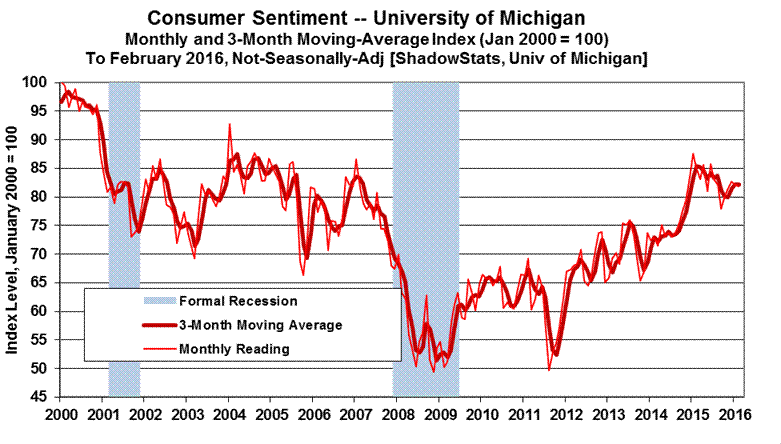
Both series continued to move lower or to hold off near-term peaks, though, smoothed for their three-month and six-month moving-average readings. The Confidence and Sentiment series tend to mimic the tone of headline economic reporting in the press (see discussion in Commentary No. 764), and often are highly volatile month-to-month, as a result. With increasingly-negative, headline financial and economic reporting and circumstances at hand and ahead, successive negative hits to both the confidence and sentiment readings remain likely to continue in the months ahead.
Smoothed for irregular, short-term volatility, the two series remain at levels seen typically in recessions. Suggested in Graph 17—plotted for the last 45 years—the latest readings of Confidence and Sentiment generally have not recovered levels preceding most formal recessions of the last four decades. Broadly, the consumer measures remain well below, or are inconsistent with, periods of historically-strong economic growth seen in 2014 and as indicated for second-and third-quarter 2015 GDP growth.
Graph 17: Comparative Confidence and Sentiment (6-Month Moving Averages) since 1970

Again, the last two graphs in this section address consumer borrowing. Debt expansion can help make up for a shortfall in income growth. Shown in Graph 18 of Household Sector, Real Credit Market Debt Outstanding, household debt declined in the period following the Panic of 2008, and it has not recovered, based on the Federal Reserve’s flow-of-funds accounting for third-quarter 2015.
The series includes mortgages, automobile and student loans, credit cards, secured and unsecured loans, etc., all deflated by the headline CPI-U. The level of real debt outstanding has remained stagnant for several years, reflecting, among other issues, lack of normal lending by the banking system into the regular flow of commerce.
The slight upturn seen in the series in the first two quarters of 2015, as also seen with the monthly median household income survey, was due partially to gasoline-price-driven, negative CPI inflation, which continues to impact the system. Nonetheless, third-quarter 2015 real debt outstanding declined minimally, reflecting a sharp slowing in quarterly consumer borrowing. Third-quarter activity also reflected surging student loans, as shown in the Graph 19.
Graph 18: Household Sector, Real Credit Market Debt Outstanding through Third-Quarter 2015

Graph 19: Nominal Consumer Credit Outstanding through December 2015
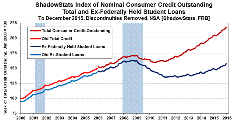
Shown through December 2015 reporting, Graph 19 of monthly Consumer Credit Outstanding is a subcomponent of Graph 18 on real Household Sector debt, but Graph 19 is not adjusted for inflation. Post-2008 Panic, outstanding consumer credit has continued to be dominated by growth in federally-held student loans, not in bank loans to consumers that otherwise would fuel broad consumption or housing growth. Although in slow uptrend, the nominal level of Consumer Credit Outstanding (ex-student loans) has not recovered since the onset of the recession. These disaggregated data are available and plotted only on a not-seasonally-adjusted basis, with December 2015 levels reflecting seasonal gains in a not-seasonally-adjusted series.
[The Reporting Detail section includes additional detail and graphs on Labor Conditions,
the Trade Deficit and Construction Spending.]
__________
HYPERINFLATION WATCH
MONETARY CONDITIONS—WARNING SIGNAL ON THE ECONOMY
Annual M3 Growth Continued to Sink in February 2016, With M1 Growth Falling to Economic-Collapse Levels. Discussed in the opening paragraphs of these Opening Comments, significant slowing in year-to-year money supply growth has hit levels not seen since the economic collapse. Such raises the issue of a pending signal—if not already in hand—of an intensifying economic downturn.
Reference is made to Graph 14 on page 23 of Commentary No. 787, and the related discussion on inflation-adjusted real year-to-year change in monthly M3 (ShadowStats Ongoing M3 Measure, post-February 2006). Real annual growth falling below zero usually signals pending recession, and such a signal is likely within the next two months, although ShadowStats contends the economy never recovered from the headline downturn that is timed formally from December 2007.
Discussed in the opening paragraphs, February 2016 saw the pace of annual money growth slow across the board, with increasingly-extreme patterns in M1 and M3, respectively the narrowest and broadest measures of what once was the headline money supply. The seasonally-adjusted level of M1 (basically cash and checking accounts, basic systemic liquidity) had been stagnant since November 2015, with the annual-growth rate for the series now down to 3.5%, from its post-recession peak of 20.6% in September 2011. That reading was the lowest level seen since the economy was in free-fall in August 2008. In 2008, however, annual M1 growth was on the rise. M1 annual growth dropping to 3.5% has not been seen since March of 2005, at the early onset of the housing and economic collapse.
In February 2016, annual growth in the broadest measure of the money supply, M3, dropped to a two-year low of 3.6%, the weakest showing since February 2014, and down from a post-recession peak of 5.9% in August 2015. In 2014, however, annual M3 growth was on the rise. M3 annual growth dropping to 3.6% or below has not been seen since September 2009, just following the headline trough of the economic collapse. Often moving in opposite directions, annual growth rates in M1 and M3 have not been this weak together since the “non-recession” slowdown of the mid-1990s.
Headline Details. The early estimate of the year-to-year change in the ShadowStats Ongoing M3 Money Supply Measure was 3.6% in February 2016, down from a revised 3.9% [previously up by 3.8%] in January 2016 and an unrevised 4.3% in December 2013. The annual change has been in continual month-to-month slowing since the near-term peak growth of 5.9% in August 2015, as seen in Graph 20.
On a month-to-month basis, February 2016 M3 rose by 0.4%, following an unrevised 0.3% gain in January and a revised 0.1% increase [previously “unchanged” at 0.0%] in December.
Graph 20: Comparative Money Supply M1, M2 and M3 Year-to-Year Changes through February 2016
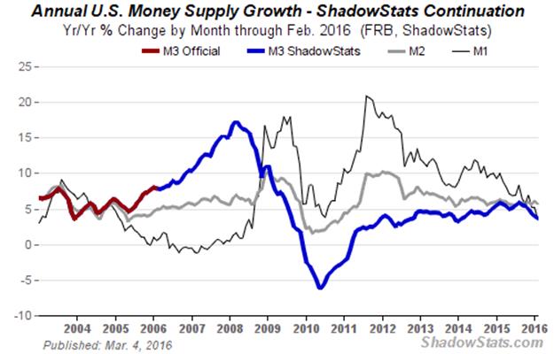
The relative weakness in annual M3 growth versus M2 reflects continued flight of funds from accounts included just in M3 (in terms of year-to-year activity), such as large time deposits and institutional money funds, into accounts in M2. Following are February 2016 year-to-year and month-to-month changes for the narrower M1 and M2 measures (M2 includes M1; M3 includes M2). See the Money Supply Special Report for full definitions of those measures. Again, the latest estimates of level and annual growth for February 2016 M3, M2 and M1, and for earlier periods are available on the Alternate Data tab of www.ShadowStats.com.
Annual M2 growth in February 2016 eased to 5.7%, from unrevised annual gains of 6.1% in January 2016 and 5.7% in December 2015, with a month-to-month increase of 0.4% in February 2016 and unrevised gains of 1.0% in January and 0.3% in December 2015.
For M1, year-to-year growth slowed to 3.5% in February 2016, down from revised annual growth of 5.2% [previously 5.5%] in January 2016 and unrevised annual growth of 5.3% in December 2015, with a month-to-month “unchanged” at 0.0% in February 2016, following a revised gain of 0.3% [previously up by 0.6%] in January 2016 and an unrevised monthly decline of 0.2% (-0.2%) in December 2015.
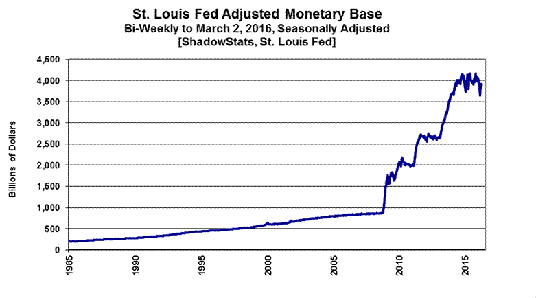
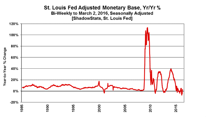
Monetary Base Appears to be Stabilizing Post-FOMC Rate-Hike. Following up on prior Commentary No. 783, No. 779, No.779-A, and No. 784 the St. Louis Fed’s monetary base appears to have stabilized both in terms of level and annual growth rate as of the two-week period ended March 2nd.
Graphs 21 and 22 show reporting of the St. Louis Fed’s Monetary Base for the two-week period ended March 2nd, with the level of $3.912 trillion, versus $3.924 trillion as of February 17th. Year-to-year growth was a decline of 0.3% (-0.3%), versus a 2.5% annual gain in the prior period. Those measures all are within the range of normal volatility.
Late in 2014, the Federal Reserve ceased net new purchases of U.S. Treasury securities as part of its quantitative easing QE3, but its outright holdings of Treasury securities have remained stable at $2.5 trillion, rolling over maturing issues. Discussed in the previously-referenced Commentaries, where the monetary base during the last year had been plus-or-minus 5% around the St. Louis Fed’s estimated 12-month average of $4.0 trillion, that range was broken to the downside only once, in the immediate post-FOMC period ended January 6th, again, due largely to related New York Fed activities.
Graph 21: Monetary Base Level, Bi-Weekly through March 2, 2016
Graph 22: Monetary Base, Year-to-Year Percent Change, through March 2, 2016
HYPERINFLATION OUTLOOK SUMMARY
(The latest version is in Commentary No. 783.)
__________
REPORTING DETAIL
EMPLOYMENT AND UNEMPLOYMENT (February 2016)
Headline February Household- and Payroll-Survey Details Were Nonsense. [Note: This section, through the PAYROLL SURVEY DETAIL, largely is repeated from the Opening Comments.] Underlying reality for U.S. labor conditions in February 2016 was in the realm of a 22.8% broad unemployment rate, with headline monthly payroll employment change likely flat, plus-or-minus, month-to-month and year-to-year growth slowing sharply, as reviewed in the main text.
Discussed in Commentary No. 784 and Commentary No. 784-A, last month’s annual benchmark revisions to the Payroll-Employment or Establishment Survey were negative, and the February headline payroll detail was published in the context of those revisions, with renewed and exaggerated upside monthly biases now being added into the headline monthly detail by the Bureau of Labor Statistics (BLS). BLS use of the Birth-Death Model (BDM) artificially inflates headline month-to-month payroll gains with add-factors that currently exceed 200,000 jobs per month (see the discussion in the Birth-Death/Bias-Factor Adjustment section).
The second major problem with the payroll estimates, as well as particularly with the unemployment-related detail, is the lack of historical comparability of the seasonally-adjusted monthly headline numbers. Such results from the BLS using concurrent seasonal adjustment factors, a process that revises the last five years of seasonally-adjusted headline data, each and every month, but where BLS does not publish the revised historical data (see the discussion in Headline Distortions from Shifting Concurrent-Seasonal Factors section).
On the Household-Survey side, data-quality was worse than usual in February, as discussed in the opening paragraphs of the Opening Comments. Otherwise warped by last’s month’s revised population estimates, and a return to non-comparability of the month-to-month, seasonally-adjusted Household-Survey detail, the unemployment/employment data were nonsense in the extreme, exaggerated again by non-comparable headline monthly details, as referenced in the previous paragraph.
Unemployment. Looking at headline detail, the U.3 unemployment rate (Household-Survey) held at 4.9% in February 2016, the same as in January 2016. The broader U.6 unemployment measure, encompassing those “marginally attached” to the workforce, eased to 9.7% in February from 9.9% in January. Adding back into the total unemployed and labor force the ShadowStats estimate of the ever-growing ranks of long-term discouraged workers—effectively displaced workers—the ShadowStats-Alternate Unemployment Estimate notched lower to 22.8% in February 2016, from 22.9% in January.
Payrolls. In the context of heavy upside biases and shifting seasonal-factors inconsistencies, nonfarm payroll activity increased to a headline monthly gain of 242,000 jobs in February 2016, up from a revised 172,000 [previously 151,000] gain in January 2016 and a revised gain in December 2015 of 271,000 (a number the BLS knows to be wrong). With the aggregate, monthly upside biases added into these numbers in excess of 200,000 jobs, the actual February 2016 headline payroll change most likely was flat, plus-or-minus. On a not-seasonally-adjusted basis, year-to-year annual growth in February 2016 held at a twenty-month-low reading of 1.9%.
PAYROLL SURVEY DETAIL. The Bureau of Labor Statistics (BLS) published the headline payroll-employment detail for February 2016 on March 4th, in the context of last month’s downside revisions to payroll activity (see Commentary No. 784 and Commentary No. 784-A). Seasonally-adjusted, the headline payroll gain for February 2016 was 242,000 jobs +/- 129,000 [more appropriately +/- 300,000] at a 95% confidence interval. That followed a revised headline gain of 172,000 jobs [previously up by 151,000] in January, and a revised gain of 271,000 [previously benchmarked to 262,000] in December.
Not-seasonally-adjusted, year-to-year growth in nonfarm payrolls held at 1.91% in February 2016, unchanged from a revised 1.91% [previously 1.89%] in January 2016, still a twenty-month low. December 2015 and November 2015 both were unrevised, holding at their benchmarked annual growth rates of 1.97% [also up by 1.91% pre-benchmark for both months].
Confidence Intervals. Where the current employment levels have been spiked by misleading and inconsistently-reported concurrent-seasonal-factor adjustments, the reporting issues suggest that a 95% confidence interval around the modeling of the monthly headline payroll gain should be well in excess of +/- 200,000, instead of the official +/- 129,000. Even if the data were reported on a comparable month-to-month basis, other reporting issues would prevent the indicated headline magnitudes of change from being significant. Encompassing Birth-Death Model biases, the confidence interval more appropriately should be in excess of +/- 300,000.
Construction-Payroll Growth Has Slowed. Graph 33 of revised Construction Payroll Employment through February 2016 is found in the Construction Spending segment, which follows in this Reporting Detail. In theory, construction payroll levels should move closely with the inflation-adjusted aggregate construction spending series and the Housing Starts series (the latter measured in units rather than dollars).
Headline month-to-month growth in construction employment was 0.2% in February 2016, versus a revised 0.2% [previously up by 0.3%] in January 2016, versus an unrevised benchmarked 0.7% [pre-benchmark also up by 0.7%] gain in December 2015. The pace monthly of growth has continued, but slowed, along with most headline construction activity and real construction spending having started to turn down or stagnate.
The February 2016 construction-payroll level of 6.631 million, showed a headline gain of 19,000 for the month. That followed a revised 15,000 [previously 18,000] monthly jobs gain for January and an unrevised benchmarked headline monthly gain was 48,000 [pre-benchmark up by 45,000] in December.
Headline construction-payroll numbers remain heavily biased to the upside (officially bloated by 6,400 jobs per month, unofficially at an order of magnitude of 20,000 jobs per month). Nonetheless, total February 2016 construction jobs remained down by 14.2% (-14.2%) from the April 2006 pre-recession series peak, but was up by an unadjusted 4.0% from the year-ago February 2015.
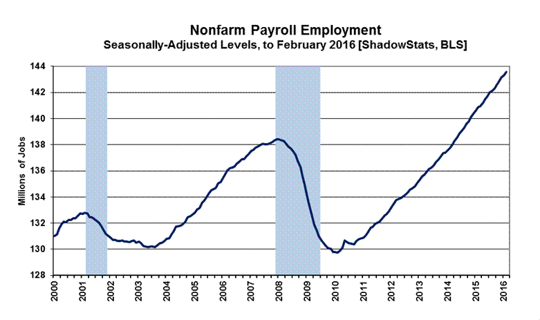
Historical Payroll Levels. Payroll employment is a coincident indicator of economic activity, and irrespective of all the reporting issues with the series, payroll employment formally regained its pre-recession high in 2014, despite the GDP purportedly having done the same somewhat shy of three years earlier, back in 2011. Reflected in the next two graphs, headline payroll employment moved to above its pre-recession high in May 2014, as of the 2015 benchmarking. Previously that had been April 2014, as of the 2014 benchmarking. Payroll employment has continued to rise since. Including the headline jobs gain of 242,000 in February 2016, headline payroll employment now is about 5.1-million jobs above its pre-recession peak.
Graphs 23 and 24 show the revised headline payroll series, both on a shorter-term basis, since 2000, and on a longer-term historical basis, from 1945. In perspective, the longer-term graph of the headline payroll-employment levels shows the extreme duration of what had been the official non-recovery in payrolls, the worst such circumstance of the post-Great Depression era.
Graph 23: Nonfarm Payroll Employment to February 2016
Graph 24: Nonfarm Payroll Employment 1945 to February 2016

Beyond excessive upside add-factor biases built into the monthly calculations (see the Birth-Death Model section), the problem remains that payroll employment counts the number of jobs, not the number of people who are employed. Much of that payroll “jobs” growth is in multiple part-time jobs—many taken on for economic reasons—where full-time employment has been desired but could not be found.
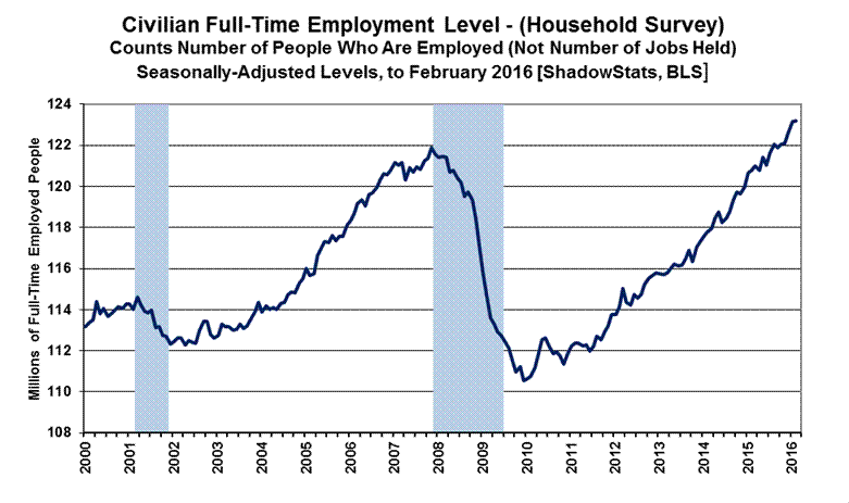
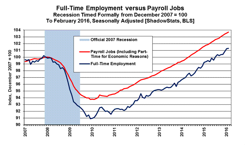
Full-Time Employment versus Part-Time Payroll Jobs. Shown in Graph 25, the level of full-time employment (Household Survey) recovered its pre-recession high in August 2015, at least temporarily. Headline February 2016 detail now stands at roughly 1.3 million above the pre-recession high for the series, thanks in particular to the irregularly-volatile gains of recent months (see the opening paragraphs of the Opening Comments). That will gyrate further in the next several months, likely to drop from the current headline level.
Such compares with the headline payroll-employment level that now is 5.1-million above its pre-recession high, having regained its peak some 22-months ago. Again, the payroll count is of jobs, not people, where much of that payroll “jobs” growth has been in part-time, and in multiple part-time jobs, many taken on for economic reasons, where full-time employment was desired but could not be found.
As a separate consideration and an indication of the level of nonsensical GDP reporting, where employment traditionally is a coincident indicator of broad economic activity, again the GDP purportedly recovered its pre-recession high some four years ago, more than two years before similar payroll activity, and more than four years before the likely-temporary, current recovery in full-time employment.
Graph 25: Full-Time Employment (Household Survey) to February 2016
Graphs 26 and 27 plot comparisons of activity in full-time employment versus payroll jobs, post-economic collapse. Full-time employment was hit hardest, with headline employment “recovery” coming largely from individuals having to settle for part-time work.
Graph 26: Full-Time Employment (Household Survey) versus Jobs Count (Payroll Survey)
Graph 27: Full-Time Employment (Household Survey) versus Jobs Count (Payroll Survey), Year-to-Year

Headline month-to-month volatility in the full-time employment reporting is more a function of the instabilities from the non-comparability of the headline, seasonally-adjusted monthly data (see the discussion in the Headline Distortions from Shifting Concurrent Seasonal Factors section) and the current population upside revision, than it is as an indicator of actual month-to-month volatility in economic activity.
The graph of full-time employment excludes the count of those employed with only part-time jobs, one or more. Total employment, including those employed with part-time work, has recovered its pre-recession high, but it still is not close to the payroll reporting. Again, the Household-Survey numbers count the number of people who have at least one job. The Payroll Survey simply counts the number of jobs (see Commentary No. 686 for further detail).
Annual Percent Changes in Headline Payrolls—Continued Slow Growth. Not-seasonally-adjusted, year-to-year change in payroll employment is untouched by the concurrent-seasonal-adjustment issues, so the monthly comparisons of year-to-year change at least are reported on a consistent basis.
With the 2015 benchmarking in place, year-to-year growth in unadjusted payrolls generally the post-recession peak growth stood at 2.29% [pre-benchmark 2.39%] in February 2015 as reflected in the headline detail of Graphs 28 and 29. Such remains the strongest annual growth since June 2000 (another recession), but subsequent annual growth has slowed. Year-to-year nonfarm payroll growth in February 2016 was 1.91%, the same as the revised annual growth of 1.91% [previously up by 1.89%] in January 2016, versus an unrevised 1.97% benchmarked growth rate of December 2015. The new February (and revised January) 2016 readings were the weakest annual growth rates in the last twenty months (since June 2014).
With bottom-bouncing patterns of recent years, current headline annual growth has recovered from the post-World War II record benchmarked decline of 5.01% (-5.01%) seen in August 2009, as shown in the accompanying graphs. That decline remains the most severe annual contraction since the production shutdown at the end of World War II [a trough of a 7.59% (-7.59%) annual contraction in September 1945]. Disallowing the post-war shutdown as a normal business cycle, the August 2009 annual decline was the worst since the Great Depression.
[Graphs 28 and 29 follow on the next page]
Graph 28: Payroll Employment, Year-to-Year Percent Change, to February 2016

Graph 29: Payroll Employment, Year-to-Year Percent Change, 1945 to February 2016

Headline Distortions from Shifting Concurrent-Seasonal Factors. Discussed and graphed here, with extended commentary and the latest detail available from ShadowStats affiliate ExpliStats, there are serious and deliberate flaws with the government’s seasonally-adjusted, monthly reporting of both employment and unemployment. Each month, the BLS uses a concurrent-seasonal-adjustment process to adjust both the payroll and unemployment data for the latest seasonal patterns. As new headline data are seasonally-adjusted for each series, the re-adjustment process also revises the monthly history of each series. A new seasonally-adjusted history is recalculated for every month, going back five years, so as to be consistent with the new seasonal patterns generated for the current headline number.
Effective Reporting Fraud. The problem remains that the BLS does not publish the monthly historical revisions along with the new headline data. As a result, current headline reporting is neither consistent nor comparable with prior data, and the unreported actual monthly variations versus headline detail can be meaningfully large. The deliberately-misleading reporting effectively is a fraud. The problem is not with the BLS using concurrent-seasonal-adjustment factors; it is with the BLS not publishing consistent data, where those data are calculated each month and are available internally to the Bureau.
Household Survey. Circumstances here are highlighted in the opening paragraphs of today’s Opening Comments. In the case of the published Household Survey (unemployment rate and related data), the seasonally-adjusted headline numbers usually are not comparable with the prior monthly data or any month before. Accordingly, the published headline detail as to whether the unemployment rate was up, down or unchanged in a given month is not meaningful, and what actually happened is not knowable by the public. Month-to-month comparisons of these popular numbers are of no substance, other than for market hyping or political propaganda. The headline month-to-month reporting in the Household Survey is made consistent only in the once-per-year reporting of December data, with annual revisions back for five years. All historical comparability disappears, though, with the ensuing headline January reporting, and with each monthly estimate thereafter.
Payroll or Establishment Survey. In the case of the published Payroll Survey data (payroll-employment change and related detail), monthly changes in the seasonally-adjusted headline data are comparable only with the prior month’s reporting, not before. Due to the BLS modeling process, the historical data never are published on a consistent basis, even with publication of the annual benchmark revision (see the comments on Graph 30).
Where the BLS does provide modeling detail for the Payroll Survey, allowing for third-party calculations, no such accommodation has been made for the Household Survey. Again, ShadowStats affiliate ExpliStats does such third-party calculations for the payroll series, and the resulting detail of the differences between the current headline reporting and the constantly-shifting, consistent and comparable history are reflected here in Graph 30.
Consider in the latest headline (and benchmarked) payroll detail that the February 2016 data were comparable only with the headline changes in the January 2016 numbers, not with December 2015 or any earlier months. Per BLS headline reporting, seasonally-adjusted February 2016 payrolls rose month-to-month by 242,000 from January, while January payrolls rose by 172,000 from December, and December payrolls rose by 271,000 from November. That headline December monthly gain was not accurate and not comparable with the headline details for February and January, because the November payroll level was not adjusted for the new seasonal adjustments. Had the BLS revised headline November reporting to be on a consistent basis with the headline reporting, the November-to-December change would have been a comparable gain of 265,000, instead of the purported 271,000 increase. In like manner, the current headline gain of 280,000 for November 2015 versus October, really was 273,000 in the latest calculations.
The differences go both ways and often are larger, as was seen in the case of November 2014, coming out of the 2014 benchmark revision. That particular incident is detailed at the ExpliStats link, and it was discussed in the Opening Comments of Commentary No. 784.
Graph 30: Concurrent-Seasonal-Factor Irregularities - Headline Detail in February 2016 versus 2015 Benchmark

Graph 30 details how far the monthly payroll employment data already have strayed from being consistent with the actual, most-recent benchmark revision, which was in October but not published. The revised series is run in the background in October, November and December, with January being the first month where the new numbers are published. Yet, at that point, the headline detail already has three months of inconsistent seasonal adjustments in play; February makes that four. If the historical data were consistent with the headline reporting, the dark blue line would be flat and at zero.
The difference seen between the red (January) and blue (February) lines at February 2014, indicates meaningful shifts in the seasonal factors for the current headline reporting in 2016. The shifts can go either way, but the surviving headline detail is not consistent and not accurate based on detail available within the BLS.
Again, if the headline monthly payroll-employment reporting were comparable and stable, month-after-month, all the lines in Graph 30 would be flat and at zero.
Birth-Death/Bias-Factor Adjustment. Despite the ongoing, general overstatement of monthly payroll employment, the BLS adds in upside monthly biases to the payroll employment numbers. The continual overstatement is evidenced usually by regular and massive, annual downward benchmark revisions (2011 and 2012 and 2014 excepted). Even with the just-published downside revision of 206,000 (-206,000) to March 2015 payrolls in the 2015 benchmarking (see Commentary No. 784 and Commentary No. 784-A), the BLS upped its annual upside bias factors by 160,000 jobs. Such discrepancies, however, are not unusual.
Discussed in the benchmark detail of Commentary No. 598, the regular benchmark revision to March 2013 payroll employment was to the downside by 119,000 (-119,000), where the BLS had overestimated standard payroll employment growth.
With the March 2013 revision, though, the BLS separately redefined the Payroll Survey so as to include 466,000 workers who had been in a category not previously counted in payroll employment. The latter event was little more than a gimmicked, upside fudge-factor, used to mask the effects of the regular downside revisions to employment surveying, and likely was the excuse behind an increase then in the annual bias factor, where the new category could not be surveyed easily or regularly by the BLS. Elements here likely had impact on the unusual issues with the 2014 benchmark revision.
Abuses from the 2014 benchmarking were detailed in Commentary No. 694 and Commentary No. 695. With the headline benchmark revision for March 2014 showing understated payrolls of 67,000 (-67,000), the BLS upped its annual add-factor bias by 161,000 for the year ahead.
Historically, the upside-bias process was created simply by adding in a monthly “bias factor,” so as to prevent the otherwise potential political embarrassment to the BLS of understating monthly jobs growth. The “bias factor” process resulted from such an actual embarrassment, with the underestimation of jobs growth coming out of the 1983 recession. That process eventually was recast as the now infamous Birth-Death Model (BDM), which purportedly models the relative effects on payroll employment of jobs creation due to new businesses starting up, versus jobs lost due to bankruptcies or closings of existing businesses.
February 2016 Add-Factor Bias. The not-seasonally-adjusted January 2016 bias was a negative monthly add-factor of 233,000 (-233,000), versus a revised negative add-factor of 16,000 (-16,000) [previously a negative 23,000 (-23,000)] in December 2015, and a negative add-factor of 275,000 (-275,000) in January 2015.
The revamped, aggregate upside bias for the trailing twelve months through February 2016 was 911,000, up by 130,000 or 16.7% from 781,000 in December 2015 (revised March 2015 was imputed proportionately based on the other revisions). That is a rough, monthly average of 75,900 in February 2016 (versus 65,100 pre-2015 benchmarking) jobs created out of thin air, on top of some indeterminable amount of other jobs that are lost in the economy from business closings. Those losses simply are assumed away by the BLS in the BDM, as discussed below.
Problems with the Model. The aggregated upside annual reporting bias in the BDM reflects an ongoing assumption of a net positive jobs creation by new companies versus those going out of business. Such becomes a self-fulfilling system, as the upside biases boost reporting for financial-market and political needs, with relatively good headline data, while often also setting up downside benchmark revisions for the next year, which traditionally are ignored by the media and the politicians. The BLS cannot measure meaningfully the impact of jobs loss and jobs creation from employers starting up or going out of business, on a timely basis (within at least five years, if ever), or by changes in household employment that were incorporated into the 2015 redefined payroll series. Such information simply is guesstimated by the BLS, along with the addition of a bias-factor generated by the BDM.
Positive assumptions—commonly built into government statistical reporting and modeling—tend to result in overstated official estimates of general economic growth. Along with these happy guesstimates, there usually are underlying assumptions of perpetual economic growth in most models. Accordingly, the functioning and relevance of those models become impaired during periods of economic downturn, and the current, ongoing downturn has been the most severe—in depth as well as duration—since the Great Depression.
Indeed, historically, the BDM biases have tended to overstate payroll employment levels—to understate employment declines—during recessions. There is a faulty underlying premise here that jobs created by start-up companies in this downturn have more than offset jobs lost by companies going out of business. Recent studies have suggested that there has been a net jobs loss, not gain, in this circumstance. Nonetheless, if a company fails to report its payrolls because it has gone out of business (or has been devastated by a hurricane), the BLS assumes the firm still has its previously-reported employees and adjusts those numbers for the trend in the company’s industry.
The presumed net additional “surplus” jobs created by start-up firms are added on to the payroll estimates each month as a special add-factor. On top of that, the monthly BDM add-factors have been increased now to an average of 75,900 jobs per month for the current year. As a result, in current reporting, the aggregate average overstatement of employment change easily exceeds 200,000 jobs per month (the underlying positive base-assumption upside bias, plus the monthly Birth-Death Model add-factor).
HOUSEHOLD SURVEY DETAIL. Noted in the opening paragraphs of the Opening Comments, the headline bloating of the monthly gain in “employed” in conjunction with the seasonally-adjusted monthly Household-Survey detail not being reported on a comparable month-to-month basis were particular egregious in January and February. This was due to BLS reporting practices with its use of concurrent seasonal factors (see Headline Distortions from Shifting Concurrent-Seasonal Factors).
Separately, detailed in Commentary No. 669, significant issues as to falsification of the data gathered in the monthly Current Population Survey (CPS), conducted by the Census Bureau, have been raised in the press and investigated by the House Committee on Oversight and Government Reform and the U.S. Congress Joint Economic Committee. Further investigation purportedly is underway in Congress. CPS is the source of the Household Survey used by the BLS in estimating monthly unemployment, employment, etc. Accordingly, the statistical significance of the headline reporting detail here is open to serious question.
Headline Unemployment Rates. At the first decimal point, the headline February 2016 unemployment rate (U.3) held at 4.9%, versus 4.9% in January 2016. The same held true at the second decimal point, with headline February 2016 U.3 at 4.92%, versus 4.92% in January. Technically, the “unchanged” change in the headline February U.3 versus January U.3 was statistically-insignificant. The headline “unchanged” in U.3 also is without meaning, given that the seasonally-adjusted, month-to-month details simply are not comparable, as just discussed.
On an unadjusted basis, however, the unemployment rates are not revised and are consistent in post-1994 reporting methodology. The unadjusted U.3 unemployment rate eased to 5.19% in February 2016 from 5.28% in January 2016.
Discussed previously in the opening paragraphs of the Opening Comments, the unchanged seasonally-adjusted, headline February 2016 U.3 unemployment rate reflected highly unusual, perfectly-offsetting and proportional surges in the seasonally-adjusted levels of employment, unemployment and the labor force, with headline employed jumping by a nonsensical 530,000 people in the month, coincident with an equally inconsistent jump of 24,000 unemployed people.
What most almost certainly was at work here is the non-comparability of the adjusted headline monthly data, with the result that the headline month-to-month changes in everything from the employed and unemployed counts to the Employment-to-Population Ratio and Participation Rate simply were meaningless (again, see the opening paragraphs of the Opening Comments).
New discouraged and otherwise marginally-attached workers always are moving into U.6 unemployment accounting from U.3, while those who have been discouraged for one year, continuously are dropped from the U.6 measure. As a result, the U.6 measure has been easing along with U.3, for a while, but those being pushed out of U.6 still are counted in the ShadowStats-Alternate Unemployment Estimate, which has remained relatively stable.
U.6 Unemployment Rate. The broadest unemployment rate published by the BLS, U.6 includes accounting for those marginally attached to the labor force (including short-term discouraged workers) and those who are employed part-time for economic reasons (i.e., they cannot find a full-time job).
Despite the unchanged, underlying seasonally-adjusted U.3 rate, and zero change in the adjusted number of people working part-time for economic reasons, a decline in those marginally attached to the workforce (including short-term discouraged workers) fell for the month, and the headline February 2016 U.6 unemployment declined to 9.71% from 9.89% in January 2016. The unadjusted U.6 unemployment rate was at 10.07% in February 2016, versus 10.54% in January 2016.
“Short-Term” Discouraged Workers. The count of short-term discouraged workers in February 2016 (never seasonally-adjusted) declined by 24,000 (-24,000) to 599,000, from 623,000 in January 2016, where the total, short-term marginally-attached discouraged workers declined by 286,000 (-286,000) to 1,803,000 in February 2016, from 2,089,000 in January 2016. The latest, official “discouraged” number reflected the flow of the headline unemployed—giving up looking for work—leaving the headline U.3 unemployment category and being rolled into the U.6 measure as short-term “marginally-attached discouraged workers,” net of the further increase in the number of those moving from short-term discouraged-worker status into the netherworld of long-term discouraged-worker status.
It is the displaced workers—the long-term discouraged-worker category—that defines the ShadowStats-Alternate Unemployment Measure. There is a continuing rollover from the short-term to the long-term category, with the ShadowStats measure encompassing U.6 and the short-term discouraged workers, plus the long-term discouraged workers. In 1994, “discouraged workers”—those who had given up looking for a job because there were no jobs to be had—were redefined so as to be counted only if they had been “discouraged” for less than a year. This time qualification defined away a large number of long-term discouraged workers. The remaining redefined short-term discouraged and redefined marginally-attached workers were included in U.6.
ShadowStats Alternate Unemployment Estimate. Adding back into the total unemployed and labor force the ShadowStats estimate of the still-growing ranks of excluded, long-term discouraged workers—a broad unemployment measure more in line with common experience—the ShadowStats-Alternate Unemployment Estimate eased to 22.8% in February 2016, from 22.9% in January 2016, pulling even with the near-term low of the series seen last in October 2015.
Again, the ShadowStats unemployment estimate generally shows the toll of long-term unemployed leaving the headline labor force—effectively becoming displaced workers—as discussed in greater detail in the following section.
SHADOWSTATS-ALTERNATE UNEMPLOYMENT RATE MEASURE. In 1994, the Bureau of Labor Statistics (BLS) overhauled its system for estimating unemployment, including changing survey questions and unemployment definitions. In the new system, measurement of the previously-defined discouraged workers disappeared. These were individuals who had given up looking for work, because there was no work to be had. These people, who considered themselves unemployed, had been counted in the old survey, irrespective of how long they had not been looking for work. These were individuals who would be considered displaced workers, due to circumstances of severely-negative economic conditions or other factors such as changing industrial patterns resulting from shifting global trade patterns.
The new survey questions and definitions had the effect of minimizing the impact on unemployment reporting for those workers about to be displaced by the just-implemented North American Free Trade Agreement (NAFTA). At the time, I had close ties with an old-line consumer polling company, whose substantial economic monthly surveys were compared closely with census-survey details. The new surveying changed the numbers, and what had been the discouraged-worker category soon became undercounted or effectively eliminated. Change or reword a survey question, and change definitions, you can affect the survey results meaningfully.
The post-1994 survey techniques also fell far shy of adequately measuring the long-term displacement of workers tied to the economic collapse into 2008 and 2009, and from the lack of subsequent economic recovery. In current headline reporting, the BLS has a category for those not in the labor force who currently want a job. Net of the currently-defined “marginally attached workers,” which includes the currently-defined and undercounted “discouraged workers” category used in the U.6, those not in the labor force currently wanting a job rose to 4.146 million in February 2016, from 4.077 million in January 2016, from 3.872 million in December 2015 and 3.608 million in November 2015 (those numbers are counted only on an unadjusted basis). While some will contend that that number includes all those otherwise-uncounted discouraged workers, such is far shy of underlying reality.
The ShadowStats number—a broad unemployment measure more in line with common experience—is my estimate. The approximation of the ShadowStats “long-term discouraged worker” category—those otherwise largely defined out of statistical existence in 1994—reflects proprietary modeling based on a variety of private and public surveying over the last two-plus decades. Beyond using the BLS U.6 estimate as an underlying monthly base, I have not found a way of accounting fully for the current unemployment circumstance and common experience using just the monthly headline data from the BLS.
Some broad systemic labor measures from the BLS, though, are consistent in pattern with the ShadowStats measure, even allowing for shifts tied to an aging population. Shown in the Opening Comments, the graph of the inverted ShadowStats unemployment measure has a strong correlation with the employment-to-population ratio, in conjunction with the labor-force participation rate, as well as with the ShadowStats-Alternate GDP Estimate and S&P 500 Real Revenues (see No. 777 Year-End Special Commentary) and the CASS Freight Index. Those economic- and labor-related series all are plotted subsequent to the 1994 overhaul of unemployment surveying (see Graphs 3 to 8).
Headline February 2016 Detail. Adding back into the total unemployed and labor force the ShadowStats estimate of long-term discouraged workers—effectively workers displaced by severe economic contractions and/or shifting trade patterns that have relocated industries—the February 2016 ShadowStats-Alternate Unemployment Estimate notched lower to 22.8%, from 22.9% in January 2016. The February reading also matched the prior near-term low reading of 22.8% in October 2015, and was down by 50 basis points or 0.5% (-0.5%) from the 23.3% series high last seen in December 2013.
Again, in contrast, the February 2016 headline U.3 unemployment reading of 4.9% held at the lowest level since February 2008, down by 510 basis points or 5.1% (-5.1%) from its peak of 10.0% in October 2009. The broader U.6 unemployment measure, including those marginally attached to the workforce (including short-term discouraged workers) and those working part-time for economic reasons, eased to 9.7% in February 2016, down from its April 2010 peak of 17.2% by 750 basis points or 7.5% (-7.5%).
Seen in the usual graph of the various unemployment measures (Graph 2 in the Opening Comments), there continues to be a noticeable divergence in the ShadowStats series versus U.6 and U.3, with the headline BLS headline unemployment measures heading lower against a currently-stagnant, high-level ShadowStats number.
The reason for this is that U.6, again, only includes discouraged and marginally-attached workers who have been “discouraged” for less than a year. As the discouraged-worker status ages, those that go beyond one year fall off the government counting, even as new workers enter “discouraged” status. A similar pattern of U.3 unemployed becoming “discouraged” or otherwise marginally attached, and moving into the U.6 category, also accounted for the early divergence between the U.6 and U.3 categories.
With the continual rollover, the flow of headline workers continues into the short-term discouraged workers category (U.6), and from U.6 into long-term discouraged worker or displaced-worker status (the ShadowStats measure). There was a lag in this happening as those having difficulty during the early months of the economic collapse, first moved into short-term discouraged status, and then, a year later they began moving increasingly into long-term discouraged status, hence the lack of earlier divergence between the series. The movement of the discouraged unemployed out of the headline labor force had been accelerating. While there is attrition in long-term discouraged numbers, there is no set cut off where the long-term discouraged workers cease to exist. See the Alternate Data tab for historical detail.
Generally, where the U.6 largely encompasses U.3, the ShadowStats measure encompasses U.6. To the extent that a decline in U.3 reflects unemployed moving into U.6, or a decline in U.6 reflects short-term discouraged workers moving into the ShadowStats number, the ShadowStats number continues to encompass all the unemployed, irrespective of the series from which they may have been ejected.
Great Depression Comparisons. Discussed in these regular Commentaries covering the monthly unemployment circumstance, an unemployment rate around 23% might raise questions in terms of a comparison with the purported peak unemployment in the Great Depression (1933) of 25%. Hard estimates of the ShadowStats series are difficult to generate on a regular monthly basis before 1994, given meaningful reporting inconsistencies created by the BLS when it revamped unemployment reporting at that time. Nonetheless, as best estimated, the current ShadowStats level likely is about as bad as the peak actual unemployment seen in the 1973-to-1975 recession and the double-dip recession of the early-1980s.
The Great Depression peak unemployment rate of 25% in 1933 was estimated well after the fact, with 27% of those employed then working on farms. Today, less than 2% of the employed work on farms. Accordingly, a better measure for comparison with the ShadowStats number might be the Great Depression peak in the nonfarm unemployment rate in 1933 of roughly 34% to 35%.
U.S. TRADE BALANCE (January 2016)
Nominal 2015 Deficit Widened in Revision; Real First-Quarter 2016 Merchandise Trade-Deficit on Track for Worst Showing Since 2007. With the initial estimate of the inflation-adjusted real January 2016 merchandise trade deficit in hand, reporting of the first-quarter 2016 real merchandise trade deficit is on an early track for the worst quarterly trade shortfall since third-quarter 2007 (see Graph 1 in the Opening Comments). That position currently still is held by the just-revised real merchandise quarterly trade shortfall for fourth-quarter 2015. Where the fourth-quarter deficit narrowed some in revision, in line with the first revision to fourth-quarter 2015 GDP, the new January 2016 trade detail provided an initial indication that first-quarter 2016 GDP also will suffer a negative-growth contribution from continuing deterioration in the U.S. trade balance.
Nominal trade deficit revisions just published for goods and services in calendar year 2015, also suggested that downside revisions loom for 2015 GDP, come the July 29th GDP benchmark revisions.
Nominal (Not-Adjusted-for-Inflation) January 2016 Trade Deficit. The Bureau of Economic Analysis (BEA) and the Census Bureau reported March 4th, that the nominal, seasonally-adjusted monthly trade deficit in goods and services for January 2016, on a balance-of-payments basis, widened by $0.969 billion to $45.677 billion, versus a revised $44.698 [previously $43.357] billion in December 2015. That was in the context of revisions widening the previously estimated annual 2015 goods and services trade shortfall to $539.775 [previously $531.503] billion. While the revisions largely were to second-half 2015 activity, the changes were revised throughout the year, with new seasonal-factor redistributions.
That January 2016 nominal deficit also widened versus a now comparable $43.601 billion trade shortfall in January 2015 (see Ongoing Cautions… section).
In terms of month-to-month trade patterns, the headline $0.979 (-$0.979) billion deterioration in the January deficit reflected a decline of $3.828 (-$3.828) billion in monthly exports with a less than offsetting decline of $2.850 ($2.850) billion in monthly imports (difference is in rounding). Where the decline in exports largely reflected lower exports of capital and consumer goods and petroleum products, the decline in imports primarily reflected declining capital goods and petroleum products. Once again, declining oil prices skewed the relative deterioration in the nominal versus real deficits (greater real deterioration).
Energy-Related Petroleum Products. For January 2016, the not-seasonally-adjusted average price of imported oil declined to $32.06 per barrel, versus $36.60 per barrel in December 2015, and versus $58.96 per barrel in January 2015. Separately, not-seasonally-adjusted physical oil-import volume in January 2016 averaged 7.312 million barrels per day, down from 8.207 million in December 2015 and up from 7.186 million in January 2015.
Ongoing Cautions and Alerts on Data Quality. Potentially heavy distortions in headline data continue from seasonal adjustments. Similar issues affect other economic releases, such as retail sales and payrolls, where the headline number reflects month-to-month change. Discussed frequently (see 2014 Hyperinflation Report—Great Economic Tumble for example), the extraordinary length and depth of the current business downturn and disruptions have disrupted regular seasonality patterns. Accordingly, the markets should not rely too heavily on the accuracy of the monthly headline data.
Noted in trade-related Commentary No. 748, at least a three-percent understatement of the historical U.S. trade deficit awaits correction in its June 2016 benchmark revision, along with implied, subsequent downside benchmark revisions to historical GDP growth in July 2016, separate from the just-published revisions. Such formalizes, temporarily, distortions in comparability of near-term (comparable) versus long-term (not comparable) reporting of the goods and services trade detail.
Where imports are counted on the negative side of the trade balance, a change in reporting methodology has shown that imports have been understated regularly, with the effect of underestimating the size of the U.S. trade deficit by at least three-percent. Such has negative implications for historical, broad economic growth and indeed for future GDP benchmark revisions.
Beginning with the headline reporting for July 2015, the Bureau of Economic Analysis (BEA) and the Census Bureau introduced a change in the trade-deficit calculation, now counting low-value imports, which previously neither were reported nor calculated in the monthly balance-of-payments estimates. To allow for near-term reporting consistency in recent headline data, trade detail back to January 2015 also was restated with July 2015 and subsequent reporting to incorporate a “temporary balance of payments adjustment for low-value imports,” included in the trade calculations.
Those changes, along with other regular minor revisions to the trade deficit for first-half 2015, had the net effect of widening the six-month trade deficit by 3.3%. The bulk of that was due to the new reporting approach. Even-greater trade deterioration looms with further, new detail, still to be added. Separately, as a result of the temporary restatement of historical post-December 2014 reporting, current headline balance-of-payment data through December 2025 are consistent with earlier data, such as might be seen with year-ago comparisons, although the numbers for January 2016 forward should be consistent.
Noted in the July 2015 trade balance Press Release, “The Census Bureau will revise historical statistics in June 2016 with the annual revision release. To maintain time-series consistency for imports of goods on a balance of payments (BOP) basis, the U.S. Bureau of Economic Analysis has applied temporary BOP adjustments to imports of goods on a Census basis beginning with January 2015 statistics. These adjustments will be removed from imports of goods on a BOP basis in June 2016 when the Census Bureau revises historical statistics.”
Real (Inflation-Adjusted) January 2016 Trade Deficit. Adjusted for seasonal factors, and net of oil-price swings and other inflation (2009 chain-weighted dollars, as used in GDP deflation), the January 2016 merchandise trade deficit (no services) widened to $61.973 billion from a revised $60.085 [previously $60.273] billion in December 2015. The January 2016 shortfall also widened sharply versus a $54.334 billion real deficit in January 2015. There were minimal revisions to earlier months in 2015, but nothing that affected the quarterly estimates.
As currently reported, the annualized quarterly real merchandise trade deficit was $588.6 billion for third-quarter 2014, $605.5 billion for fourth-quarter 2014, $692.4 billion for first-quarter 2015, $694.8 billion for second-quarter 2015, $706.1 billion for third-quarter 2015, and a revised estimate of $721.7 [previously $722.4] billion for fourth-quarter 2015. That last number purportedly subtracted annualized quarterly real growth of 0.25% (-0.25%) from the second headline estimate of fourth-quarter 2015 real GDP growth.
As suggested in prior Commentaries, the real fourth-quarter 2015 deficit was the worst quarterly shortfall since third-quarter 2007, and the real first-quarter 2016 deficit is on track to be even worse (again, see Graph 1). Based solely on the initial January 2016 real merchandise trade deficit, the first-quarter 2016 real merchandise trade deficit is on track for an annualized shortfall of $743.7 billion, which would make that reporting the new worst such deficit since third-quarter 2007, and which again would contribute negative growth to the first-quarter 2016 GDP estimate.
Headline deficits likely will get even deeper in the months ahead, intensifying the already negative impact on GDP growth.
CONSTRUCTION SPENDING (January 2016)
Broad-Based, Real Construction Spending Continued in Low-Level, Stagnating Non-Recovery. Still shy of its pre-recession peak in March 2006 by 24.2% (-24.2%), inflation-adjusted real construction spending fell in fourth-quarter 2015 and otherwise has continued to stagnate, at a low-level of activity, albeit somewhat up-trending in the initial reporting of January 2016 detail.
With revised reporting in place, fourth-quarter 2015 real construction spending contracted quarter-to-quarter at an annualized pace of 2.9% (-2.9%) [previously down by 3.8% (-3.8%)], following annualized quarterly real gains of 4.1% in third-quarter 2015, 25.0% in second-quarter 2015, and 6.0% in first-quarter 2015. The latest detail still was consistent with a contraction in annualized real fourth-quarter 2015 GDP, although that GDP measure currently is up by 1.0% [in its first revision, previously up by 0.7%]. Yet, in conjunction with other underlying economic detail, real construction spending still is suggestive ultimately of a pending downside revision to fourth-quarter GDP growth.
Based solely on the initial and unstable reporting for January 2016, and in the context of sharply contracting headline construction inflation, first-quarter 2016 real construction spending was on track for annualized real quarterly growth of 9.1%.
Graphs 9 to 12 in the Opening Comments show comparative nominal and real construction activity for the aggregate series as well as for private residential- and nonresidential-construction and public-construction. Again, seen after adjustment for inflation, the real aggregate series had remained in low-level stagnation into first-quarter 2015, with some short-lived gains that turned down anew in the fourth-quarter 2015, with some rebound in January 2016. Areas of recent relative real strength in all of the major subcomponents have flattened out, or turned down in revision, both before and after inflation, except for the highly-volatile public sector, which just bounced higher. The general pattern of real activity remains one of low-level, up-trending stagnation. The aggregate nominal detail, before inflation adjustment, is shown in Graph 31 of this Reporting Detail, with the real numbers plotted in Graph 32.
Graph 31: Total Nominal Construction Spending

Graph 32: Index of Total Real Construction Spending

PPI Final Demand Construction Index (FDCI). ShadowStats uses the Final Demand Construction Index (FDCI) component of the Producer Price Index (PPI) for deflating the current aggregate activity in the construction-spending series. The subsidiary private- and public-construction PPI series are used in deflating the subsidiary series, again, all as shown in Graphs 9 to 12 in the Opening Comments.
The previously-used New Construction Index (NCI) in the PPI was so far shy of reflecting construction costs as to be virtually useless. Although closely designed to match this construction-spending series, the FDCI and subsidiary numbers have two problems. First, the historical data only go back to November 2009. Second, they generally still understate actual construction inflation. Private surveys tend to show higher construction-related inflation than is reported by the government. For example, year-to-year inflation reflected in the privately-published Building Cost Index and Construction Cost Index [Dodge Data and Analytics (McGraw Hill) Engineering News-Record] usually runs well above the headline pace of annual inflation in the PPI’s Final Demand Construction Index. Yet, the annual PPI construction-inflation measure recently has moved to about even with, if not somewhat higher than the private-sector measures.
There is no perfect, publicly-available inflation measure for deflating construction. For the historical series in the accompanying graphs, the numbers are deflated by the NCI through November 2009, and by the FDCI and subsidiaries thereafter.
Seasonally-adjusted January 2016 FDCI month-to-month inflation contracted by 0.35% (-0.35%), having been “unchanged” at 0.00% in December 2015. In terms of year-to-year inflation, the January 2016 FDCI was up by 1.16%, versus 1.88% annual inflation in December 2015.
Where the subsidiary series often track the aggregate inflation detail, January 2016 headline inflation for publicly-funded construction fell by a sharper 0.44% (-0.44%) for the month, having increased by 0.09% in December 2015, while it rose by 1.43% year-to-year in January 2016, having shown an annual gain of 1.96% in December 2015. Separately, inflation for privately-funded construction fell month-to-month by 0.26% (-0.26%) in January 2016, having been “unchanged” at 0.00% in December 2015 with year-to-year inflation up by 0.98% in January 2016, versus 1.80% in December 2015.
Headline Reporting for January 2016. The Census Bureau reported March 1st that the headline, total value of construction put in place in the United States for January 2016 was $1,140.8 billion, on a seasonally-adjusted, but not-inflation-adjusted annual-rate basis. That estimate was up by a statistically-significant 1.5% +/- 1.2% (all confidence intervals are at the 95% level), versus an upwardly-revised $1,123.5 [previously $1,116.6] billion in December 2015. Net of prior-period revisions, the headline January monthly gain was 2.1%.
December spending was up by a revised 0.6% [previously up by 0.1%] versus $1,117.0 [previously $1,116.0, initially $1,122.5] billion in November 2015. November’s spending declined by a revised 0.5% (-0.5%) [previously down by 0.6% (-0.6%), initially down by 0.4% (-0.4%)] versus an unrevised $1,122.7 billion of spending in October 2015.
Adjusted for FDCI inflation (negative inflation in January), total real monthly spending in January 2016 was up by 1.9%, versus a gain of 0.6% in December 2015 and a decline of 0.3% (-0.3%) in November.
On a year-to-year annual-growth basis, January 2016 nominal construction spending rose by a statistically-significant 10.4% +/- 1.9%, versus revised year-to-year gains of 8.9% [previously up by 8.2%] in December 2015 and 9.9% [previously up by 9.8%, initially up by 10.5%] in November 2015. Net of construction costs indicated by the FDCI, the year-to-year gain in total real construction spending was at 9.1% in January 2016, 6.9% in December 2015 and 7.8% in November 2015.
The statistically-significant, headline monthly nominal gain of 1.5% in aggregate January 2016 construction spending, versus a gain of 0.6% in aggregate December 2015 spending, included a headline monthly jump of 4.5% in January public spending, versus a 3.5% gain in December. Private spending gained 0.5% month-to-month in January, following a decline of 0.3% (-0.3%) in December. Within total private construction spending, the residential sector was “unchanged” at 0.0% in January, following a decline of 0.8% (-0.8%) in December, while the nonresidential sector rose by 1.0% in January, having contracted by 1.5% (-1.5%) in December.
Construction and Related Graphs. The earlier Graphs 31 and 32 reflected total construction spending through January 2016, both in the headline nominal dollar terms, and in real terms, after inflation adjustment. The inflation-adjusted graph is on an index basis, with January 2000 = 100.0. Adjusted for the PPI’s NCI measure through October 2009 and the PPI’s Final Demand Construction Index thereafter, real aggregate construction spending showed the economy slowing in 2006, plunging into 2011, then turning minimally higher in an environment of low-level stagnation, trending lower from late-2013 into mid-2014 and some boost into 2015. Activity declined in fourth-quarter 2015, with a January uptick.
The pattern of non-recovered, inflation-adjusted activity here—net of government inflation estimates—does not confirm the economic recovery indicated by the headline GDP series (see prior Commentary No. 789 and No. 777 Year-End Special Commentary). To the contrary, the latest broad construction reporting, both before (nominal) and after (real) inflation adjustment, generally still shows a pattern of low-level activity, where activity never recovered pre-recession highs and has flattened-out anew, turning lower in fourth-quarter 2015.
Graph 33: Construction Payroll Employment to Date
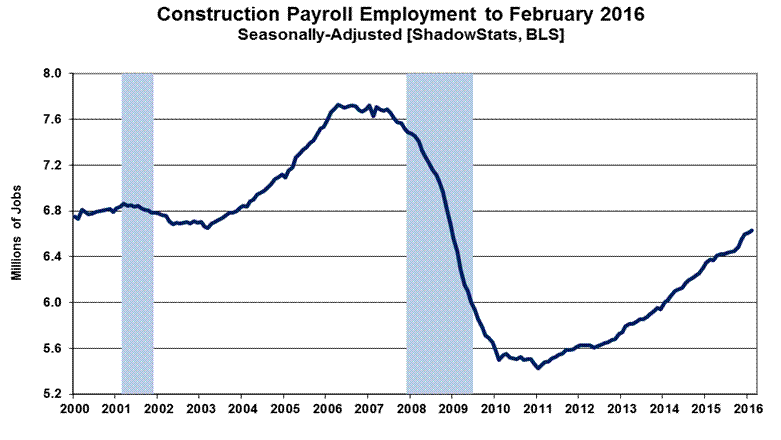
Graph 33 shows February 2016 construction employment, as discussed and detailed in the earlier Payroll Employment section.
In theory, payroll levels should move more closely with the inflation-adjusted aggregate series, where the nominal series reflects the impact of costs and pricing, as well as a measure of the level of physical activity. Ironically, in the context of last month’s the upside payroll benchmark revision, construction payrolls have shown increasing strength at the same time that broad construction activity—measured in terms of units or in real, inflation-adjusted dollars—generally had begun to slow or turn down anew.
Graph 34: Aggregate Nominal Construction Spending by Major Category to Date
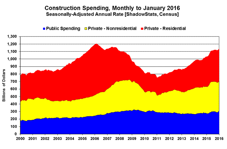
Graph 34 shows total nominal construction spending, broken out by the contributions from total-public (blue), private-nonresidential (yellow) and private-residential (red) spending.
The next two graphs (Graph 35 and 36) cover private residential construction along with housing starts (combined single- and multiple-unit starts) for January 2016 (see Commentary No. 786). Keep in mind that the construction spending series is in nominal terms, while housing starts reflect unit volume, which should be parallel with the inflation-adjusted series shown in Graph 10 of the Opening Comments section and presumably with the headline construction-payroll data in Graph 33.
Graph 35: Nominal Private Residential Construction Spending to Date

Graph 36: Single- and Multiple-Unit Housing Starts to Date

The final two graphs (Graphs 37 and 38) show the patterns of the monthly level of activity in private nonresidential-construction spending and in public-construction spending. The spending in private-nonresidential construction has turned flat, remaining off its historic peak, although it recently had been closing in on the pre-recession high, rallying sharply.
Graph 37: Nominal Private Nonresidential Construction Spending to Date
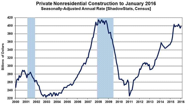
Graph 38: Nominal Public Construction Spending to Date
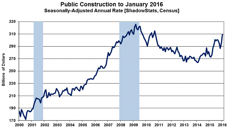
Public construction spending, which is 98% nonresidential, had continued in a broad downtrend, with intermittent bouts of fluttering stagnation and then some upturn in growth in the last year, turning down anew, recently, with a current spike in activity. Viewed net of inflation, as shown in Graphs 11 and 12, both series appear stalled shy of their pre-recession peaks.
__________
WEEK AHEAD
There are no major economic releases in the week ahead.
__________